Quick start
SVAR React Kanban gets a board on the page in a couple of minutes - install the package, render the widget with your columns and cards, and add the editor when you're ready to let users change things.
Install
The package ships as @svar-ui/react-kanban. Pick whichever package manager you already use:
npm install @svar-ui/react-kanban
yarn add @svar-ui/react-kanban
bun add @svar-ui/react-kanban
It's built for React (hooks), so you'll need a React project. Older React versions without hooks support won't work - the components rely on hooks-based reactivity.
Import and render
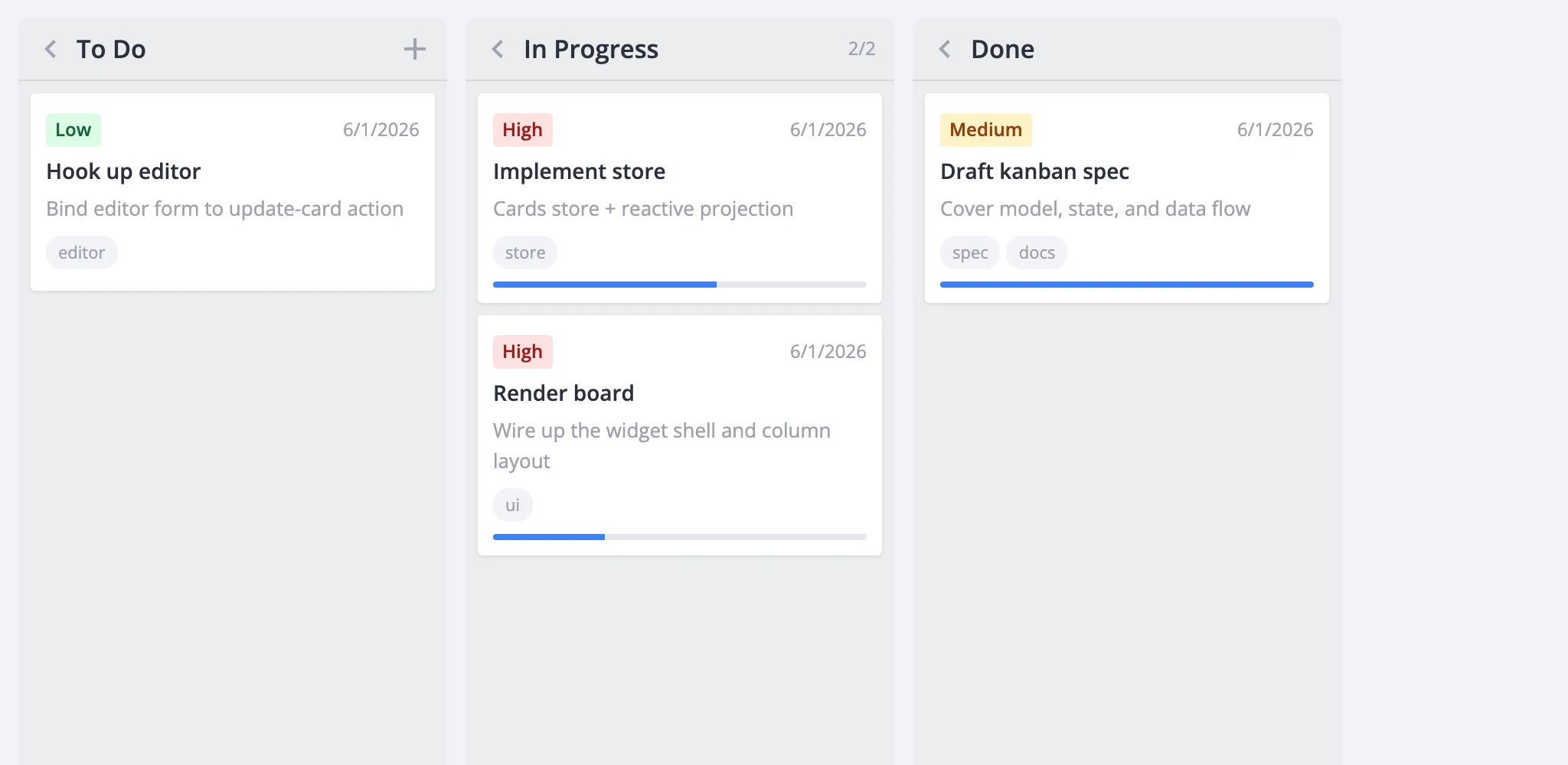
Import Kanban and pass it two things: a columns array that defines the board's stages and a cards array of the items moving through them.
import { Kanban, Willow } from "@svar-ui/react-kanban";

const columns = [
    { id: "backlog", label: "Backlog" },
    { id: "progress", label: "In Progress" },
    { id: "done", label: "Done" },
];

const cards = [
    { id: 1, label: "Fix login bug", column: "backlog", priority: 2 },
    { id: 2, label: "Write tests", column: "progress", priority: 1 },
];

function App() {
    return (
        <Willow>
            <Kanban cards={cards} columns={columns} />
        </Willow>
    );
}
The Willow wrapper isn't optional - it injects the CSS variables the board and its sub-components style themselves with. Skip it and the board renders unstyled and effectively broken. Mount it once near your app root; one wrapper covers the board, editor, toolbar, and context menu. Use WillowDark instead for dark mode.
Column order follows the array, left to right. Each card needs an id and a column that matches one of the column ids - everything else (label, description, priority, progress, deadline, tags, users) is free-form and passed straight through to the renderers, editor, filters, and sort comparators. The column field is configurable through columnAccessor if your data names it something else.
Out of the box you get columns of draggable cards. Moving cards between columns and reordering within one already works - no extra wiring - and every drag fires a move-card action the host can observe, validate, or cancel.
Add the editor
A bare Kanban handles drag-and-drop, but clicking a card has no edit UI to open. To let users edit titles and other fields, capture the instance API through the init callback and mount the Editor next to the board.
import { useState } from "react";
import { Kanban, Editor, Willow } from "@svar-ui/react-kanban";

const columns = [
    { id: "backlog", label: "Backlog" },
    { id: "progress", label: "In Progress" },
    { id: "done", label: "Done" },
];

const cards = [
    { id: 1, label: "Fix login bug", column: "backlog", priority: 2 },
    { id: 2, label: "Write tests", column: "progress", priority: 1 },
];

function App() {
    const [api, setApi] = useState(null);

    return (
        <Willow>
            <Kanban init={setApi} cards={cards} columns={columns} />
            {api && <Editor api={api} />}
        </Willow>
    );
}
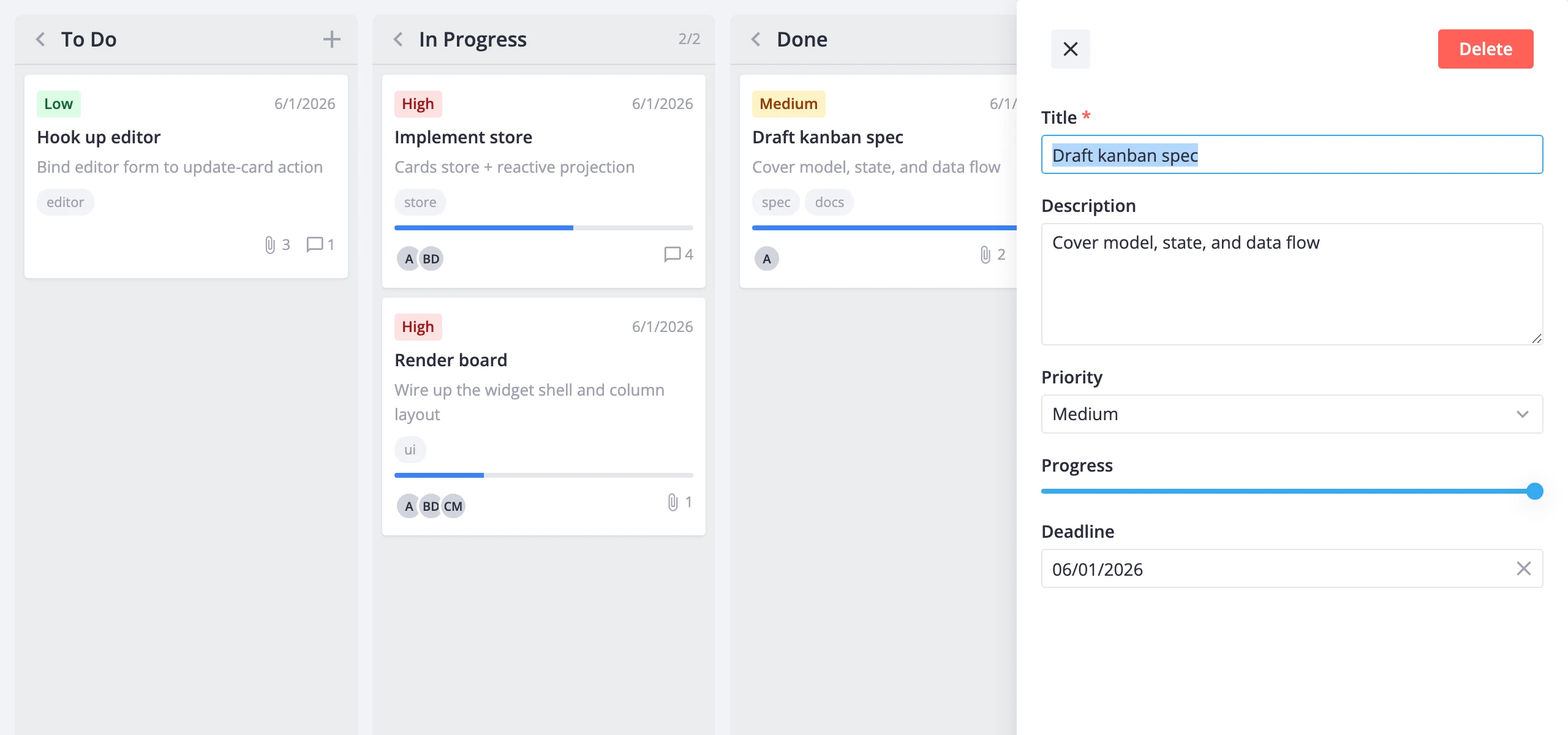
The init callback fires once with the kanban API instance; storing it in state re-renders the app, so the {api && ...} guard mounts the editor only after there's an API to talk to. From then on the editor reads the selected card from the board's reactive state - clicking a card opens it for editing automatically, and field changes auto-save via the update-card action. The editor ships pre-wired fields for priority, progress, deadline, tags, and users.
That's the full minimum: a rendered board plus a working editor. From here you can pick whichever direction matches what you're building.
Where to go next
- Key features - what the board can do: layout, card customization, editing, filtering, sorting, and performance tuning.
- Free vs PRO - what the open-source build covers and what PRO adds (dynamic loading, undo/redo history, export to PDF/PNG/xlsx).
- Core features - cards, columns, editing, filtering, sorting, and themes.
- Advanced features - history, toolbar, context menu, tooltips, popup cards, server persistence, and import/export.
- API reference - every prop, action, method, and helper exported by the package.