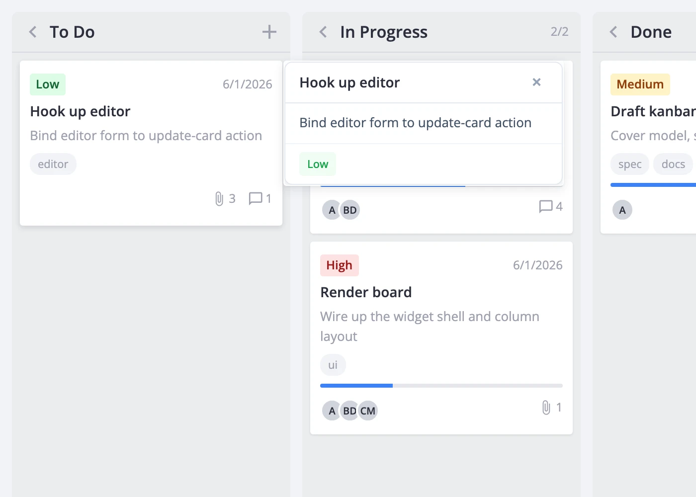
Card Popup
The cardPopup prop lets you replace the default editor click target with a custom popup component. When set, clicking a card opens your component in an anchored popup instead of the sidebar editor. This is useful for lightweight previews, quick-action panels, or any card-click experience that doesn't need a full form.
How It Works
The popup takes over the card-click path. Without cardPopup, clicking a card dispatches select-card and opens the Editor. With cardPopup set, clicks open your popup component instead - the editor is skipped entirely.
Your component receives two props:
card- the fullKanbanCardobject for the clicked cardclose- a function that dismisses the popup
The popup anchors to the clicked card element and repositions on scroll. Pressing Escape or clicking outside the popup also closes it. Only one popup is visible at a time; clicking a second card swaps the content and anchor.
Setup
Pass a React component to the cardPopup prop.
import { Kanban } from "@svar-ui/react-kanban";
import QuickView from "./QuickView.jsx";

const columns = [
  { id: "todo", label: "To Do" },
  { id: "doing", label: "In Progress" },
  { id: "done", label: "Done" },
];
const cards = [
  { id: 1, label: "Draft spec", column: "todo" },
  { id: 2, label: "Build UI", column: "doing" },
];

<Kanban cards={cards} columns={columns} cardPopup={QuickView} />
The popup component itself is a regular React component:
// QuickView.jsx
import "./QuickView.css";

function QuickView({ card, close }) {
  return (
    <div className="quick-view">
      <h4>{card.label}</h4>
      {card.description && <p>{card.description}</p>}
      <button onClick={close}>Close</button>
    </div>
  );
}

export default QuickView;
/* QuickView.css */
.quick-view {
  background: white;
  border-radius: 8px;
  box-shadow: 0 4px 16px rgba(0, 0, 0, 0.15);
  padding: 16px;
  width: 280px;
}
The widget handles positioning and dismissal. You own the markup and styling inside the popup.
Component Contract
Your popup component must accept these props:
| Prop | Type | Description |
|---|---|---|
card | KanbanCard | The clicked card's data |
close | () => void | Call this to dismiss the popup |
The popup is fully interactive - pointer events pass through to your content, so buttons, inputs, and links all work. The widget provides no default background, padding, or shadow; style everything in your component.
If your popup needs to dispatch actions (update a card, delete it, open the editor), obtain the API through the init callback and pass it to your component via context or props.
Coexistence with the Editor
When cardPopup is set, clicks always open the popup, never the editor. The two don't compete at runtime - the popup wins on every click path.
If you want both a preview popup and a full editor, add an "Open editor" button inside your popup that dispatches select-card programmatically:
import { useState } from "react";
import { Kanban, Editor } from "@svar-ui/react-kanban";
import CardPreview from "./CardPreview.jsx";

function App() {
  const [api, setApi] = useState(null);

  return (
    <>
      <Kanban
        cards={cards}
        columns={columns}
        cardPopup={CardPreview}
        init={a => setApi(a)}
      />
      {api && <Editor api={api} />}
    </>
  );
}
// CardPreview.jsx
import { useContext } from "react";
import { context } from "@svar-ui/react-core";

function CardPreview({ card, close }) {
  const api = useContext(context.kanbanApi);

  const openEditor = () => {
    api.exec("select-card", { id: card.id });
    close();
  };

  return (
    <div className="preview">
      <h4>{card.label}</h4>
      <p>{card.description}</p>
      <button onClick={openEditor}>Edit in sidebar</button>
      <button onClick={close}>Close</button>
    </div>
  );
}

export default CardPreview;
Clicking a card shows the preview popup. The preview's "Edit in sidebar" button opens the full editor and closes the popup.
For the full prop reference, see cardPopup.