Key Features
A tour of what the SVAR React Calendar widget does out of the box: the views you can switch between, how users edit and move events, what recurrence and filtering give you, and the hooks for tailoring look and behavior.
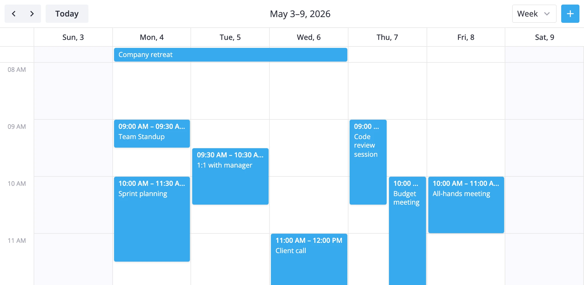
The Calendar is a React component backed by a reactive store. You hand it an array of events and it renders them in any of seven views, handles the grid math, drag interactions, and toolbar wiring. Every user action - navigating, creating, editing, deleting, filtering - can be intercepted and customised through API.
Views at a Glance
The widget ships with seven views. Only day, week, and month show up by default - list more in the views prop to expose them.
| View id | Layout | Range | Plan |
|---|---|---|---|
day | Time grid plus an all-day bar | 1 day | MIT |
week | 7-column time grid plus an all-day bar | 1 week | MIT |
month | Calendar matrix, weeks as rows | 1 month | MIT |
agenda | Chronological list grouped by day | 1 month | PRO |
year | 12 mini-months with markers on busy days | 1 year | PRO |
resources | Resource columns over a vertical time axis | 1 day | PRO |
timeline | Resource rows with a horizontal time axis | 1 day | PRO |
Picking the active view and which ones to show
view selects the view on mount; views controls what the toolbar's view switcher offers.
<Calendar
  events={data}
  view="week"
  views={["day", "week", "month", "agenda", "year"]}
/>
Tweaking a built-in view
views entries can be ViewConfig objects. Use them to relabel a view or deep-merge section overrides. This week view runs from 6 AM to 10 PM and snaps drags to 30 minutes:
<Calendar
  events={data}
  views={[
    {
      id: "week",
      sections: {
        timeGrid: {
          yScale: { startHour: 6, endHour: 22, snapStep: 30 },
        },
      },
    },
    "month",
  ]}
/>
The merge replaces only the keys you specify; step, format, and the other section defaults stay put.
Resource scheduling
The resources and timeline views need columns (or rows) defined via xScale.items / yScale.items plus an accessor that maps each event to its column id:
<Calendar
  events={data}
  view="resources"
  views={[
    {
      id: "resources",
      sections: {
        timeGrid: {
          xScale: {
            items: [
              { id: "room-a", label: "Room A" },
              { id: "room-b", label: "Room B" },
            ],
            accessor: "roomId",
          },
        },
      },
    },
  ]}
/>
When a section override isn't enough - a workweek, a fortnight, a fiscal year - subclass ViewModel and call registerCalendarView.
Editing and Interaction
Out of the box, users can:
- Click and drag on a time grid to create a new event.
- Drag an event to move it; drag its edges to resize.
- Click an event to select it and edit through the
Editorcompanion. - Right-click an event for a context menu - once you wrap the calendar in
<ContextMenu>.
Every interaction dispatches an action through the store. You can observe or block them by passing prop callbacks (onAddEvent, onUpdateEvent, onDeleteEvent, onSelectEvent) or registering handlers via api.on(...) and api.intercept(...).
Using the Editor
Editor is a separate companion component. Mount it next to <Calendar> and pass the same api:
import { Calendar, Editor } from "@svar-ui/react-calendar";
import { useState } from "react";

function App() {
  const [api, setApi] = useState(null);

  return (
    <>
      <Calendar init={setApi} events={events} />
      <Editor api={api} />
    </>
  );
}
It auto-saves field changes through update-event. Use placement="modal" for a dialog layout, or autoSave={false} plus a custom bottomBar for an explicit Save flow.
Read-only mode
Pass readonly to disable drag, resize, and create, and to drop the toolbar's add-event button:
<Calendar events={events} readonly />
Dragging in external items
To drop items from outside the calendar - a task list, a backlog, a palette - onto the grid, pass the eventProjection prop. Your app owns the native HTML drag gesture; the calendar resolves the pointer to a snapped start/end (and resource, in resource views), enriches the descriptor in place, and draws a preview marker. On drop you dispatch add-event with the resolved event. See the external drag-in guide for the full wiring.
Right-click menu
ContextMenu wraps the calendar and adds a right-click menu. The default edit-event and delete-event items are handled internally; custom entries bubble through onClick. getMenuOptions() returns the default item list as a starting point:
import { Calendar, ContextMenu, getMenuOptions } from "@svar-ui/react-calendar";
import { useState } from "react";

function App() {
  const [api, setApi] = useState(null);

  const options = [
    ...getMenuOptions(),
    { id: "duplicate", text: "Duplicate", icon: "wxi-empty" },
  ];

  const onClick = ({ action, context }) => {
    if (action.id === "duplicate") {
      api.exec("add-event", { event: { ...context, id: undefined } });
    }
  };

  return (
    <ContextMenu api={api} options={options} onClick={onClick}>
      <Calendar init={setApi} events={events} />
    </ContextMenu>
  );
}
Programmatic control
The instance API is the entry point for anything you do without user input - jumping dates, switching views, pushing events from a backend, or blocking a delete with a confirmation dialog. api.exec dispatches actions, api.intercept lets you cancel them:
import { useState } from "react";

function App() {
  const [api, setApi] = useState(null);

  const init = (a) => {
    setApi(a);
    a.intercept("delete-event", ({ id }) => confirm("Delete this event?"));
  };

  const goToToday = () => {
    api.exec("navigate-time", { direction: "now" });
  };

  return <Calendar events={events} init={init} />;
}
See the API reference for the full surface.
Recurrence and Filtering
Recurring events
Set recurring and add an iCalendar rrule to events that repeat. The store expands them into occurrences, and occurrences are fully editable: a built-in recurrence editor lets the user pick a scope - this occurrence only (single), this and following (following), or the whole series (series) - when they save a change or delete:
const events = [
  {
    id: 1,
    start: new Date(2026, 4, 4, 9, 0),
    end: new Date(2026, 4, 4, 9, 30),
    text: "Daily standup",
    rrule: "FREQ=DAILY;INTERVAL=1",
  },
];

<Calendar events={events} recurring />
When the user edits a recurring event, onUpdateEvent carries mode: "single" | "following" plus the originalDate of the occurrence. Use those to persist exceptions correctly. Exceptions track back to the master event via masterEventId and originalDate; excluded dates live in exdates.
Filtering events
Filtering is view-level: the source events array isn't touched, only what gets rendered. Dispatch filter-events with a predicate and an optional tag to stack multiple filters:
api.exec("filter-events", {
	filter: event => event.priority === "high",
	tag: "priority",
});

// Clear by re-dispatching with no filter under the same tag
api.exec("filter-events", { filter: null, tag: "priority" });
For a turnkey calendar-group sidebar, mount CalendarPanel inside the calendar's children render function - it dispatches filter-events for you when a checkbox toggles:
import { Calendar, CalendarPanel } from "@svar-ui/react-calendar";

const calendars = [
  { id: "work", label: "Work" },
  { id: "personal", label: "Personal", active: false },
];

<Calendar events={events}>
  <CalendarPanel calendars={calendars} accessor="calendarId" />
</Calendar>
More in PRO
Beyond the extra views and recurrence, the PRO build adds a few capabilities for larger scheduling apps. Each has its own guide:
- Dynamic loading - fetch events per visible range instead of loading everything up front. The store emits a request when the range changes; you feed matching events back.
- Undo/redo history - set
historyto track event add/update/move/delete, with automatic Undo and Redo toolbar controls. - PDF/PNG export - dispatch
export-datato snapshot the current view and render it through the export service, or hand the data to your own callback for other formats. - Time-zone helpers -
toTimeZoneandfromTimeZonereproject event times so the grid shows another zone's wall clock.
See Free vs PRO for the full split.
Customization Hooks
The widget exposes hooks at every layer - markup, styling, toolbar layout, event content, and persistence.
Cell and event styling
cellCss paints background grid cells; eventCss paints event wrappers. Both receive a context with the active view, section, and mode, so a single callback can adapt across layouts:
const cellCss = (ctx) => {
  if (ctx.date && (ctx.date.getDay() === 0 || ctx.date.getDay() === 6)) {
    return "weekend";
  }
  return "";
};

const eventCss = (ctx) => {
  return `priority-${ctx.event.priority ?? "normal"}`;
};

<Calendar events={events} cellCss={cellCss} eventCss={eventCss} />
See the styling guide for the full set of mode and section identifiers.
Custom event content, tooltip, and event card
Three props take React components: eventContent replaces the inner markup of an event, tooltip shows on hover, eventPopup shows on click. Each receives a small set of props (event, mode, sometimes close):
<Calendar
  events={events}
  eventContent={MyEventBlock}
  tooltip={MyTooltip}
  eventPopup={MyEventCard}
/>
Custom toolbar
Pass toolbar.items to replace the default layout. getToolbarItems() returns the default array as a starting point - append, remove, or swap entries:
import { getToolbarItems } from "@svar-ui/react-calendar";

const toolbar = {
  items: [
    ...getToolbarItems(),
    { id: "export", comp: "button", text: "Export" },
  ],
};

const onAction = ({ id }) => {
  if (id === "export") {
    // ...
  }
};

<Calendar events={events} toolbar={toolbar} onAction={onAction} />
Pass toolbar={null} to hide it entirely. Custom item ids fire action, which the onAction prop and api.on("action", ...) both observe.
Custom editor fields
Editor accepts an items array. Build it from getEditorItems() plus your own entries, and register a React component for any custom comp type via registerEditorItem:
import { Editor, getEditorItems, registerEditorItem } from "@svar-ui/react-calendar";
import Comments from "@svar-ui/react-comments";

registerEditorItem("comments", Comments);

const items = [
  ...getEditorItems(),
  { comp: "comments", key: "comments", label: "Comments" },
];

<Editor api={api} items={items} />
Backend integration
For a one-call REST hookup, attach RestDataProvider inside init. It implements the action handlers for add-event, update-event, and delete-event, so user changes round-trip to your server without per-action wiring. Use api.setNext to attach it to the action chain:
import { Calendar, RestDataProvider } from "@svar-ui/react-calendar";
import { useState, useEffect } from "react";

const provider = new RestDataProvider("/api");

function App() {
  const [events, setEvents] = useState([]);

  useEffect(() => {
    provider.getData().then(setEvents);
  }, []);

  const init = (api) => {
    api.setNext(provider);
  };

  return <Calendar events={events} init={init} />;
}
For non-REST backends, listen to onAddEvent, onUpdateEvent, and onDeleteEvent and persist the changes yourself.
iCal import and export
parseICal turns an .ics payload into a CalendarEvent[] ready to feed into events. serializeICal does the reverse - useful for exporting api.getEvents() as a downloadable file.
import { parseICal, serializeICal } from "@svar-ui/react-calendar";

const imported = parseICal(text);
const ics = serializeICal(api.getEvents());
Theming and localization
Wrap the calendar in Willow or WillowDark for the built-in themes. For other languages and a custom week start, use the Locale wrapper from @svar-ui/calendar-locales - see the localization guide.
Where to Go Next
- Quick start - a minimal working example.
- Properties reference - every prop with full type signatures.
- Styling guide - patterns for
cellCss,eventCss, and custom event markup.