Tooltip
This guide covers the card tooltip - a passive hover overlay that shows extra information about a card without opening the editor or interrupting the user's flow.
Setup
The tooltip is a React component you write. Pass it to the tooltip prop on <Kanban>, and the widget handles the rest - tracking the mouse, resolving which card is hovered, mounting your component at the cursor, and tearing it down when the mouse leaves.
import { Kanban } from "@svar-ui/react-kanban";
import CardTooltip from "./CardTooltip.jsx";

<Kanban cards={cards} columns={columns} tooltip={CardTooltip} />
When tooltip isn't set, no mouse-move listeners are attached to the board. Setting it at runtime adds them through normal React hooks - no manual cleanup needed.
Component contract
Your tooltip component receives a single prop: card, the full KanbanCard object for the hovered card.
// CardTooltip.jsx
import "./CardTooltip.css";

function CardTooltip({ card }) {
  return (
    <div className="my-tooltip">
      <strong>{card.label}</strong>
      {card.description && <p>{card.description}</p>}
    </div>
  );
}

export default CardTooltip;
/* CardTooltip.css */
.my-tooltip {
  background: #1e293b;
  color: #f1f5f9;
  border-radius: 6px;
  padding: 8px 12px;
  font-size: 12px;
  box-shadow: 0 4px 12px rgba(0, 0, 0, 0.25);
  max-width: 280px;
}
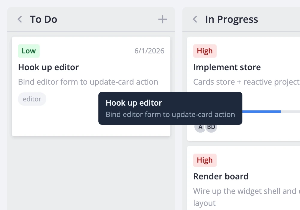
The widget mounts the component inside a fixed-position wrapper offset slightly from the cursor. It doesn't provide any default background, border, or padding - your component owns all of its own styling.
A richer tooltip can pull in helper data. Here's one that resolves priority labels, progress, and assigned users:
import { useMemo } from "react";
import { getPriorityOptions } from "@svar-ui/react-kanban";

function CardTooltip({ card }) {
  const priorities = getPriorityOptions();

  const priorityLabel = useMemo(
    () =>
      card.priority != null
        ? priorities.find(p => p.id === card.priority)?.label
        : null,
    [card.priority, priorities]
  );

  return (
    <div className="card-tooltip">
      <div className="title">{card.label}</div>
      {card.description && <div className="desc">{card.description}</div>}
      <div className="meta">
        {priorityLabel && <span className="chip">{priorityLabel}</span>}
        {typeof card.progress === "number" && (
          <span className="chip">{Math.round(card.progress * 100)}%</span>
        )}
      </div>
    </div>
  );
}

export default CardTooltip;
Styling and positioning notes
The tooltip wrapper uses position: fixed and pointer-events: none. This means:
- The tooltip follows the cursor but never intercepts clicks or hover events. Clicks pass straight through to the card underneath.
- Don't place interactive elements (buttons, links, inputs) inside the tooltip - they won't receive events. If you need hover-then-interact behavior, use the
cardPopupprop instead, which opens on click and is fully interactive.
The tooltip is suppressed automatically while a card popup is open, so the two never overlap.
The component re-mounts each time the hovered card changes. Keep the tooltip lightweight - avoid expensive computations or large DOM trees that would cause jank as the user moves across cards.