Themes
This guide covers how to apply Calendar's built-in themes, layer the sidebar panel and locale on top, and override CSS variables when you need a custom look.
How theming works
Calendar styling has two layers. The outer layer is a theme wrapper - Willow or WillowDark, both re-exported from @svar-ui/react-core. It loads a base palette of CSS variables that every SVAR widget reads through var(--wx-...). The inner layer is calendar-specific: variables prefixed --wx-calendar-... that set defaults for grid lines, weekend cells, and the time-axis column. The shipped themes set those calendar variables on top of the base palette.
A theme wrapper does two things. It adds a class (wx-willow-theme or wx-willow-dark-theme) on the wrapped subtree, and it loads Roboto when fonts={true} (the default). Anything inside the wrapper picks up the variables; anything outside doesn't.
Composition is direct: put Locale and any panel components inside the same theme wrapper as Calendar, and they all share the variables. To vary styling per instance, scope an override to a class on a parent element instead of forking the theme.
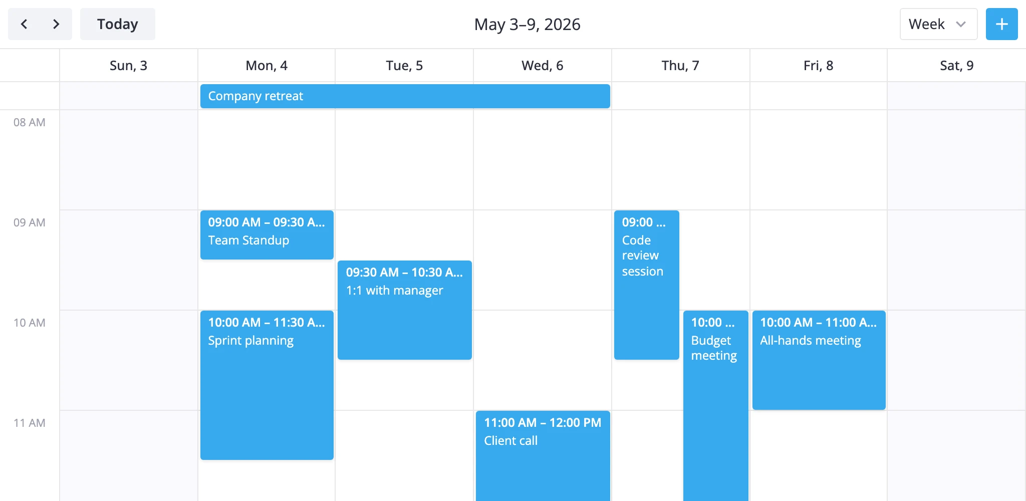
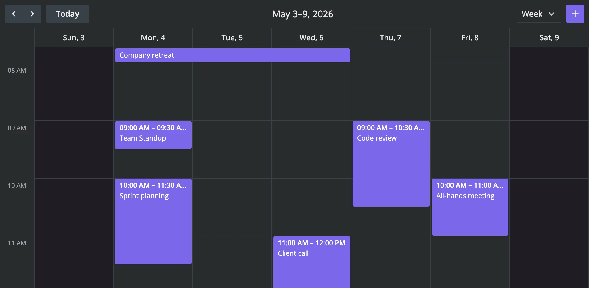
Applying a built-in theme
Wrap <Calendar> in Willow (light) or WillowDark (dark). Both are exported from @svar-ui/react-calendar.
import { Calendar, Willow } from "@svar-ui/react-calendar";

const events = [
  { id: 1, start: new Date(2026, 4, 5, 9), end: new Date(2026, 4, 5, 10), text: "Standup" },
];

function App() {
  return (
    <Willow>
      <Calendar events={events} view="week" />
    </Willow>
  );
}
For the dark variant, swap in WillowDark:
import { Calendar, WillowDark } from "@svar-ui/react-calendar";

function App() {
  return (
    <WillowDark>
      <Calendar events={events} view="week" />
    </WillowDark>
  );
}
Pass fonts={false} to skip Roboto loading if your app already serves its own webfont:
<Willow fonts={false}>
  <Calendar events={events} view="week" />
</Willow>
Injecting Calendar Panel
CalendarPanel reads colors and borders from the same CSS variables. Put it inside the theme wrapper, then mount it as the children of <Calendar>:
import { Calendar, CalendarPanel, Willow } from "@svar-ui/react-calendar";

const calendars = [
  { id: "work", label: "Work", css: "cal-work" },
  { id: "home", label: "Home", css: "cal-home" },
  { id: "holiday", label: "Holidays", css: "cal-holiday", active: false },
];

function App() {
  return (
    <Willow>
      <Calendar events={events} view="week">
        <CalendarPanel calendars={calendars} />
      </Calendar>
    </Willow>
  );
}
The panel sits in the calendar's sidebar slot and inherits the wrapper's variables. Any per-group css class you set on a calendar entry can be combined with the built-in classes - see Targeted overrides below.
Combining with locale
The Locale component from @svar-ui/react-core is a separate context - it provides translation strings, not styles. Nest it with the theme wrapper in either order; both contexts reach everything inside.
import { useState } from "react";
import { Calendar, Editor, Willow } from "@svar-ui/react-calendar";
import { Locale } from "@svar-ui/react-core";
import { fr } from "@svar-ui/calendar-locales";
import { fr as frCore } from "@svar-ui/core-locales";

const words = { ...fr, ...frCore };

function App() {
  const [api, setApi] = useState(null);

  return (
    <Willow>
      <Locale words={words}>
        <Calendar init={v => setApi(v)} events={events} view="week" />
        {api && <Editor api={api} />}
      </Locale>
    </Willow>
  );
}
Merge the calendar locale (@svar-ui/calendar-locales) with the core locale (@svar-ui/core-locales) - Calendar reads strings from both. To switch locales at runtime, use a key prop on the calendar so it remounts and picks up the new dictionary.
CSS variables
Calendar-specific variables are defined by the theme wrapper. The list below is the complete set; defaults live in the theme provider, not in the calendar source.
| Variable | Controls |
|---|---|
--wx-calendar-grid-color | Grid line color in time-grid and month sections |
--wx-calendar-weekend-background | Background fill on weekend cells in week, month, and year views |
--wx-calendar-y-scale-width | Width of the left-hand time-axis column (defaults to 60px) |
Calendar also reads general-purpose variables from the wrapper: colors (--wx-color-primary, --wx-color-font, --wx-color-font-alt, --wx-color-link, --wx-color-danger), backgrounds (--wx-background, --wx-background-alt, --wx-background-hover), borders (--wx-border, --wx-border-radius), font sizes and weights (--wx-font-size, --wx-font-weight-md), padding, and the icon set. Those are documented with the theme package, not here.
Overriding variables
Scope overrides to a wrapper class on a parent element so they don't leak into other widgets on the page:
import "./my-calendar.css";

function App() {
  return (
    <div className="my-calendar">
      <Willow>
        <Calendar events={events} view="week" />
      </Willow>
    </div>
  );
}
/* my-calendar.css */
.my-calendar {
  --wx-calendar-grid-color: #d1d5db;
  --wx-calendar-weekend-background: #f9fafb;
  --wx-calendar-y-scale-width: 80px;
}
The variables cascade into the Willow subtree because the wrapper class sits above it in the DOM.
Key CSS classes
These are the classes most likely to appear in app-level overrides. Every class is public - wx- doesn't mean "internal."
| Class | Where it appears |
|---|---|
wx-calendar, wx-calendar-sidebar, wx-calendar-main | The calendar's outer flex layout (sidebar + main content) |
wx-navigation | The toolbar row |
wx-grid-section, wx-grid-cell, wx-grid-line | Time-grid sections and their cells |
wx-month-grid, wx-month-day, wx-month-label | Month-view grid and its day cells |
wx-list-section, wx-list-day, wx-list-event | Agenda-view rows |
wx-bar-event, wx-bar-section, wx-bar-title, wx-bar-time | Multi-day bar events at the top of time-grid views |
wx-box-event, wx-box-section, wx-box-title, wx-box-time | Box-rendered events in month and year views |
wx-now-line, wx-now-dot | The current-time indicator |
wx-today, wx-weekend, wx-out-of-month | Date-based modifiers on grid cells |
wx-calendar-panel, wx-calendar-name | CalendarPanel container and per-calendar checkbox |
wx-calendar-tooltip | Hover tooltip wrapper |
Targeted overrides
When you assign a css class to a calendar group via CalendarPanel (or to events via eventCss), pair it with the built-in event classes to recolor a single calendar's events:
import { Calendar, CalendarPanel, Willow } from "@svar-ui/react-calendar";
import "./calendar-colors.css";

const calendars = [
  { id: "work", label: "Work", css: "cal-work" },
  { id: "home", label: "Home", css: "cal-home" },
];

const cssByCalendar = obj => `cal-${obj.event.calendarId}`;

function App() {
  return (
    <Willow>
      <Calendar events={events} view="week" eventCss={cssByCalendar}>
        <CalendarPanel calendars={calendars} />
      </Calendar>
    </Willow>
  );
}
/* calendar-colors.css */
.cal-work.wx-box-event,
.cal-work.wx-bar-event {
  background-color: #9797f8;
  color: white;
}
.cal-work.wx-calendar-name {
  background-color: #9797f8;
  color: white;
}
eventCss returns a class for each event wrapper, which combines with the built-in wx-bar-event / wx-box-event classes. The panel applies the same css to its checkbox label via wx-calendar-name. The compound selector (.cal-work.wx-bar-event) keeps the override scoped to matching events and the matching legend entry.