Day View
This guide covers how to set up and tune the day view: which hours to show, how slot size and snap behave, and how to style cells and events for a single-day schedule.
Layout
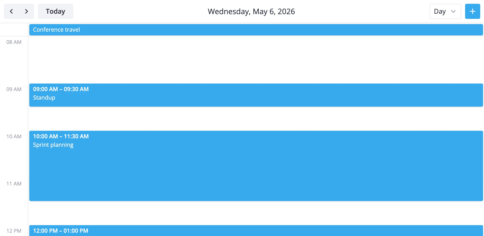
The day view stacks two sections: a slim multiday bar at the top for all-day or multi-day events, and a scrollable timeGrid below for time-of-day events. Every event lands in exactly one section based on whether its start and end fall on the same calendar date.
The split matters when you customize behavior, because the two sections expose different knobs:
multidayis abarssection. Drag and drag-to-create are off by default in day view - there's nothing meaningful to drag inside a one-day strip.timeGridis aboxessection. Slot size, snap, the now line, and most styling rules apply here.
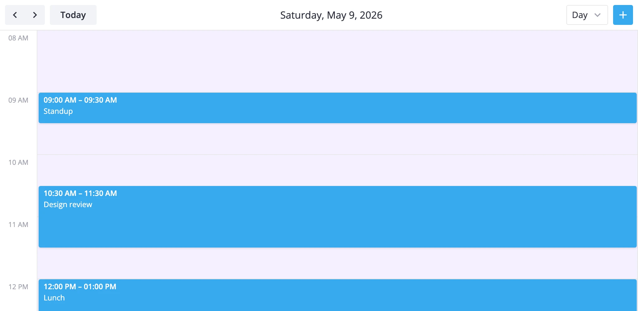
The default visible range is 8 AM to 6 PM, with 60-minute slots and 15-minute snap. Both axes are pinned to a single column - there's no week or resource axis to configure.
To enable the day view, list "day" in the views prop (it's already part of the default ["day", "week", "month"] list) and either pass it as the initial view or let users pick it from the toolbar.
<Calendar events={events} view="day" date={new Date()} />
To tune the day view, pass a ViewConfig object instead of the bare "day" string. Anything you put under sections.timeGrid is deep-merged into the defaults - you only restate the keys you change.
<Calendar
  events={events}
  view="day"
  views={[
    {
      id: "day",
      sections: {
        timeGrid: {
          yScale: { startHour: 6, endHour: 22 }
        }
      }
    },
    "week",
    "month"
  ]}
/>
Visible hours and slot size
The day's time axis is a time scale on the y-axis of timeGrid. Three keys control what the user sees:
startHour/endHour- the visible window (defaults8and18).step- minutes per row (default60). Drives how many hour labels render.ui.minUnitHeight- minimum pixel height per slot (default100). Lower it for compact layouts, raise it when slots feel cramped.
A "full day, half-hour rows" config:
const views = [
	{
		id: "day",
		sections: {
			timeGrid: {
				yScale: {
					startHour: 0,
					endHour: 24,
					step: 30,
					ui: { minUnitHeight: 40 },
				},
			},
		},
	},
];
Events that stretch outside startHour-endHour are clamped to the visible window. Events fully outside the window aren't rendered at all, so widen the range when users have early-morning or late-night meetings you don't want to lose.
A "compact working hours, two-hour blocks" config:
const views = [
	{
		id: "day",
		sections: {
			timeGrid: {
				yScale: {
					startHour: 8,
					endHour: 18,
					step: 120,
					ui: { minUnitHeight: 40 },
				},
			},
		},
	},
];
For a live example of switching between full-day and working-hours modes, see apps/demos/src/cases/DayView.jsx.
Snap and drag
Snap and drag are independent of the visible step. The grid can show 60-minute rows while drag and create still snap every 15 minutes:
yScale.snapStep- snap granularity in minutes (default15). Setfalseto disable snapping entirely.ui.drag/ui.dragCreate- toggle dragging existing events and drag-to-create new ones (bothtruefortimeGridby default).
Coarser, half-hour snap:
const views = [
	{
		id: "day",
		sections: {
			timeGrid: {
				yScale: { snapStep: 30 },
			},
		},
	},
];
Read-only day with no creation:
const views = [
	{
		id: "day",
		sections: {
			timeGrid: {
				ui: { drag: false, dragCreate: false },
			},
		},
	},
];
If you need read-only behavior across every view, set the top-level readonly prop on <Calendar> instead - it disables creation and drag globally and hides the toolbar's add-event button.
Now line
The day view doesn't show a current-time line by default. Turn it on per view through sections.timeGrid.ui.nowLine:
const views = [
	{
		id: "day",
		sections: {
			timeGrid: {
				ui: { nowLine: true },
			},
		},
	},
];
Styling cells
Cell-level styling runs through the cellCss callback on <Calendar>. It receives a CellContext with the active view, section, mode, scale units, and resolved date, and returns a CSS class name (or "").
Highlight lunch slots and weekends in the day grid:
import { Calendar } from "@svar-ui/react-calendar";
import type { CellContext } from "@svar-ui/react-calendar";

function cellCss(ctx: CellContext): string {
  const { date, section } = ctx;
  if (!date) return "";
  const day = date.getDay();
  if (day === 0 || day === 6) return "weekend";
  if (
    section === "timeGrid" &&
    date.getHours() >= 12 &&
    date.getHours() < 13
  )
    return "lunch";
  return "";
}

<Calendar events={events} view="day" cellCss={cellCss} />
/* styles.css */
.weekend { background-color: #f5f0ff !important; }
.lunch   { background-color: #fef9e7 !important; }
Branch on ctx.section to scope styling. In day view the only sections are multiday and timeGrid, so section === "timeGrid" reliably picks the time slots.
Styling events
Event styling runs through eventCss. It receives an EventContext with the event itself plus the render mode ("grid" | "bars" | "boxes"), so you can vary classes between the multiday bar (bars) and the timeGrid (boxes).
Color events by a custom priority field, with mode-specific tweaks:
import { Calendar } from "@svar-ui/react-calendar";
import type { EventContext } from "@svar-ui/react-calendar";

function eventCss(ctx: EventContext): string {
  const cls = `priority-${ctx.event.priority || "default"}`;
  if (ctx.mode === "bars")  return cls + " bar-event";
  if (ctx.mode === "boxes") return cls + " box-event";
  return cls;
}

<Calendar events={events} view="day" eventCss={eventCss} />
For richer event markup - badges, icons, custom layout inside the event body - pass a React component to eventContent. It receives { event, mode } so the same component can render a compact bar in the multiday strip and a full block in the timeGrid:
<Calendar events={events} view="day" eventContent={EventContent} />
Pair eventContent with eventCss when the markup change isn't enough on its own - eventCss controls the wrapper, eventContent controls what's inside it.
What to read next
- Custom views - subclass
DayViewModelwhen section overrides aren't enough. - API reference:
views,cellCss,eventCss,eventContent.