Navigation Bar
This guide covers the toolbar above the calendar grid - the default layout, how to swap or hide it, how to compose your own from building blocks, and how to wire custom buttons back into the calendar.
How the toolbar is built
The toolbar is a list of small components ("blocks"). Each block is an object with at least a comp field naming the block type and an optional id the calendar uses to wire the block to a specific role.
type ToolbarItem = {
  id?: string;
  comp: string;
  value?: any;
  options?: { id: string; label: string }[];
  [key: string]: any;
};
The toolbar prop takes an object with items (the block list) and an optional css class. Three values mean three different things:
undefined- the calendar renders its default toolbar.null- no toolbar.{ items: [...] }- your layout replaces the default one.
Two bits of auto-wiring run before the toolbar renders. Any block with id: "modes" becomes the view switcher: the calendar overwrites its value with the active view id and its options with the labelled list from the views prop. Picking a different option dispatches navigate-to with { view }. If only one view is available, the modes block is dropped. The second rule is the readonly strip - when readonly={true}, every block whose comp === "addEventButton" is filtered out.
The built-in blocks (dateNav, todayButton, dateLabel, addEventButton, menuButton) come pre-wired to the matching store actions. Generic blocks from @svar-ui/react-toolbar (button, icon, label, separator, spacer) don't - they need a handler or a registered custom component to talk to the calendar.
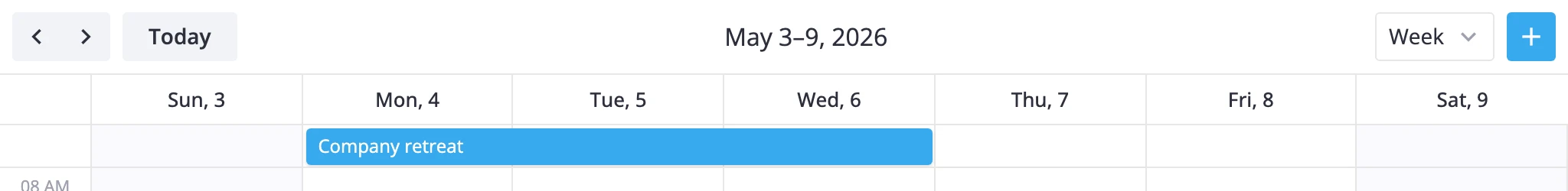
Default toolbar
When toolbar is not set, the calendar renders this layout:
[
	{ id: "nav", comp: "dateNav" },
	{ id: "today", comp: "todayButton" },
	{ comp: "spacer" },
	{ id: "title", comp: "dateLabel" },
	{ comp: "spacer" },
	{ id: "modes", comp: "richselect" },
	{ id: "add-event", comp: "addEventButton" },
];
Two spacers keep the date label centered between the left controls and the right-side actions. The view switcher is a richselect, and the add-event button closes the row.
To extend the default instead of rebuilding it, call getToolbarItems() for a fresh copy of that array:
import { Calendar, getToolbarItems } from "@svar-ui/react-calendar";

const toolbar = {
  items: [
    ...getToolbarItems(),
    { id: "export", comp: "button", icon: "wxi-download", text: "Export" },
  ],
};

<Calendar events={data} date={date} toolbar={toolbar} />
Without toolbar
Pass null to drop the toolbar entirely. The calendar still works - you just drive navigation from your own UI.
<Calendar events={data} date={date} toolbar={null} ref={apiRef} />
{ items: [] } is different: it renders an empty toolbar container. Useful when you want the wrapper for spacing or styling but no blocks inside.
To navigate from elsewhere, dispatch the same actions the built-in blocks use via api.exec — see navigate-time and navigate-to:
api.exec("navigate-time", { direction: "next" });
api.exec("navigate-to", { view: "month" });
api.exec("navigate-to", { date: new Date(2026, 0, 1) });
Custom toolbar layouts
Pass your own items to replace the default layout. All built-in blocks are available - pick the ones you need and arrange them with spacers.
Inverted - view switcher on the left, navigation on the right:
toolbar={{ items: [
  { id: "modes", comp: "segmented" },
  { comp: "spacer" },
  { id: "title", comp: "dateLabel" },
  { id: "nav",   comp: "dateNav" },
]}}
Sides - nav left, views right, no centering:
toolbar={{ items: [
  { id: "nav",   comp: "dateNav" },
  { id: "title", comp: "dateLabel" },
  { comp: "spacer" },
  { id: "modes", comp: "segmented" },
]}}
Minimal - view switcher only, pushed to the right:
toolbar={{ items: [
  { comp: "spacer" },
  { id: "modes", comp: "segmented" },
]}}
The id: "modes" slot takes any view-switcher component - richselect for a dropdown, segmented for inline buttons. Auto-wiring runs for both.
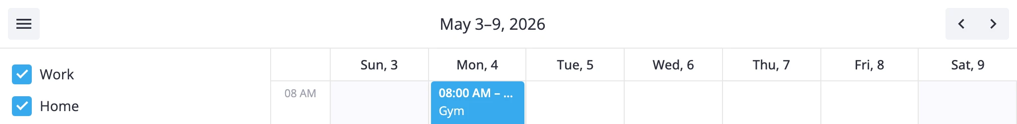
Hamburger menu and side panel
The menuButton block is a hamburger icon. Clicking it dispatches action with { id: "menu-button" }, which surfaces in the onAction prop. That's the standard way to toggle a CalendarPanel sidebar.
import { useState } from "react";
import { Calendar, CalendarPanel } from "@svar-ui/react-calendar";

const toolbar = { items: [
  { id: "menu", comp: "menuButton" },
  { comp: "spacer" },
  { id: "title", comp: "dateLabel" },
  { comp: "spacer" },
  { id: "nav", comp: "dateNav" },
]};

function App() {
  const [panelVisible, setPanelVisible] = useState(true);

  const handleAction = (ev) => {
    if (ev.id === "menu-button") setPanelVisible(v => !v);
  };

  return (
    <Calendar events={data} date={date} toolbar={toolbar} onAction={handleAction}>
      <CalendarPanel open={panelVisible} calendars={calendars} />
    </Calendar>
  );
}
The block's own id ("menu" here) doesn't matter - menuButton always dispatches action with { id: "menu-button" }. Match against that fixed id in your handler.
Adding a custom block
Any React component can be a toolbar block. Register it once with registerToolbarItem from @svar-ui/react-toolbar, then reference it by name in items.
// PrintButton.jsx
import { Button } from "@svar-ui/react-core";

function PrintButton() {
  const print = () => { window.print(); };
  return <Button icon="wxi-print" onClick={print} />;
}

export default PrintButton;
import { registerToolbarItem } from "@svar-ui/react-toolbar";
import PrintButton from "./PrintButton.jsx";

registerToolbarItem("printButton", PrintButton);
toolbar={{ items: [
  { id: "nav",   comp: "dateNav" },
  { id: "today", comp: "todayButton" },
  { comp: "spacer" },
  { id: "title", comp: "dateLabel" },
  { comp: "spacer" },
  { id: "print", comp: "printButton" },
  { id: "modes", comp: "richselect" },
  { id: "add-event", comp: "addEventButton" },
]}}
To read calendar state or fire actions from inside the block, grab the calendar-api context. It exposes getState, getReactiveState, exec, getEvent, and fmt.
import { useContext } from "react";
import { context } from "@svar-ui/react-core";

const api = useContext(context["calendar-api"]);
const { currentView, rangeLabel } = api.getReactiveState();
Dispatching custom actions
Custom blocks fire their own actions through exec("action", { id }). The id surfaces in onAction on the Calendar component, where you decide what to do with it.
// inside the block
import { useContext } from "react";
import { context } from "@svar-ui/react-core";

function ExportBlock() {
  const api = useContext(context["calendar-api"]);
  const exportPdf = () => {
    api.exec("action", { id: "export-pdf" });
  };
  // ...
}
// in the host app
<Calendar
  events={data}
  toolbar={myToolbar}
  onAction={ev => {
    if (ev.id === "export-pdf") downloadPdf();
  }}
/>
It's the same channel menuButton uses - every custom toolbar event flows through onAction, distinguished by id.
Overflow
When items don't fit the available width, the toolbar framework hides the overflowing ones and exposes them through a trailing dots button (wxi-dots-h). It's built into @svar-ui/react-toolbar and needs no configuration.
See also
- For full prop and type signatures, see the Calendar API reference.
- For the sidebar that pairs with
menuButton, see the CalendarPanel reference.