Editing events
This guide covers mounting the event editor next to the calendar, choosing which fields users can change, and controlling where the form appears. The editor handles the full lifecycle of an event: it opens on selection, saves edits through the calendar action pipeline, and clears the selection on close.
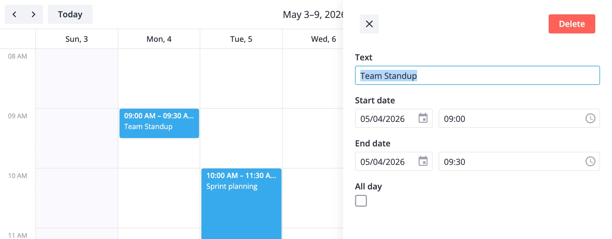
How editing works
The Editor component is a calendar-bound wrapper around @svar-ui/react-editor. Three rules describe how it behaves:
- Selection drives visibility. The editor renders only when
editorDatain calendar state holds an event. Clicking an event in the grid (or callingexec("select-event", { id })) populateseditorDataand shows the form. Closing the editor callsselect-eventwithid: null. - The selected event is the source of truth. The wrapper binds form values to
editorDatadirectly, not to a local copy, so edits can't drift away from calendar state. - Saves flow through calendar actions.
autoSaveis on by default, so each change dispatchesupdate-eventthrough the same pipeline as drag/resize. Delete dispatchesdelete-event. There's no separate submit step.
The editor needs the calendar instance to read editorData and dispatch actions, so it always takes an api prop captured via ref or init. Default fields come from getEditorItems() - a title plus a combined schedule block for start, end, and all-day. Replace or extend that list when you need extra inputs.
The field model, item contract, validation, and toolbar options all come from the underlying editor - see the SVAR React Editor properties for the full contract. This guide covers only the calendar-specific wiring on top of it.
One calendar-specific quirk: when you change start on a same-day timed event, the wrapper shifts end to the new date and keeps the original end time. This stops a noon-to-three meeting from turning into a 27-hour overnight event the moment you pick a new day.
Mounting the editor
The minimum setup pairs Calendar with Editor and a captured api reference.
import { useRef, useState, useEffect } from "react";
import { Calendar, Editor } from "@svar-ui/react-calendar";

function App() {
  const apiRef = useRef(null);
  const [ready, setReady] = useState(false);

  useEffect(() => {
    if (apiRef.current) setReady(true);
  }, []);

  return (
    <>
      <Calendar ref={apiRef} />
      {ready && <Editor api={apiRef.current} />}
    </>
  );
}
The ready guard waits for the calendar to mount before rendering the editor - without it, the editor would try to read editorData from an undefined api. Once mounted, the editor stays in the DOM and toggles its inner form based on the current selection.
Default fields
getEditorItems() returns a two-item config:
| Key | Component | Owned fields | Purpose |
|---|---|---|---|
text | text | text | Event title |
schedule | event-dates | start, end, allDay | Combined start, end, and all-day controls |
schedule is one multi-field item, not three separate ones. It writes start, end, and allDay straight onto the event and validates that end is never earlier than start. Toggling all-day hides both time pickers while the date inputs stay visible. The event-dates and date-time-picker components are registered automatically inside the wrapper, so you don't pre-register them.
Recurring events
With recurring={true} on the calendar, getEditorItems() swaps the schedule item for an event-recurrence form whenever the selection is a series or a "this and following" edit. That form layers the RRULE controls on top of the start, end, and all-day fields; single-occurrence edits fall back to the plain event-dates schedule. See the recurring events guide for how series, single, and following edits flow through the store.
Adding custom fields
Two patterns extend the form: append to the defaults, or replace them entirely.
Append to defaults
To keep title, dates, and the all-day flag but tag events with extra data, spread getEditorItems() and add your own entries on top.
import { useRef, useState, useEffect } from "react";
import { Calendar, Editor, getEditorItems } from "@svar-ui/react-calendar";

const items = [
  ...getEditorItems(),
  {
    comp: "richselect",
    key: "priority",
    label: "Priority",
    options: [
      { id: "high", label: "High" },
      { id: "medium", label: "Medium" },
      { id: "low", label: "Low" },
    ],
  },
];

function App() {
  const apiRef = useRef(null);
  const [ready, setReady] = useState(false);

  useEffect(() => {
    if (apiRef.current) setReady(true);
  }, []);

  return (
    <>
      <Calendar ref={apiRef} events={data} date={date} />
      {ready && <Editor api={apiRef.current} items={items} />}
    </>
  );
}
Each item maps to a form field. key is the event property the field reads and writes. comp is the component id. Everything else passes through to that component.
Replace with custom blocks
For richer editors - comments, task lists, custom date pickers - register the components with registerEditorItem first, then build a fresh items array from scratch.
import { useRef, useState, useEffect } from "react";
import {
  Calendar,
  Editor,
  registerEditorItem,
} from "@svar-ui/react-calendar";
import { Comments } from "@svar-ui/react-comments";
import { Tasklist } from "@svar-ui/react-tasklist";

registerEditorItem("comments", Comments);
registerEditorItem("tasks", Tasklist);

const users = [
  { id: 1, name: "Alice" },
  { id: 2, name: "Bob" },
];

const items = [
  { comp: "text", key: "text", label: "Text", column: "left" },
  {
    comp: "date-time-picker",
    key: "start",
    label: "Start date",
    time: true,
    config: { buttons: false },
  },
  {
    comp: "date-time-picker",
    key: "end",
    label: "End date",
    time: true,
    config: { buttons: false },
  },
  {
    key: "comments",
    comp: "comments",
    label: "Comments",
    users,
    activeUser: 1,
    column: "left",
  },
  {
    key: "tasks",
    comp: "tasks",
    label: "Checklist",
  },
];

function App() {
  const apiRef = useRef(null);
  const [ready, setReady] = useState(false);

  useEffect(() => {
    if (apiRef.current) setReady(true);
  }, []);

  return (
    <>
      <Calendar ref={apiRef} events={data} date={date} />
      {ready && (
        <Editor
          placement="modal"
          layout="columns"
          api={apiRef.current}
          items={items}
        />
      )}
    </>
  );
}
registerEditorItem(name, Component) exposes a React component under a string id. The matching comp value in your items array tells the editor which component to render for that field. Register components before the editor mounts. The full item contract - key, comp, validation, column, multi-field keys, and the rest - lives in the SVAR React Editor properties.
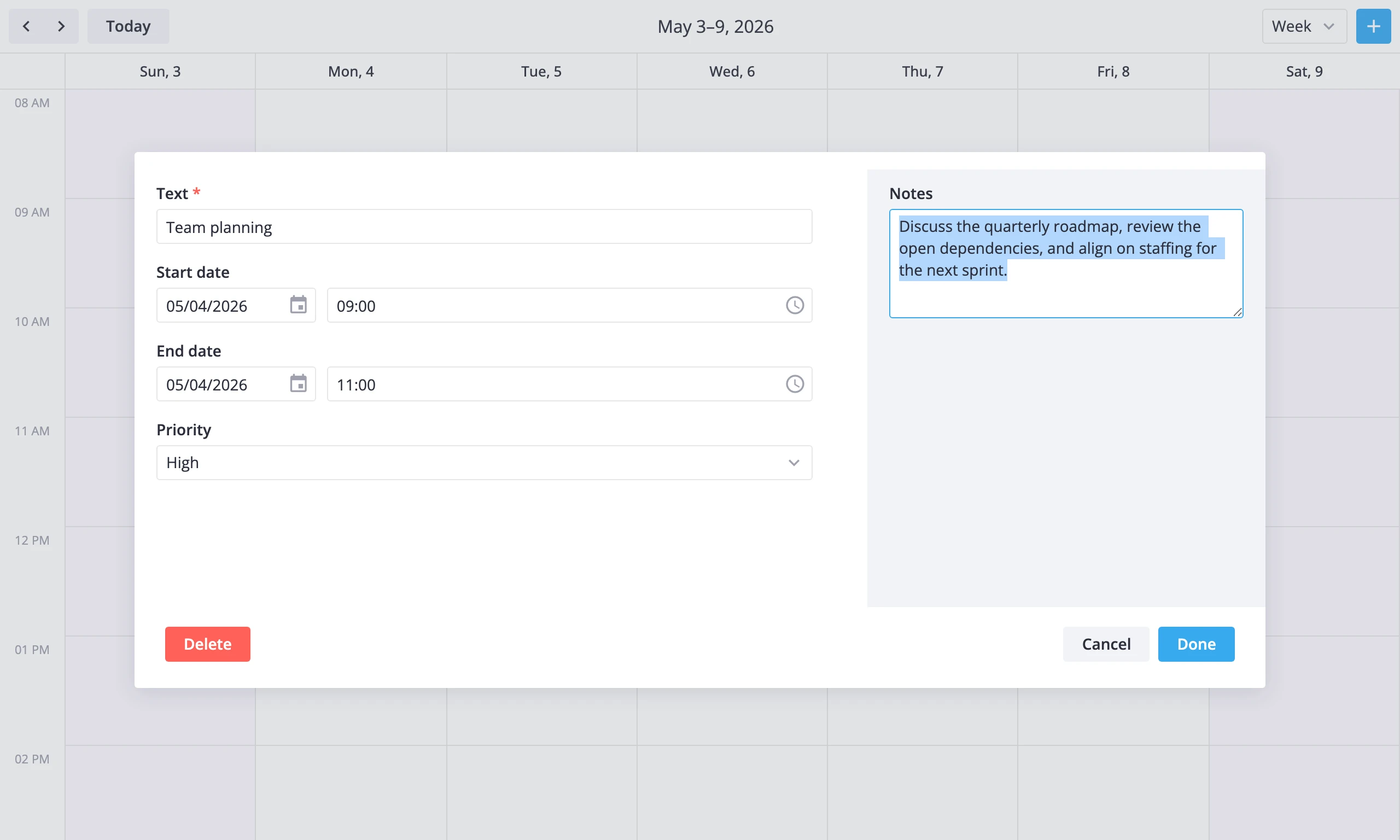
Placement and column layout
The placement prop picks where the form appears:
"sidebar"- the editor docks next to the calendar."fullscreen"- the editor fills the calendar area."modal"- the editor opens in a centered modal dialog.
Leave placement unset and the editor chooses a responsive default: "sidebar" on a normal-width calendar, "fullscreen" once the calendar root drops below 480px. An explicit placement always wins over that default. The full placement contract lives in the SVAR React Editor properties.
The layout prop arranges fields inside the form:
"default"- vertical stack, one field per row."columns"- items withcolumn: "left"go into a left column; the rest fill the right column.
<Editor placement="modal" layout="columns" api={api} items={items} />
Column layout pairs well with modal placement when the editor mixes short fields (text, dates) on one side with larger components (comments, checklists) on the other.
Readonly mode
The editor has no dedicated readonly prop. To show events without letting users change them, set readonly={true} on the calendar. That hides the toolbar add-event button and disables drag/move/create. Events stay clickable, so just leave <Editor> out of the template when you don't want any form at all:
<Calendar ref={apiRef} events={data} date={date} readonly={true} />
For a read-only preview on click, keep the editor mounted and swap the items for non-editable comp types - for example, label blocks instead of text inputs.
Custom editor
When you need full control over save, delete, and close - confirmation dialogs, cross-field validation, custom bottom bars - turn off autoSave and drive the actions yourself.
import { useContext, useRef, useState, useMemo } from "react";
import { context } from "@svar-ui/react-core";
import { Calendar } from "@svar-ui/react-calendar";
import { Editor, registerEditorItem } from "@svar-ui/react-editor";

function App() {
  const { showModal } = useContext(context.helpers);

  const apiRef = useRef(null);
  const [api, setApi] = useState(null);

  const editorData = useMemo(() => {
    return api ? api.getReactiveState().editorData : null;
  }, [api]);

  const selected = editorData ? editorData : null;

  const bottomBar = {
    items: [
      { comp: "button", id: "delete", text: "Delete", type: "danger", onClick: handleDelete },
      { comp: "spacer" },
      { comp: "button", id: "close", text: "Cancel", type: "default" },
      { comp: "button", id: "save", text: "Done", type: "primary" },
    ],
  };

  const closeEditor = () => {
    api?.exec("select-event", { id: null });
  };

  const handleSave = ({ values }) => {
    if (!api || !selected) return;
    api.exec("update-event", { id: selected.id, event: values });
  };

  const handleDelete = async () => {
    if (!api || !selected) return;
    try {
      await showModal({ title: "Delete event?", message: "This action cannot be undone." });
    } catch {
      return;
    }
    api.exec("delete-event", { id: selected.id });
    closeEditor();
  };

  const handleAction = ({ item, changes }) => {
    if (item.id === "close") closeEditor();
    else if (item.id === "save" && changes.length === 0) closeEditor();
  };

  return (
    <>
      <Calendar ref={apiRef} events={data} date={date} init={setApi} />
      {selected && (
        <Editor
          items={items}
          bottomBar={bottomBar}
          topBar={false}
          autoSave={false}
          placement="modal"
          layout="columns"
          values={selected}
          onSave={handleSave}
          onAction={handleAction}
        />
      )}
    </>
  );
}
A few things change in this setup:
autoSave={false}stops per-keystrokeupdate-eventdispatches. Edits collect inside the form until the user clicks Save.topBar={false}drops the default close/delete top bar.bottomBardefines a custom button row instead.onSaveandonActionroute Save, Cancel, and Delete to your own handlers. The example wraps Delete in a confirmation modal before dispatchingdelete-event.values={selected}binds the form to the selected event read fromgetReactiveState().editorData. This pattern lets you intercept the event before it reaches the form - for example, to clone it or run validation.
The select-event action with id: null is what closes the editor. It clears editorData, and the {selected && ...} branch unmounts the form.