Timeline View
This guide covers how to lay out events along a horizontal time axis with one row per resource, so users can compare schedules across rooms, vehicles, or staff at a glance.
The functionality is available in PRO Edition only
PRO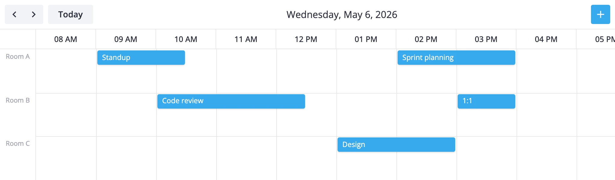
How the timeline thinks
The timeline view is a single-day view with one section in bars mode. Time runs along the x-axis and resources stack along the y-axis. Each resource owns a row, and events show up as horizontal bars whose length equals their duration. It's the transposed sibling of the resources view - same data, different orientation.
Two pieces drive it:
- The y-axis lists your resources. Each resource is a
{ id, label }object insideyScale.items. - The
accessoris the event field that links an event to a resource id (e.g."room","unit_id","assignee").
By default the y-axis has a single placeholder unit, so a bare mount renders an empty-looking timeline until you supply real resources. Events whose accessor value doesn't match any configured resource id are dropped from the view - there's no default fallback row.
The view scrolls horizontally. When the time range is wider than the viewport, users scroll along the x-axis; when there are more resources than fit vertically, the rows scroll on the y-axis. Navigation steps by one day at a time. Visible hours come from the standard time scale (startHour, endHour, step), so the same overrides you use on the day or week view apply here.
The timeline view is a PRO feature and is not listed in views by default - add it explicitly to enable it.
Defining rows
Resources are configured by deep-merging into the view's timeGrid section. Provide an items array and an accessor that names the event field linking each event to a row.
import { Calendar } from "@svar-ui/react-calendar";

const rooms = [
  { id: "room-a", label: "Room A" },
  { id: "room-b", label: "Room B" },
  { id: "room-c", label: "Room C" },
];

const events = [
  { id: 1, start: new Date(2025, 4, 5, 9), end: new Date(2025, 4, 5, 11), text: "Standup", room: "room-a" },
  { id: 2, start: new Date(2025, 4, 5, 10), end: new Date(2025, 4, 5, 12, 30), text: "Code review", room: "room-b" },
  { id: 3, start: new Date(2025, 4, 5, 13), end: new Date(2025, 4, 5, 15), text: "Design", room: "room-c" },
];

const views = [
  {
    id: "timeline",
    sections: {
      timeGrid: {
        yScale: {
          items: rooms,
          accessor: "room",
        },
      },
    },
  },
];

<Calendar events={events} view="timeline" views={views} />
Each event needs a room field whose value matches one of the configured ids. Use whatever field name fits your domain - set accessor to that field. If two events overlap in the same row they pack into lanes within that row, so you'll see them stacked vertically inside the resource band.
Horizontal time axis
The x-axis is a standard time scale, so the same options that tune the day or week view apply. Override xScale inside the same timeGrid section.
Trim or expand visible hours:
views={[
  {
    id: "timeline",
    sections: {
      timeGrid: {
        xScale: { startHour: 6, endHour: 22 },
        yScale: { items: rooms, accessor: "room" },
      },
    },
  },
]}
Use 30-minute slots and widen the column footprint so half-hour blocks stay readable when the timeline scrolls:
views={[
  {
    id: "timeline",
    sections: {
      timeGrid: {
        xScale: {
          startHour: 8,
          endHour: 18,
          step: 30,
          ui: { minUnitWidth: 120 },
        },
        yScale: { items: rooms, accessor: "room" },
      },
    },
  },
]}
minUnitWidth controls the minimum pixel width per time unit; raise it when slots feel cramped. The default is 100px. Row height is governed by yScale.ui.minUnitHeight (default 40px) - bump it when bars need more breathing room.
Styling cells and bars
Use cellCss and eventCss to color rows, time bands, and bars by data. Both callbacks receive the active view id, so you can scope rules to the timeline only.
import "./CalendarStyles.css";
import type { CellContext, EventContext } from "@svar-ui/react-calendar";

const cellCss = (ctx: CellContext): string => {
  if (ctx.view !== "timeline") return "";
  // shade the lunch hour band across all rows
  if (ctx.x?.start && ctx.x.start.getHours() === 12) return "lunch";
  return "";
};

const eventCss = (ctx: EventContext): string => {
  return `room-${ctx.event.room}`;
};

<Calendar events={events} view="timeline" views={views} cellCss={cellCss} eventCss={eventCss} />
/* CalendarStyles.css */
.lunch { background-color: #fef9e7; }
.room-room-a { background-color: #2e7d32; }
.room-room-b { background-color: #1565c0; }
.room-room-c { background-color: #6a1b9a; }
cellCss runs for every grid cell with a CellContext that carries view, section, mode, and the resolved x/y scale units. In the timeline x is a time slot and y is a resource unit, so you can paint per-resource backgrounds by branching on ctx.y?.id or shade time bands via ctx.x.
eventCss fires for each bar with the event itself plus the render mode (always "bars" for the timeline). Branch on event fields like priority or room to drive bar color.
For the typed callback signatures see the cellCss and eventCss reference pages. For more on the views[].sections deep-merge rules, see the views reference. Subclass TimelineViewModel when section overrides aren't enough.