Year View
This guide covers the year view - what it shows, how to turn it on, and how to tune its layout. Use it when users need a wide-angle look at twelve months at once.
The functionality is available in PRO Edition only
PRO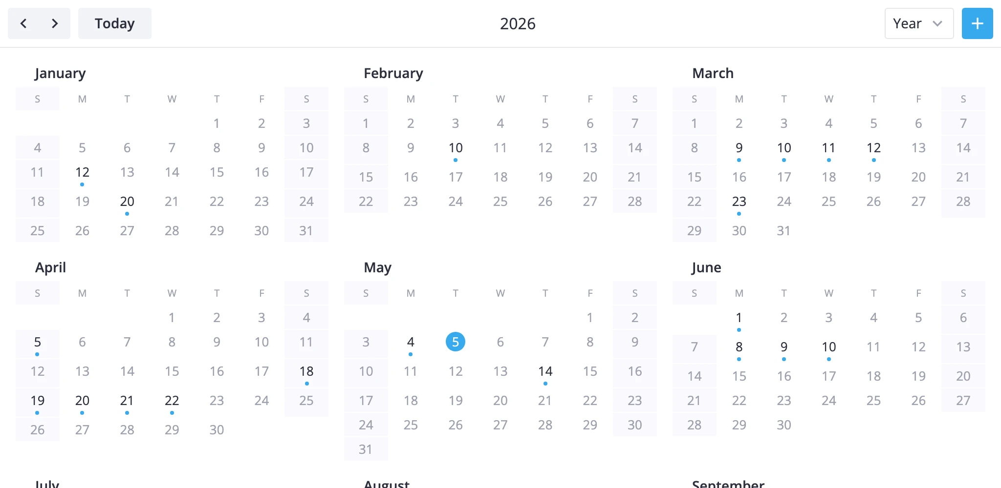
12-Month Overview
The year view is one of the seven built-in views. It renders the full calendar year as twelve mini-month grids in a 3 by 4 block. Each day cell gets a marker dot when an event falls on that day.
Key rules that shape the view:
- Range: January 1 through December 31 of the active year. Prev/next steps by 1 year, "Today" jumps to the current year.
- Scope: read-only. Drag, resize, drag-create, and click-to-create don't work here. Switch to day, week, or month to edit.
- Marked days: the model scans every event against every month and stores the full event reference on each day it covers. A multi-day event marks every day it spans. The interval is half-open, so an event ending at midnight on day
ddoesn't mark dayd. - Today highlight: the cell matching today's date gets a highlight automatically.
- Week start: the layout uses the same
weekStartDayas the month view, so changing the locale'scalendar.weekStartshifts both views together. - Hover: hovering a marked day opens a tooltip listing that day's events. The default uses
event.text; pass atooltipcomponent to render your own.
The view is PRO-only. The package pre-registers it, but it only shows up in the mode switcher when you list it in views.
Enabling Year View
The default views prop is ["day", "week", "month"]. Add "year" to expose the view in the mode switcher. Set view="year" to open on it.
import { Calendar } from "@svar-ui/react-calendar";

const events = [
  { id: 1, start: new Date(2025, 2, 10, 9), end: new Date(2025, 2, 10, 10), text: "Meeting" },
  { id: 2, start: new Date(2025, 2, 9), end: new Date(2025, 2, 12), text: "Conference" },
];

<Calendar
  events={events}
  view="year"
  date={new Date(2025, 5, 15)}
  views={["year", "day", "week", "month"]}
/>
The views order controls the order of buttons in the mode switcher. Put "year" first if you want it leading the switcher even when the calendar opens on a different view.
Localizing the Year Label
YearViewModel's getRangeLabel() returns the four-digit year. Month labels inside each mini-grid come from the yearMonthFormat locale key. Weekday headers follow weekStartDay. Wrap the calendar in <Locale> from @svar-ui/react-core to swap both at once.
import { useState, useMemo } from "react";
import { Locale } from "@svar-ui/react-core";
import { Calendar } from "@svar-ui/react-calendar";

const [sundayStart, setSundayStart] = useState(false);
const words = useMemo(() => ({ calendar: { weekStart: sundayStart ? 0 : 1 } }), [sundayStart]);

<Locale words={words}>
  <Calendar events={events} view="year" date={date} views={["year", "day", "week", "month"]} />
</Locale>
Flipping weekStart re-aligns every month: day 1 lands on a different cell and the weekday header row reorders to match.
Custom Tooltip on Marked Days
Pass a React component to tooltip to replace the default hover label. In the year view the component receives { events } - plural, because a single day can carry multiple events.
import { Calendar } from "@svar-ui/react-calendar";
import YearTooltip from "./YearTooltip.jsx";

<Calendar events={events} view="year" date={date} views={["year", "month"]} tooltip={YearTooltip} />
// YearTooltip.jsx
function YearTooltip({ events }) {
  return (
    <ul>
      {events.map(e => (
        <li key={e.id}>{e.text}</li>
      ))}
    </ul>
  );
}

export default YearTooltip;
Custom Day Content
The year mode draws a built-in dot on marked days. Pass an eventContent component and branch on mode === "year-tooltip" to render your own marker instead.
import { Calendar } from "@svar-ui/react-calendar";
import YearDot from "./YearDot.jsx";

<Calendar events={events} view="year" date={date} views={["year", "month"]} eventContent={YearDot} />
The calendar reuses the same component across views - branch on mode if you also use it for "grid", "bars", "boxes", or "list".
Custom Cell Styling
Use cellCss to paint specific days inside the year grid. The callback receives a CellContext. Branch on view === "year" and read ctx.date.
import { Calendar } from "@svar-ui/react-calendar";

const cellCss = (ctx) => {
  if (ctx.view !== "year" || !ctx.date) return "";
  const day = ctx.date.getDay();
  return day === 0 || day === 6 ? "weekend" : "";
};

<Calendar events={events} view="year" date={date} views={["year", "month"]} cellCss={cellCss} />
.weekend {
  color: var(--wx-color-error);
}
Building a Custom Year Variant
For wider overviews - a fiscal year, a multi-year planner - subclass YearViewModel and register it under a new id with registerCalendarView. Override rangeStart, addRange, and getRangeLabel for the range you want. The section pipeline stays the same, so the twelve mini-month layout keeps working.
import { YearViewModel, registerCalendarView } from "@svar-ui/react-calendar";

class FiscalYearViewModel extends YearViewModel {
	rangeStart(date: Date): Date {
		// Fiscal year starts in April
		const y = date.getMonth() < 3 ? date.getFullYear() - 1 : date.getFullYear();
		return new Date(y, 3, 1);
	}

	addRange(date: Date, n: number): Date {
		return new Date(date.getFullYear() + n, date.getMonth(), 1);
	}

	getRangeLabel(): string {
		const y = this.startDate.getFullYear();
		return `FY ${y}-${y + 1}`;
	}
}

registerCalendarView("fiscal-year", FiscalYearViewModel);
<Calendar events={events} view="fiscal-year" date={date} views={["fiscal-year", "month"]} />
The base process() keeps producing the twelve-month layout - the subclass only shifts which year is in scope and how the toolbar labels it.