Resources View
This guide covers how to schedule events against named resources - rooms, people, equipment - in a single-day grid where each resource gets its own column.
The functionality is available in PRO Edition only
PRO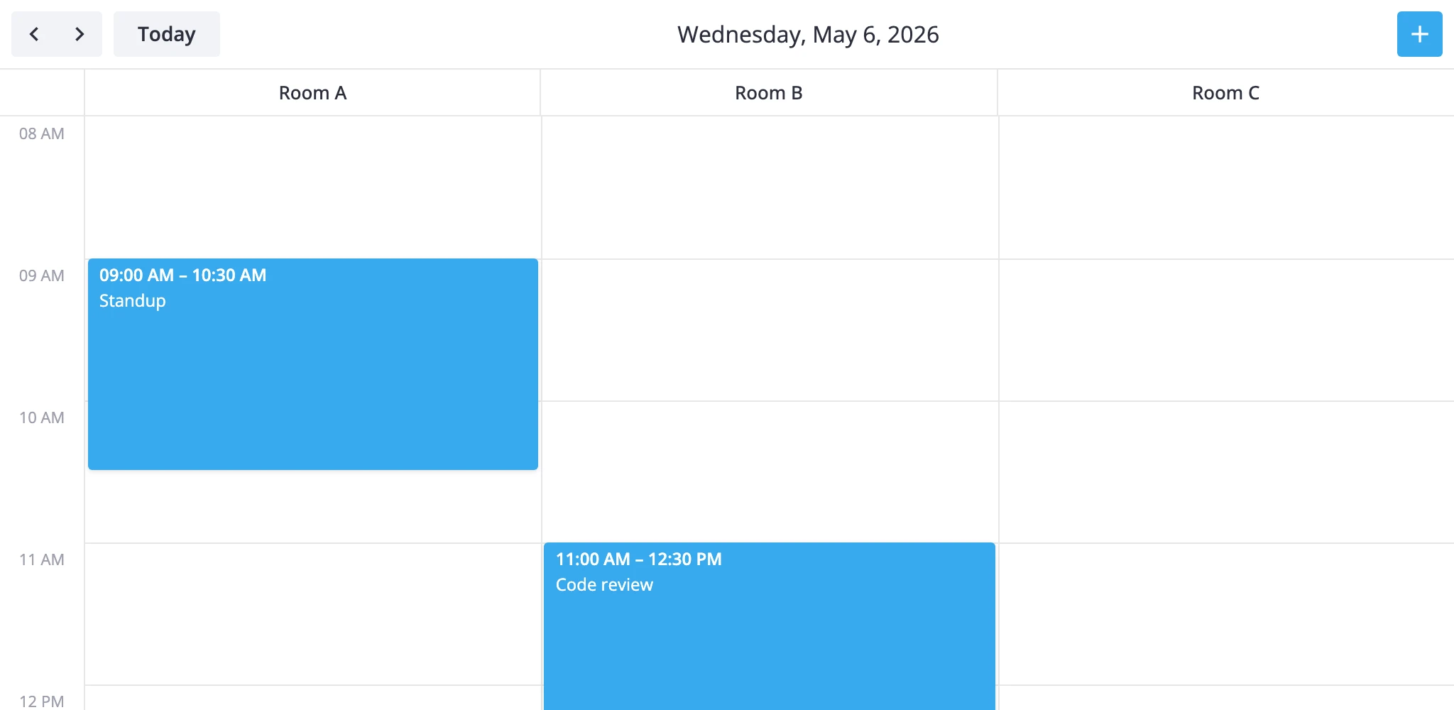
How It Works
The resources view is one of the calendar's seven built-in views. It renders a single section called timeGrid with two scales:
- x-axis -
unitscale. One column per resource, defined byxScale.items. - y-axis -
timescale. Hours run top to bottom, same as indayandweek.
Each event is matched to a column through the accessor field on the x-scale. The accessor names a property on the event - for example, "unit_id" or "roomId" - and its value must match one of the configured items[].id. Events without a matching id don't render.
The view ships with one placeholder column so the empty state still renders. You'll almost always replace it. Columns go on the views prop as a ViewConfig object that deep-merges into the section.
resources is PRO-only and isn't in the default views list - add it explicitly. It uses the scrollable renderer, so a long resource list scrolls horizontally instead of cramming columns into the viewport.
timeline is the transposed twin: time on x, resources on y. Same data model, same accessor - pick whichever orientation fits your layout.
Defining columns
Replace the default unit list with your resources. The accessor names the field on each event that links it to a column.
import { Calendar } from "@svar-ui/react-calendar";

const rooms = [
  { id: "room-a", label: "Room A" },
  { id: "room-b", label: "Room B" },
  { id: "room-c", label: "Room C" },
];

const events = [
  { id: 1, start: new Date("2026-05-05T09:00"), end: new Date("2026-05-05T10:30"), roomId: "room-a", text: "Standup" },
  { id: 2, start: new Date("2026-05-05T11:00"), end: new Date("2026-05-05T12:00"), roomId: "room-b", text: "Review" },
];

const views = [
  {
    id: "resources",
    sections: {
      timeGrid: {
        xScale: { items: rooms, accessor: "roomId" },
      },
    },
  },
];

<Calendar events={events} view="resources" views={views} date={new Date("2026-05-05")} />
Each event needs the field named by accessor. An event with roomId: "room-d" won't render - there's no matching column.
Tuning the time axis
The time scale defaults to 8:00-18:00 with 60-minute slots. Override these through the same sections block. Only the keys you set are replaced; everything else keeps its default.
const views = [
	{
		id: "resources",
		sections: {
			timeGrid: {
				xScale: { items: rooms, accessor: "roomId" },
				yScale: { startHour: 7, endHour: 20, step: 30, snapStep: 15 },
			},
		},
	},
];
step is the slot height in minutes. snapStep is the drag-snap granularity.
Reactive accessor binding
The accessor can be a getter/setter pair instead of a string. Use this when a drag between columns should update a different field than the one you read from.
const xScale = {
	items: rooms,
	accessor: {
		get: event => event.assignment?.roomId,
		set: (event, id) => ({ assignment: { ...event.assignment, roomId: id } }),
	},
};
The set function is called when an event is dragged into another column; it returns the partial event update that the store applies.
Custom resource view subclass
When views[].sections overrides aren't enough - for example, you need an extra section above the grid or different navigation steps - subclass ResourcesViewModel and register it under a new id with registerCalendarView.
import {
	ResourcesViewModel,
	registerCalendarView,
} from "@svar-ui/react-calendar";
import type { Section } from "@svar-ui/react-calendar";

class WeekResourcesView extends ResourcesViewModel {
	getSections(): Section[] {
		const [timeGrid] = super.getSections();
		return [
			{
				...timeGrid,
				yScale: { ...timeGrid.yScale, startHour: 6, endHour: 22 },
			},
		];
	}

	addRange(date: Date, n: number): Date {
		const d = new Date(date);
		d.setDate(d.getDate() + n * 7);
		return d;
	}
}

registerCalendarView("week-resources", WeekResourcesView);
Then list it in views:
<Calendar view="week-resources" views={["week-resources", "week"]} events={events} />
registerCalendarView is global. Calling it again with the same id replaces the previous class for any future <Calendar> instances.
Styling cells
The cellCss prop runs for every grid cell. The CellContext it receives carries the active view, section, mode, and the resolved date when both axes are date-based. For the resources view the x-axis is units, so use ctx.x?.id to branch by column and ctx.date for the row's hour.
import type { CellContext } from "@svar-ui/react-calendar";

const cellCss = (ctx: CellContext) => {
  if (ctx.section !== "timeGrid") return "";
  if (ctx.x?.id === "room-a") return "premium";
  if (ctx.date && ctx.date.getHours() >= 12 && ctx.date.getHours() < 13) {
    return "lunch";
  }
  return "";
};

<Calendar cellCss={cellCss} ... />
/* In your CSS file */
.premium { background: #fff7e6; }
.lunch   { background: #fef9e7; }
To color events by resource, use eventCss with EventContext:
import type { EventContext } from "@svar-ui/react-calendar";

const eventCss = (ctx: EventContext) => {
	return `room-${ctx.event.roomId}`;
};
Vertical time axis
In resources the time axis is vertical and the resource axis horizontal. If you want the inverse - time across the top, resources stacked as rows - use the timeline view instead. It uses the same accessor model but swaps the scales:
const views = [
	{
		id: "timeline",
		sections: {
			timeGrid: {
				yScale: { items: rooms, accessor: "roomId" },
			},
		},
	},
];
Both views share the scrollable renderer and step navigation by one day.
What to read next
- Views reference - full
ViewConfigshape and section override rules. registerCalendarView- registering a custom view class.cellCssandeventCss- per-cell and per-event styling hooks.