Stack layout
This guide shows how to render the board as a single vertical list of groups, so it stays usable on phone-width screens where side-by-side columns don't fit.
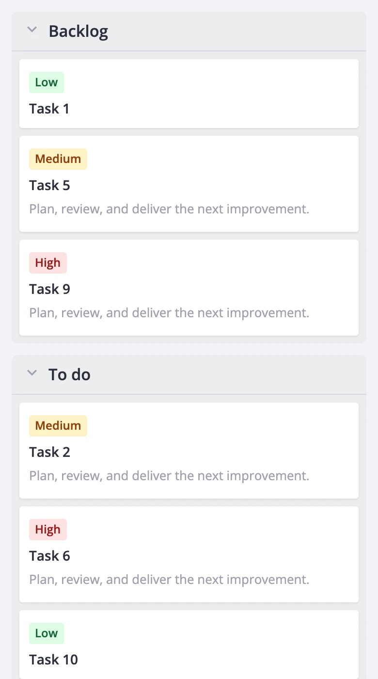
In the default "board" layout, columns sit next to each other and the board scrolls sideways. The "stack" layout puts every column, one after another, into one scrolling list. Each column becomes a group with its own header, and the user scrolls down through the whole board.
Stack mode only changes how the board is drawn. Cards, columns, actions, filters, sorting, summaries and the data provider work the same way in both layouts. Switching layouts doesn't touch the store and fires no action, so you can toggle it at any time.
Enabling the stack layout
Set layout: "stack" in the render prop:
<script setup>
import { Kanban } from "@svar-ui/vue-kanban";
</script>

<template>
  <Kanban :cards="cards" :columns="columns" :render="{ layout: 'stack' }" />
</template>
layout accepts "board" (the default) and "stack". The value is reactive, so you can bind it to a toggle:
<script setup>
import { ref } from "vue";
import { Kanban } from "@svar-ui/vue-kanban";

const stack = ref(true);
</script>

<template>
  <label><input type="checkbox" v-model="stack" /> Stack layout</label>

  <Kanban
    :cards="cards"
    :columns="columns"
    :render="{ layout: stack ? 'stack' : 'board', virtualizeCards: true }"
  />
</template>
The other render fields still apply, but some of them change meaning in stack mode:
| Field | In stack mode |
|---|---|
columnScroll | Overridden: the whole stack scrolls as one. Your value comes back when you leave stack mode. |
fixedColumnWidth | Ignored. Groups always take the full width. |
virtualizeCards | Honored. Offscreen groups mount no cards. |
estimatedCardHeight | Honored. |
cardOverscan | Honored, with the same default. |
virtualizeColumns | Doesn't affect rendering. It decides when columns request data (see below). |
columnOverscan | Ignored. |
With dynamic loading (PRO), virtualizeColumns becomes a vertical gate. Without it, every expanded column with unknown data requests its cards right away, as in the board layout. With it, a column sends request-data only when one of its expanded groups is within one viewport height of the visible area. Groups of the same column still produce one request.
On touch screens, fast flings can outrun rendering by a frame. Content fills in a bit late, but the scroll height stays correct. If that bothers you, raise cardOverscan.
Choosing the breakpoint
The widget never checks the viewport size, media queries or the device type, and there is no "auto" value. Your app decides when to switch and passes the result. A matchMedia listener is enough:
<script setup>
import { ref, watchEffect, onWatcherCleanup } from "vue";
import { Kanban } from "@svar-ui/vue-kanban";

const narrow = ref(false);

watchEffect(() => {
  const mq = window.matchMedia("(max-width: 640px)");
  const sync = () => (narrow.value = mq.matches);
  sync();
  mq.addEventListener("change", sync);
  onWatcherCleanup(() => mq.removeEventListener("change", sync));
});
</script>

<template>
  <Kanban
    :cards="cards"
    :columns="columns"
    :render="{ layout: narrow ? 'stack' : 'board', virtualizeCards: true }"
  />
</template>
Keeping detection in your code avoids an SSR hydration mismatch, since the server can't know the screen width. It also lets you force a layout, for example from a "Mobile / Desktop" switch or in tests.
The same flag can drive other mobile choices. Here the editor opens full screen in stack mode:
<script setup>
import { ref } from "vue";
import { Kanban, Editor } from "@svar-ui/vue-kanban";

const api = ref();
const narrow = ref(false);
// ...matchMedia effect from the example above
</script>

<template>
  <Kanban
    ref="api"
    :cards="cards"
    :columns="columns"
    :render="{ layout: narrow ? 'stack' : 'board' }"
  />
  <Editor v-if="api" :api="api" :placement="narrow ? 'fullscreen' : 'sidebar'" />
</template>
The board takes its height from the parent element (height: 100%). On mobile, size the parent with 100dvh or a flex layout rather than 100vh, so the mobile browser's address bar doesn't hide the bottom of the board.
How groups are built
The stack is a flat list of groups, built from the current board view:
- Without swimlanes, each column becomes one group, in column order.
- With swimlanes (PRO), groups go column by column. Each column produces one group per lane, in lane order, holding that lane's cards for the column.
A group with no cards is left out completely: no header and no body, even when it's collapsed. This is different from the board layout, where empty columns and lanes stay visible. Hiding empty groups has two side effects:
- Double-clicking an empty column to add a card has no target in stack mode.
- An empty, collapsed column has no header, so the user can't expand it from the stack.
Groups use the same filtered and sorted card arrays as the board. If a filter hides every card in a column, that column's group disappears from the stack.
Columns with a cardWidth (flow columns, PRO) render their card grid at the full stack width. The number of grid tracks follows the available width, so one card per row on a phone is expected. Cards wider than the stack are clipped. The stack never scrolls sideways.
Header, collapse, and scrolling
Each group has one header that stays pinned to the top while you scroll through its cards. When the next group reaches the top, its header pushes the previous one out. Only one header is pinned at a time.
The header combines everything about the group in one row:
- The column collapse toggle.
- The column label.
- With swimlanes, the lane collapse toggle with the lane label.
- The column's summary tags.
Summaries show the whole-column result, even when the group holds only one lane's cards. The header has no card count and no add-card button.
A group is collapsed when its column or its lane is collapsed. A collapsed group shows only its header. Collapsing a column in stack mode collapses all of that column's groups. The collapsed state is stored on the column or lane itself, so it carries over when you switch back to the board layout:
<script setup>
import { Kanban } from "@svar-ui/vue-kanban";

const columns = [
  { id: "backlog", label: "Backlog" },
  { id: "todo", label: "To do" },
  { id: "doing", label: "In progress" },
  { id: "done", label: "Done", collapsed: true },
];
</script>

<template>
  <Kanban :cards="cards" :columns="columns" :render="{ layout: 'stack' }" />
</template>
Here the "Done" group starts collapsed and shows only its header.
Headers also render the column menu button and carry the column and lane IDs. An outer column menu or context menu opens for the group's column, with the group's swimlane and only that lane's cards. Card clicks, selection, the card menu, the context menu, tooltips and card popups work as in the board layout.
Limitations
Stack mode is a reading and editing layout. It leaves out some board features:
- No drag-and-drop. Cards can't be dragged in stack mode, and switching to stack mode cancels a drag in progress. A finger that starts on a card scrolls the board instead. To move a card, use the editor, a menu, or dispatch
move-cardfrom a custom control. - No add button or card count in group headers.
- Empty groups are hidden, as described in How groups are built.
renderfields are remapped:columnScrollis forced to board scroll,fixedColumnWidthandcolumnOverscanare ignored, andvirtualizeColumnsonly gates data requests.
There are no stack-specific gestures, tap-target sizes or menus.
Styling stack groups
In stack mode the board root .wx-board gets the wx-layout-stack class (along with wx-scroll-board). Use it to scope styles that should apply only to the stacked layout. Inside it:
- Each group is a
section.wx-stack-group. - The group header is
header.wx-stack-header. Its background is--wx-kanban-column-bg, which should stay opaque so cards don't show through the pinned header. - The cards live in
.wx-stack-body.
The group section receives the column's static css class and the result of columnCss. In stack mode, columnCss gets the group's cards, so with swimlanes it sees one lane's cards, not the whole column:
<script setup>
import { Kanban } from "@svar-ui/vue-kanban";
</script>

<template>
  <Kanban
    :cards="cards"
    :columns="columns"
    :render="{ layout: 'stack' }"
    :columnCss="(items) => (items.length > 20 ? 'busy' : '')"
  />
</template>

<style scoped>
:global(.wx-layout-stack .wx-stack-group.busy .wx-stack-header) {
  border-left: 4px solid var(--wx-color-danger);
}
</style>
Related
render- all render fields- Columns guide - layout - scroll modes in the board layout
- Swimlanes - lanes in both layouts
columnCss- dynamic column classes