Themes
Kanban draws its colors, shadows, and typography from CSS custom properties injected by a theme wrapper component. The widget never hardcodes visual values - it reads var(--wx-kanban-*) tokens (and a handful of shared --wx-* tokens) from the nearest ancestor that sets them. To restyle the board, override those variables on a wrapper element; to restyle individual cards or columns at runtime, use the cardCss and columnCss callback props.
Default themes
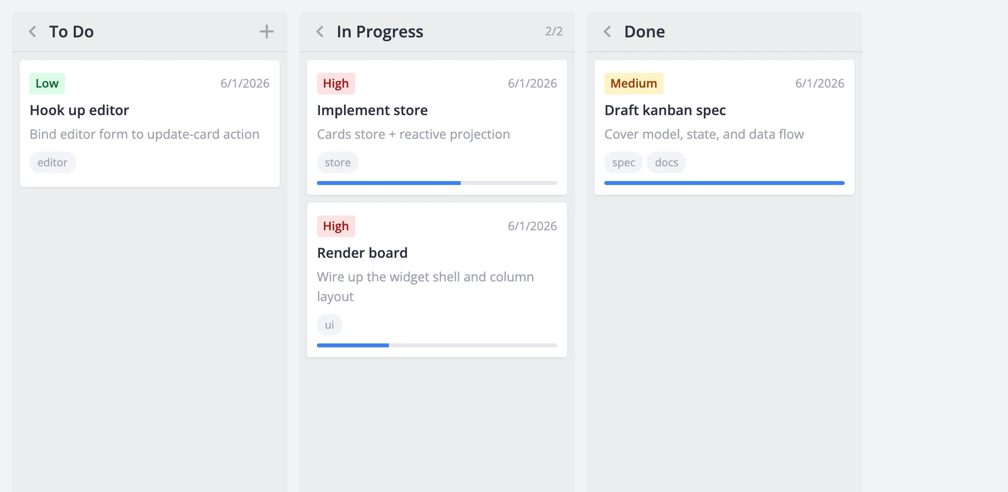
Two themes ship with the package: Willow (light) and WillowDark (dark). Mount one at your app root so every SVAR component beneath it picks up the same visual baseline:
<script setup>
  import { Kanban, Willow } from "@svar-ui/vue-kanban";
</script>

<template>
  <Willow>
    <Kanban :cards="cards" :columns="columns" />
  </Willow>
</template>
For dark mode, swap Willow for WillowDark:
<script setup>
  import { Kanban, WillowDark } from "@svar-ui/vue-kanban";
</script>

<template>
  <WillowDark>
    <Kanban :cards="cards" :columns="columns" />
  </WillowDark>
</template>
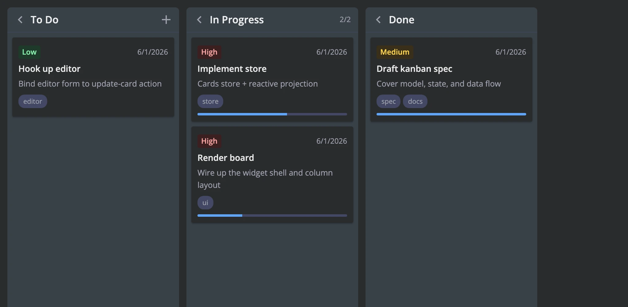
One theme wrapper covers the board, editor, toolbar, and context menu - you don't need to wrap each sub-component separately.
Switching theme at runtime
Both theme wrappers are regular Vue components (SFC), so you can switch between them with a conditional:
<script setup>
  import { Kanban, Willow, WillowDark } from "@svar-ui/vue-kanban";
  import { ref } from "vue";

  const dark = ref(false);
</script>

<template>
  <WillowDark v-if="dark">
    <Kanban :cards="cards" :columns="columns" />
  </WillowDark>
  <Willow v-else>
    <Kanban :cards="cards" :columns="columns" />
  </Willow>

  <button :onclick="() => (dark = !dark)">Toggle theme</button>
</template>
CSS variables and overrides
Kanban-specific variables
These variables control the board's own surfaces. They all live under the --wx-kanban-* namespace.
| Variable | Controls |
|---|---|
--wx-kanban-bg | Board background |
--wx-kanban-column-bg | Column background and sticky header |
--wx-kanban-column-over-limit-bg | Column header/body when the card limit is exceeded |
--wx-kanban-card-bg | Card background |
--wx-kanban-card-shadow | Card resting shadow |
--wx-kanban-card-shadow-hover | Card hover shadow |
--wx-kanban-card-shadow-drag | Drag ghost shadow |
--wx-kanban-border-color | Column header divider and drop placeholder border |
--wx-kanban-drop-placeholder-bg | Drop-target highlight tint |
--wx-kanban-tag-bg | Tag chip and default priority chip background |
--wx-kanban-avatar-bg | Avatar fallback background |
--wx-kanban-progress-bg | Progress bar track |
--wx-kanban-progress-fill | Progress bar fill |
--wx-kanban-priority-low-bg | Low-priority chip background |
--wx-kanban-priority-low-color | Low-priority chip text |
--wx-kanban-priority-medium-bg | Medium-priority chip background |
--wx-kanban-priority-medium-color | Medium-priority chip text |
--wx-kanban-priority-high-bg | High-priority chip background |
--wx-kanban-priority-high-color | High-priority chip text |
--wx-kanban-scroll-height | Internal: tracks the scroll container height for collapsed columns |
The widget also reads several shared SVAR variables directly - override these on the theme wrapper to tune the board alongside other SVAR widgets:
| Variable | Controls |
|---|---|
--wx-border-radius | Card corners, drop placeholder corners, priority chip rounding |
--wx-radius-major | Column corner radius |
--wx-icon-border-radius | Hover-state rounding on column buttons and the card menu button |
--wx-color-primary | Focus ring on cards and column buttons |
--wx-color-danger | Over-limit counter color |
--wx-color-font | Primary text (card titles, menu hover) |
--wx-color-font-alt | Muted text (counts, deadlines, descriptions, progress labels) |
--wx-color-font-disabled | Disabled text |
--wx-background | Base background (used by card background in both themes) |
--wx-background-alt | Alternate background |
--wx-background-hover | Hover background on column buttons and card menu button |
--wx-font-size-sm | Small text size (counts, buttons) |
--wx-font-weight | Base font weight |
--wx-font-weight-md | Medium font weight (column titles, over-limit counters) |
--wx-avatar-size | Avatar dimensions |
--wx-avatar-font-size | Avatar fallback text size |
Overriding variables
Wrap the board in a container element and set the variables there. This keeps overrides scoped and avoids leaking into other parts of your app:
<template>
  <div class="my-board">
    <Willow>
      <Kanban :cards="cards" :columns="columns" />
    </Willow>
  </div>
</template>

<style scoped>
  .my-board {
    --wx-kanban-card-bg: #fffff0;
    --wx-kanban-column-bg: #f0f4f8;
    --wx-kanban-card-shadow: 0 2px 4px rgba(0, 0, 0, 0.05);
    --wx-kanban-progress-fill: #10b981;
  }
</style>
Per-card and per-column CSS
For styling that depends on runtime data - a card's priority, whether a column is over its limit, progress state - use the cardCss and columnCss callback props. Each callback returns a CSS class name string that the renderer appends to the element's class list.
Card styling
cardCss receives the card object and its parent column. Return one or more class names:
<script setup>
  import { Kanban, Willow } from "@svar-ui/vue-kanban";

  const cardCss = (card, column) => {
    const cls = card.priority === 3 ? "card-high" : "";
    const done = (card.progress ?? 0) >= 1 ? "card-complete" : "";
    return `${cls} ${done}`.trim();
  };
</script>

<template>
  <Willow>
    <div class="board-wrapper">
      <Kanban :cards="cards" :columns="columns" :cardCss="cardCss" />
    </div>
  </Willow>
</template>

<style scoped>
  .board-wrapper :global(.wx-card.card-high) {
    border-top: 3px solid #ef4444;
  }
  .board-wrapper :global(.wx-card.card-complete) {
    opacity: 0.6;
    background: #f5f5f5;
  }
</style>
cardCss doesn't replace a card's static css property - the renderer combines both, so you can set a permanent class on the card data and add dynamic classes at render time.
Column styling
columnCss receives the column's card array and the column view. It works the same way:
<script setup>
  import { Kanban, Willow } from "@svar-ui/vue-kanban";

  const columnCss = (cards, column) => {
    if (column.overLimit) return "col-wip-exceeded";
    if (cards.length === 0) return "col-empty";
    return "";
  };
</script>

<template>
  <Willow>
    <div class="board-wrapper">
      <Kanban :cards="cards" :columns="columns" :columnCss="columnCss" />
    </div>
  </Willow>
</template>

<style scoped>
  .board-wrapper :global(.wx-column.col-wip-exceeded) {
    background: #fef2f2;
  }
  .board-wrapper :global(.wx-column.col-empty) {
    opacity: 0.7;
  }
</style>
CSS classes reference
These class names are stable and safe to target in custom stylesheets:
| Class | Element | Applied when |
|---|---|---|
wx-kanban | Board root | Always |
wx-board | Scroll wrapper | Always |
wx-scroll-board | .wx-board | render.columnScroll is false |
wx-layout-flex | .wx-board | render.fixedColumnWidth is false |
wx-column | Column section | Always |
wx-collapsed | .wx-column | Column is collapsed |
wx-over-limit | .wx-column | Column exceeds its cardLimit |
wx-column-header | Column header | Column is expanded |
wx-column-cards | Card scroll container | Always |
wx-card | Card article element | Always |
wx-card-row | Wrapper around each card | Always |
wx-dragging | .wx-card-row | Card is being dragged |
wx-drop-placeholder | Drop hint | Drag is over the column |
wx-card-priority-low | Priority chip | Card priority is Low |
wx-card-priority-medium | Priority chip | Card priority is Medium |
wx-card-priority-high | Priority chip | Card priority is High |
wx-editor-kanban | Editor wrapper | Always |