Toolbar
The toolbar puts the most common board actions - adding cards, undoing changes, sorting - behind a single button bar. You place it wherever you want in your layout and wire it to the Kanban through the instance API.
How the toolbar works
Toolbar is a standalone companion. Kanban doesn't render it for you - you mount it yourself and pass the API so it can dispatch actions and react to state changes.
Three boolean props control which buttons appear: add (on by default), undo, and sort. Each maps to a group of pre-wired buttons that dispatch the matching store actions on click. You can also skip these props and pass a custom items array instead. That replaces the default set entirely, but items with a recognized id still route through the built-in click handler.
The toolbar renders even before the API is available. Buttons stay inert until the Kanban mounts and passes its API, so there's no need to guard against a missing reference during initial render.
Mounting the toolbar
Import Toolbar alongside Kanban and share the API reference between them. The init callback is the easiest way:
<script setup>
    import { Kanban, Toolbar } from "@svar-ui/vue-kanban";

    const api = ref(null);
</script>

<template>
    <Toolbar :api="api" />
    <Kanban
        :cards="cards"
        :columns="columns"
        :init="a => (api = a)"
    />
</template>
The toolbar shows the add-card button by default. Clicking it dispatches add-card with edit: true, which creates a blank card and opens the editor - provided you have an <Editor> mounted separately.
Built-in buttons
Enable button groups with the add, undo, and sort props:
<Toolbar :api="api" add undo sort />
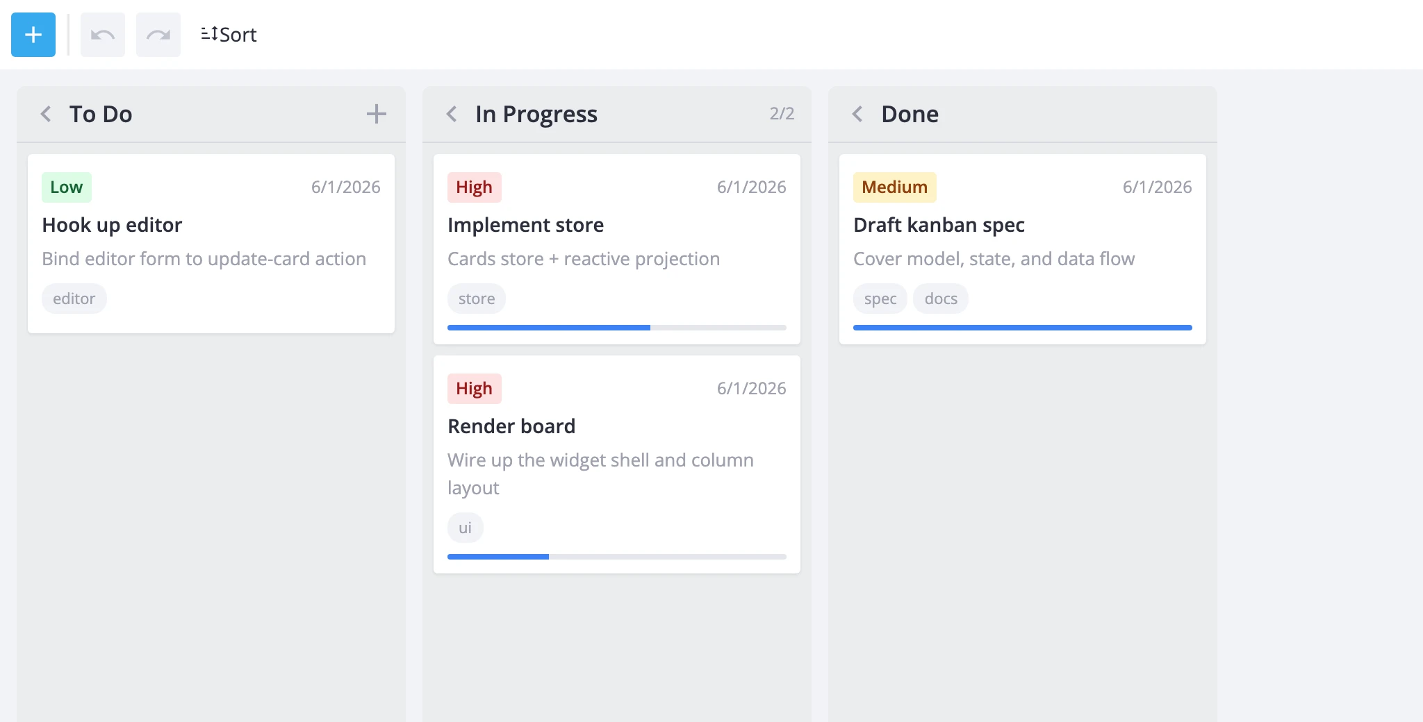
This renders the full default set: a primary add button, undo/redo icon buttons, and a collapsible sort menu.
Add creates a blank card and opens the editor. It shows by default even without explicitly setting :add="true".
Undo / Redo walk the history stack. They auto-disable when their stack is empty and re-enable as the user makes changes. These buttons only work when the Kanban has history={true}.
Sort opens a dropdown with four options - title A-Z, title Z-A, priority ascending, priority descending - plus a "Clear sorting" entry. Each dispatches sort-cards with the matching criterion.
Pairing with history
Undo/redo buttons require the Kanban to track change history. Enable both together:
<script setup>
    import { Kanban, Toolbar } from "@svar-ui/vue-kanban";

    const api = ref(null);
</script>

<template>
    <Toolbar :api="api" undo />
    <Kanban
        :cards="cards"
        :columns="columns"
        :history="true"
        :init="a => (api = a)"
    />
</template>
Without history={true} on the Kanban, the undo and redo buttons render but stay permanently disabled.
Custom items
Pass an items array to replace the default button set entirely. When items is provided, the add, undo, and sort props are ignored.
<script setup>
    import { Kanban, Toolbar } from "@svar-ui/vue-kanban";

    const api = ref(null);

    const items = [
        { id: "add-card", comp: "button", icon: "wxi-plus", text: "New task", type: "primary" },
        { comp: "separator" },
        { id: "filter-mine", comp: "icon", icon: "wxi-filter", title: "My cards",
          handler: () => api.exec("filter-cards", {
              tag: "mine",
              filter: c => c.assignee === currentUser
          })
        },
    ];
</script>

<template>
    <Toolbar :api="api" :items="items" />
    <Kanban :cards="cards" :columns="columns" :init="a => (api = a)" />
</template>
Items whose id matches a built-in id (add-card, undo, redo, sort-clear, etc.) keep the default click handler - you only need a custom handler for new actions. Items without a recognized id or a custom handler are click-inert.
Extending the default set
Use getToolbarItems to start from the defaults and then modify:
<script setup>
    import { Kanban, Toolbar, getToolbarItems } from "@svar-ui/vue-kanban";

    const api = ref(null);

    const items = [
        ...getToolbarItems({ add: true }),
        {
            text: "Sort",
            icon: "wxi-sort",
            collapsed: true,
            layout: "column",
            items: [
                { id: "sort-deadline", comp: "item", text: "Deadline (soonest)",
                  handler: () => api.exec("sort-cards", { sort: { field: "deadline", dir: "asc" } })
                },
                { id: "sort-clear", comp: "item", text: "Clear sorting" },
            ],
        },
    ];
</script>

<template>
    <Toolbar :api="api" :items="items" />
    <Kanban :cards="cards" :columns="columns" :init="a => (api = a)" />
</template>
getToolbarItems accepts { add, undo, sort } flags and returns items in a fixed order: add, then undo/redo, then sort. The example above keeps the default add button and separator, drops the built-in sort menu, and substitutes a custom one that sorts by deadline. The sort-clear entry still uses the built-in handler because its id is recognized.