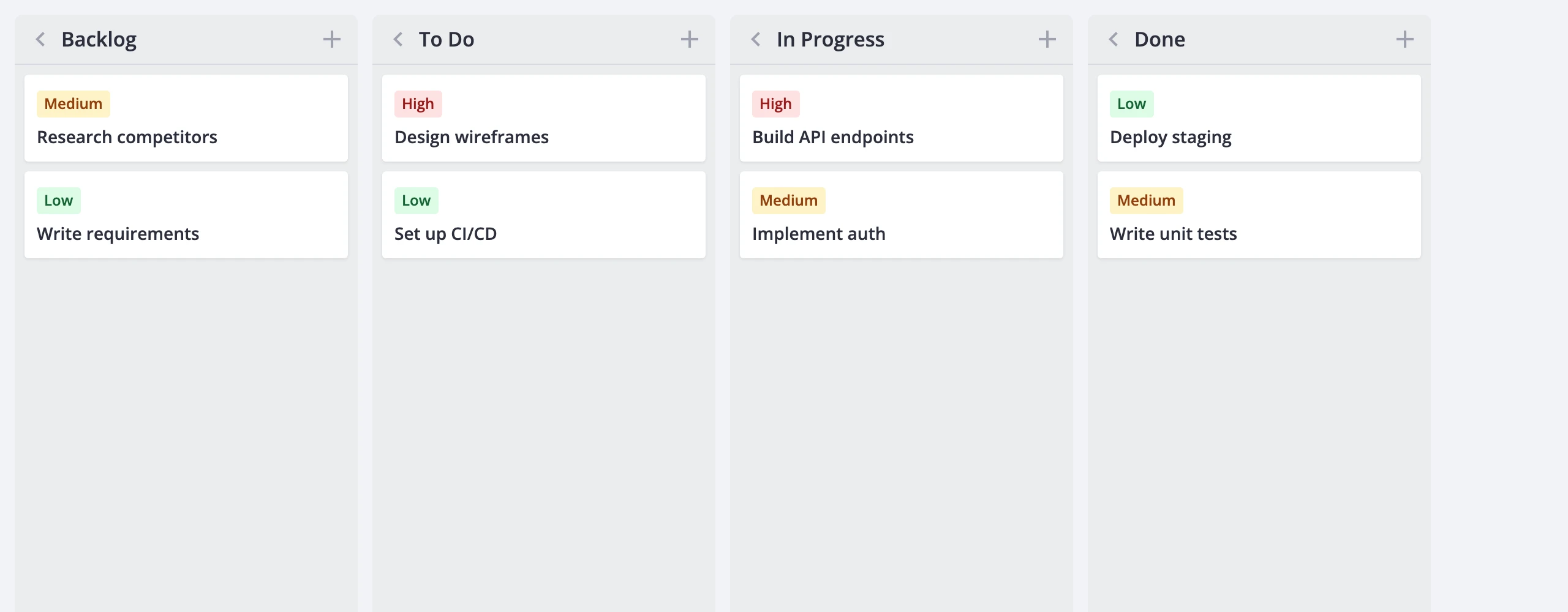
Columns
Columns are the stages cards move through - "Backlog", "In Progress", "Done", or whatever your workflow demands. This guide covers column setup, layout and scroll options, grouping by different fields, and runtime styling.
Defining columns
Every board needs a columns array. Each entry has at least an id and a label, and the array order sets the left-to-right display order.
<script setup>
    import { Kanban } from "@svar-ui/vue-kanban";

    const columns = [
        { id: "backlog", label: "Backlog" },
        { id: "todo", label: "To Do" },
        { id: "doing", label: "In Progress" },
        { id: "done", label: "Done" },
    ];

    const cards = [];
</script>

<template>
    <Kanban :cards="cards" :columns="columns" />
</template>
A column object supports these fields:
id- unique identifier (string or number)label- display text shown in the column headercss- static CSS class applied to the column rootmetadata- freeform object for host-specific datacardLimit- soft cap on card count (number,truefor count-only badge, orfalse/omitted to hide)addCard- whether the "+" button appears in the header (defaults totrue)collapsed- initial collapsed state
Columns are shallow-copied on init. Mutating the original array after passing it in won't do anything - change the prop or dispatch update-column.
Column accessor
By default, each card carries a column field that matches a column id. The columnAccessor prop controls how the store reads and writes that membership.
To use a different property name, pass a string:
<template>
    <Kanban :cards="cards" :columns="columns" columnAccessor="stage" />
</template>
Now every card needs a stage field whose value matches a column id.
When column membership is derived rather than stored as a flat property, pass an object with get and set callbacks:
<script setup>
    const userAccessor = {
        get: (card) => card.user,
        set: (card, value) => ({
            ...card,
            user: value,
            users: [value],
        }),
    };
</script>

<template>
    <Kanban :cards="cards" :columns="columns" :columnAccessor="userAccessor" />
</template>
get reads the column id from the card. set returns a new card object with the updated membership - it's called when a card is dragged to another column.
Grouping by other fields
Switch columnAccessor and columns together to regroup cards by a different dimension without recreating the widget. The same dataset can be viewed by stage, priority, or assignee.
<script setup>
    import { ref, computed } from "vue";
    import { Kanban } from "@svar-ui/vue-kanban";

    const stageColumns = [
        { id: "backlog", label: "Backlog" },
        { id: "todo", label: "To Do" },
        { id: "doing", label: "In Progress" },
    ];

    const priorityColumns = [
        { id: 1, label: "Low" },
        { id: 2, label: "Medium" },
        { id: 3, label: "High" },
    ];

    const groupBy = ref("stage");

    const columns = computed(
        () => groupBy.value === "stage" ? stageColumns : priorityColumns
    );
    const columnAccessor = computed(
        () => groupBy.value === "stage" ? "stage" : "priority"
    );
</script>

<template>
    <Kanban :cards="cards" :columns="columns" :columnAccessor="columnAccessor" />
</template>
When the accessor is a string, each card must have that field with a value matching one of the column ids. With a get/set object, get decides which column each card belongs to.
Column header actions
Each column header ships with a collapse toggle and an add-card button.
The collapse toggle is always present. Clicking it dispatches update-column to flip the collapsed flag. Collapsed columns show a rotated label and a card count badge but don't render their card list. Collapse works even in readonly mode.
The add-card button shows when addCard isn't explicitly false and readonly is off. Clicking it creates a new card in that column and opens the editor.
To hide the button on specific columns, set addCard: false:
<script setup>
    const columns = [
        { id: "backlog", label: "Backlog" },
        { id: "done", label: "Done", addCard: false },
    ];
</script>
Card limits
The cardLimit field on a column controls a count badge in the header and an over-limit visual state.
- Set
cardLimitto a number to show acurrent/limitbadge. When the card count exceeds the limit, the column receives thewx-over-limitclass and the badge text turns to a danger color. - Set
cardLimittotrueto show a count-only badge without a cap. - Omit or set
cardLimittofalseto hide the badge entirely.
<script setup>
    const columns = [
        { id: "backlog", label: "Backlog", cardLimit: true },
        { id: "doing", label: "In Progress", cardLimit: 5 },
        { id: "done", label: "Done" },
    ];
</script>

<template>
    <Kanban :cards="cards" :columns="columns" />
</template>
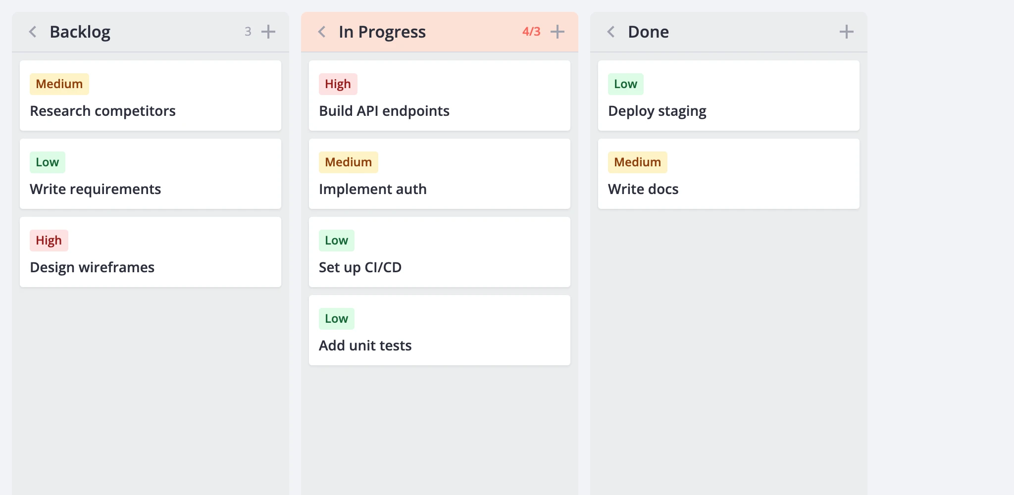
Card limits are soft - they flag the column visually but don't prevent cards from being added or moved in.
Layout: scroll and width
The render prop controls column layout and scrolling. Two independent settings drive it: columnScroll and fixedColumnWidth.
Scroll modes
render.columnScroll sets whether each column scrolls independently or the whole board shares one vertical scrollbar.
columnScroll: true(default) - each column has its own vertical scrollbar. Headers stay pinned at the top of each column.columnScroll: false- the board becomes one tall scroll surface. All columns scroll together, and headers stick to the top of the viewport.
<template>
    <Kanban :cards="cards" :columns="columns" :render="{ columnScroll: false }" />
</template>
Column width
render.fixedColumnWidth controls whether columns have a uniform pixel width or share the available space.
fixedColumnWidth: true(default) - every column is 280px wide. Horizontal scrolling appears when the columns overflow the viewport.fixedColumnWidth: false- columns share the viewport width equally, with a minimum floor of 240px each. Horizontal scrolling appears only when the total minimum width exceeds the viewport.
<template>
    <Kanban
        :cards="cards"
        :columns="columns"
        :render="{ fixedColumnWidth: false }"
    />
</template>
These two settings are orthogonal. All four combinations work:
columnScroll | fixedColumnWidth | Result |
|---|---|---|
true | true | Classic board. Each column scrolls independently, fixed width. |
true | false | Columns fill the viewport, each scrolls independently. |
false | true | Board-wide scroll with sticky headers, fixed-width columns. |
false | false | Board-wide scroll with sticky headers, columns fill viewport. |
Performance
For large boards, the render prop offers virtualization options that keep the DOM small while the store holds the full dataset.
Card virtualization
Set render.virtualizeCards to render only the cards visible in the scroll viewport, plus a configurable overscan buffer:
<template>
    <Kanban
        :cards="cards"
        :columns="columns"
        :render="{
            virtualizeCards: true,
            estimatedCardHeight: 96,
            cardOverscan: 8,
        }"
    />
</template>
estimatedCardHeight- height guess in pixels for unmeasured cards. Defaults to80.cardOverscan- extra cards rendered above and below the visible area. Defaults to5.
Heights are measured after the first render and cached by card id. The cache survives reorder, filter, and sort. In flex-width mode, width changes invalidate the cache automatically so cards re-measure.
Column virtualization
Set render.virtualizeColumns to skip rendering card content for off-screen columns:
<template>
    <Kanban
        :cards="cards"
        :columns="columns"
        :render="{
            virtualizeColumns: true,
            columnOverscan: 1,
        }"
    />
</template>
Column shells (headers, collapse state, badges) stay in the DOM - only the card list inside off-screen columns is skipped. This preserves scroll geometry and drop-target lookup.
columnOverscan- extra columns rendered beyond the visible area on each side. Defaults to1.
Card and column virtualization are independent and can be combined.
Updating columns at runtime
Call api.exec("update-column", ...) to patch a column after the board mounts. Pass the column id and a partial object with the fields to change.
<script setup>
    import { ref } from "vue";
    import { Kanban } from "@svar-ui/vue-kanban";

    const api = ref(null);

    function renameColumn() {
        api.value.exec("update-column", {
            id: "doing",
            column: { label: "Work in Progress" },
        });
    }

    function collapseColumn() {
        api.value.exec("update-column", {
            id: "done",
            column: { collapsed: true },
        });
    }
</script>

<template>
    <Kanban ref="api" :cards="cards" :columns="columns" />
</template>
Any ColumnConfig field is fair game: label, css, cardLimit, collapsed, addCard, and so on.
Styling columns
Columns accept CSS classes in two ways: statically per definition or dynamically via a callback.
Static classes
Set css on a column definition to apply a class unconditionally:
<script setup>
    const columns = [
        { id: "backlog", label: "Backlog", css: "column-muted" },
        { id: "doing", label: "In Progress" },
    ];
</script>
Dynamic classes
Pass columnCss to compute classes at render time based on a column's cards and state:
<template>
    <Kanban
        :cards="cards"
        :columns="columns"
        :columnCss="(items, column) => {
            if (items.length === 0) return 'column-empty';
            return '';
        }"
    />
</template>
The first argument is the column's filtered/sorted card array; the second is the projected column view. The returned string is appended to the column root's class list after any static css value and the built-in modifiers (wx-collapsed, wx-over-limit).
Built-in CSS classes
The board applies these classes automatically:
wx-column- always present on the column rootwx-collapsed- set when the column is collapsedwx-over-limit- set when the card count exceeds a numericcardLimit
Target these in your stylesheet to customize column states.