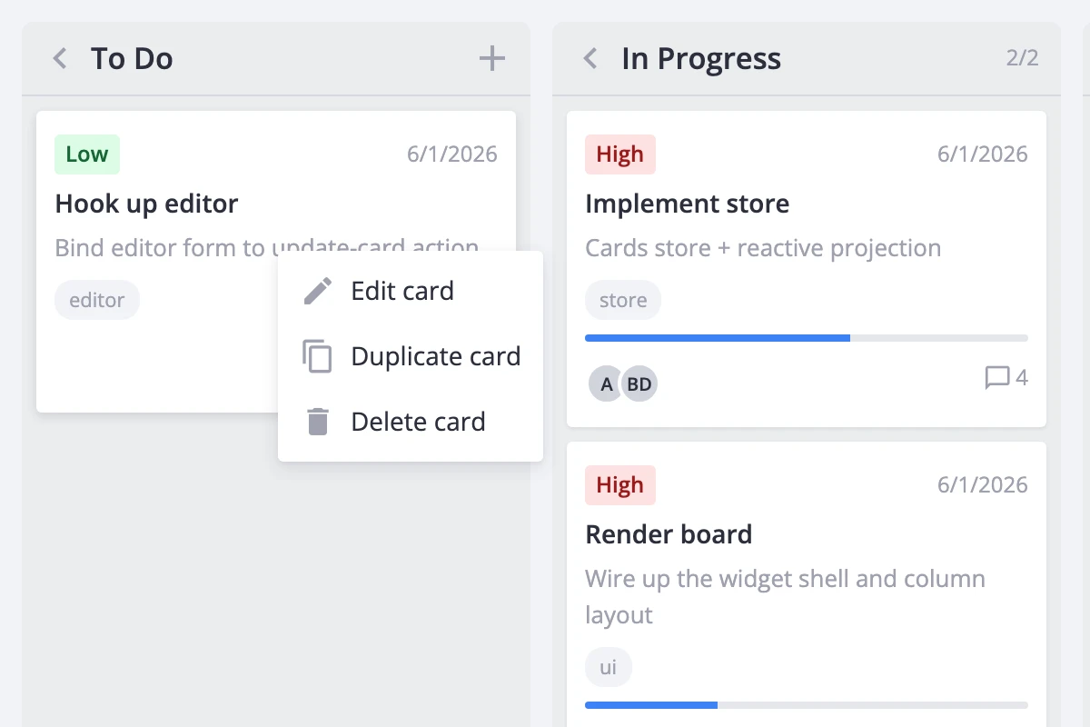
Card Menu
The kanban board supports context menus for card-level actions - editing, duplicating, deleting, and anything custom you add. You can trigger the menu through right-click or through a visible button on each card, and control which items appear on a per-card basis.
How the menu works
The card menu has two entry points that share the same options and handlers:
- Right-click context menu - wrap
<Kanban>in a<ContextMenu>component. Right-clicking any card opens the menu at the pointer. - Per-card menu button - enable the
menusection in thecardprop. A three-dot button appears on each card and opens the same menu on left-click.
Both entry points use the same default options from getMenuOptions(): Edit card, Duplicate card, and Delete card. Each default item maps to a store action (select-card, duplicate-card, delete-card) that fires automatically when clicked. Custom items you add are surfaced through the onclick callback instead.
When you enable both entry points, they share one menu instance and one configuration. Users get a consistent experience regardless of how they open the menu.
Right-click context menu
Wrap <Kanban> in <ContextMenu> and pass the kanban API reference. The wrapper listens for contextmenu events, resolves the clicked card from the DOM, and opens the menu.
<script setup>
import { Kanban, ContextMenu, Editor } from "@svar-ui/vue-kanban";
import { ref } from "vue";

const api = ref();
</script>

<template>
  <ContextMenu :api="api">
    <Kanban ref="api" :cards="cards" :columns="columns" />
  </ContextMenu>
  <Editor v-if="api" :api="api" />
</template>
The Editor is optional but makes the built-in "Edit card" action useful - it opens the editor for the clicked card.
Per-card menu trigger
Instead of (or alongside) right-click, you can show a three-dot button directly on each card. Set menu to true in the card prop:
<template>
  <Kanban
    :cards="cards"
    :columns="columns"
    :card="{ menu: true }"
  />
</template>
The button appears in the card header and opens the default menu on click. No <ContextMenu> wrapper is needed - the kanban handles it internally.
To use both entry points together, enable card.menu and wrap in <ContextMenu>:
<template>
  <ContextMenu :api="api">
    <Kanban
      ref="api"
      :cards="cards"
      :columns="columns"
      :card="{ menu: true }"
    />
  </ContextMenu>
</template>
Default options
When no custom options are provided, the menu shows three items from getMenuOptions():
| Item | Action dispatched |
|---|---|
| Edit card | select-card (opens the editor) |
| Duplicate card | duplicate-card |
| Delete card | delete-card |
These built-in items dispatch their store actions automatically. You don't need an onclick handler for them.
Custom items
Extend the menu by spreading getMenuOptions() and adding your own entries. Handle custom item IDs in the onclick callback - only built-in IDs dispatch store actions automatically.
For the right-click wrapper:
<script setup>
import {
  Kanban, ContextMenu, Editor, getMenuOptions
} from "@svar-ui/vue-kanban";
import { ref } from "vue";

const api = ref();

const options = [
  ...getMenuOptions(),
  { id: "archive-card", text: "Archive", icon: "wxi-empty" },
];

function onclick({ action }) {
  if (action.id === "archive-card") {
    api.value.exec("update-card", {
      id: action.context.id,
      card: { archived: true },
    });
  }
}
</script>

<template>
  <ContextMenu :api="api" :options="options" :onclick="onclick">
    <Kanban ref="api" :cards="cards" :columns="columns" />
  </ContextMenu>
</template>
For the per-card button, pass the same configuration through card.menu:
<template>
  <Kanban
    :cards="cards"
    :columns="columns"
    :card="{
      menu: {
        options: [
          ...getMenuOptions(),
          { id: 'archive-card', text: 'Archive', icon: 'wxi-empty' },
        ],
        onclick: ({ action }) => { /* handle custom items */ },
      },
    }"
  />
</template>
When both entry points are active, pass the same options and onclick to both to keep the menu consistent:
<script setup>
import {
  Kanban, ContextMenu, Editor, getMenuOptions
} from "@svar-ui/vue-kanban";
import { ref } from "vue";

const api = ref();

const options = [
  ...getMenuOptions(),
  { id: "my-action", text: "My action", icon: "wxi-empty" },
];

function onclick({ action }) {
  if (action.id === "my-action") {
    // handle custom action
  }
}
</script>

<template>
  <ContextMenu :api="api" :options="options" :onclick="onclick">
    <Kanban
      ref="api"
      :cards="cards"
      :columns="columns"
      :card="{ menu: { options, onclick } }"
    />
  </ContextMenu>
  <Editor v-if="api" :api="api" />
</template>
Filtering items per card
Use resolver to block the menu entirely for certain cards, and filter to hide individual items based on card data.
resolver receives the resolved card and the mouse event. Return a falsy value to suppress the menu for that card:
<script setup>
function resolver(card) {
  return !card.readOnly;
}

function filter(item, card) {
  if (card.locked && item.id === "delete-card") return false;
  return true;
}
</script>

<template>
  <ContextMenu :api="api" :resolver="resolver" :filter="filter">
    <Kanban ref="api" :cards="cards" :columns="columns" />
  </ContextMenu>
</template>
In this example, read-only cards show no menu at all, while locked cards see the menu but without the "Delete card" option.
The per-card button entry point supports filter and onclick but not resolver. To conditionally hide the button itself, toggle card.menu based on your data or hide all items through filter.