Cards
Cards are the work items on your board - tasks, tickets, leads, whatever moves through columns. This guide covers how cards carry data, how the built-in layout decides what to show, and how you create, update, move, and delete cards through the action API.
Card data shape
A card is a plain object with an id and whatever fields your app needs. The widget reads certain well-known field names for its built-in sections, but you're free to attach any extra data for custom templates, filters, or sort comparators.
const cards = [
	{
		id: 1,
		label: "Design homepage",
		column: "todo",
		description: "Create wireframes and mockups",
		priority: 2,
		progress: 0.3,
		deadline: new Date("2026-08-01"),
		tags: ["ui", "design"],
		users: [1, 2],
		attachments: 3,
		comments: 5,
	},
];
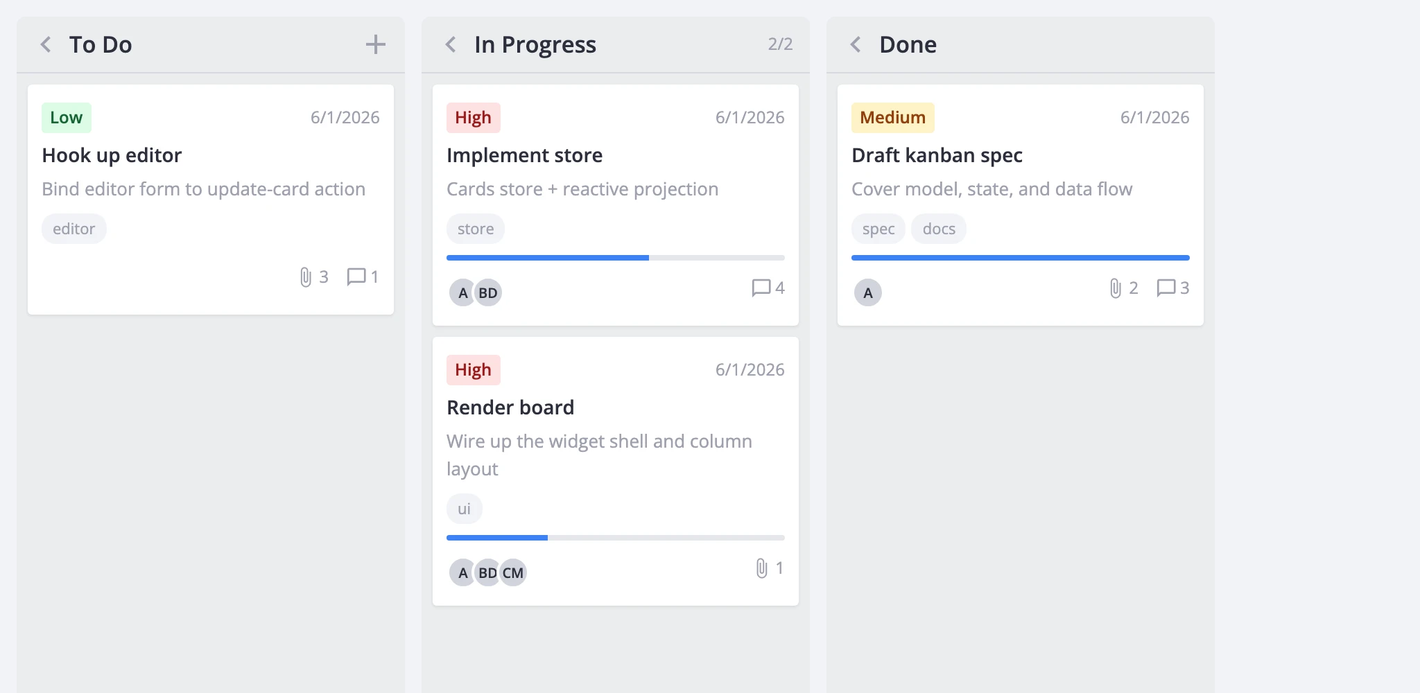
The column field (or whatever key columnAccessor points to) determines which column a card belongs to. Everything else is optional - the built-in card hides any section whose data is missing.
Fields the built-in card layout reads:
- label - card title
- description - short text under the title
- priority - numeric id resolved against
card.priority.data - progress - number from 0 to 1
- deadline -
Date, ISO string, or timestamp - tags - array of ids resolved against
card.tags.data - users - array of ids resolved against
card.users.data - attachments - numeric count
- comments - numeric count
- cover - image URL for the cover strip
- css - static CSS class(es) on the card wrapper
Section visibility (CardShape)
The card prop takes a CardShape object that controls which sections the built-in card renders. Each key is either a boolean toggle or an object with section-specific options.
<Kanban
  :cards="cards"
  :columns="columns"
  :card="{
    priority: true,
    description: true,
    progress: true,
    deadline: true,
  }"
/>
Omit a key or set it to false to hide the section. A section also won't render if the card object doesn't have data for it - CardShape is an upper bound on visibility, not a guarantee.
The default shape (returned by getCardShape()) enables priority, progress, description, deadline, and tags. Start from that default and adjust:
<script setup>
  import { Kanban, getCardShape } from "@svar-ui/vue-kanban";

  const card = { ...getCardShape(), users: { data: users }, menu: true };
</script>

<template>
  <Kanban :cards="cards" :columns="columns" :card="card" />
</template>
Per-section options
Several sections take an options object instead of a plain boolean.
Priority
Pass a data array to map numeric ids to labels and colors:
<Kanban
  :cards="cards"
  :columns="columns"
  :card="{
    priority: {
      data: [
        { id: 1, label: 'Low', css: 'wx-card-priority-low' },
        { id: 2, label: 'Medium', css: 'wx-card-priority-medium' },
        { id: 3, label: 'High', css: 'wx-card-priority-high' },
      ],
    },
  }"
/>
Without data, the card renders the raw priority value. Use getPriorityOptions() to start from the built-in Low / Medium / High list.
Tags
Pass a data array for label/color resolution and an optional max to cap visible tags:
:card="{
  tags: {
    max: 3,
    data: [
      { id: 'docs', label: 'Docs', css: 'tag-docs' },
      { id: 'ui', label: 'UI', css: 'tag-ui' },
    ],
  },
}"
Users
Pass a data array with optional avatar images, and max to limit visible avatars:
:card="{
  users: {
    max: 3,
    data: [
      { id: 1, label: 'Alice', img: '/avatars/alice.png' },
      { id: 2, label: 'Bob' },
    ],
  },
}"
When img isn't provided, the avatar shows initials derived from label.
Progress
Set showLabel: true to display a percentage label next to the progress bar:
:card="{
  progress: { showLabel: true },
}"
Deadline
Provide a format string to control date display. Supported tokens are YYYY, MM, DD, HH, mm:
:card="{
  deadline: { format: 'YYYY-MM-DD' },
}"
With deadline: true, the date renders via toLocaleDateString().
Custom card body
When the built-in sections aren't enough, pass a cardContent slot to replace the entire card body. The wrapper element (selection state, drag affordances, data-id attribute) stays intact - only the inner content is swapped.
<Kanban :cards="cards" :columns="columns">
  <template #cardContent="{ card, cardShape }">
    <div class="my-card">
      <strong>{{ card.label }}</strong>

      <span v-if="card.owner">{{ card.owner }}</span>
    </div>
  </template>
</Kanban>
The slot receives the source card object and the resolved cardShape, so you can still consult the shape flags inside custom markup.
Card styling
Two mechanisms apply CSS classes to cards.
Static class on the card object. Set a css field on individual cards:
const cards = [
	{ id: 1, label: "Urgent fix", column: "doing", css: "card--urgent" },
];
Dynamic class via cardCss callback. Return a class string based on card data:
<Kanban
  :cards="cards"
  :columns="columns"
  :cardCss="(card) =>
    card.deadline && new Date(card.deadline) < new Date()
      ? 'card--overdue'
      : ''"
/>
Both stack - card.css and the cardCss return value are both appended to the card wrapper. Column-level styling works the same way through columnCss.
Card menu
Enable the per-card menu button by setting menu in the card shape. The simplest form uses the built-in options from getMenuOptions() (Edit, Duplicate, Delete):
<Kanban :cards="cards" :columns="columns" :card="{ menu: true }" />
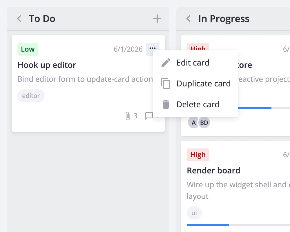
For custom menu entries, pass an options array and a click handler:
<script setup>
  import { Kanban, getMenuOptions } from "@svar-ui/vue-kanban";

  const menuOptions = [
    ...getMenuOptions(),
    { id: "archive", text: "Archive", icon: "wxi-archive" },
  ];

  function onMenuClick({ action }) {
    if (action.id === "archive") {
      // handle the custom action
    }
  }
</script>

<template>
  <Kanban
    :cards="cards"
    :columns="columns"
    :card="{ menu: { options: menuOptions, onclick: onMenuClick } }"
  />
</template>
Built-in item ids (edit-card, duplicate-card, delete-card) keep their default store-action wiring regardless of whether they come from the default list or a custom array.
Adding, updating, moving, deleting cards
All card mutations go through actions dispatched via api.exec(). The widget doesn't modify the source cards array directly - the internal store handles immutable updates and triggers re-rendering.
<script setup>
  import { ref } from "vue";
  import { Kanban } from "@svar-ui/vue-kanban";

  const api = ref(null);
</script>

<template>
  <Kanban ref="api" :cards="cards" :columns="columns" />

  <button :onclick="() => api.exec('add-card', {
    card: { label: 'New task', column: 'todo' },
  })">
    Add
  </button>
</template>
Key actions:
add-card- creates a card. Passedit: trueto open the editor on it immediately. Useafterto control insertion position.update-card- patches a card by id:api.exec("update-card", { id: 1, card: { progress: 0.5 } }).move-card- moves a card to a different column or reorders within the same column:api.exec("move-card", { id: 1, column: "done", before: null }). Settingbefore: nullplaces the card at the end.duplicate-card- clones a card with optional overrides:api.exec("duplicate-card", { id: 1, card: { label: "Copy" } }).delete-card- removes a card:api.exec("delete-card", { id: 1 }).
To react to mutations, use event handler props (onaddcard, onupdatecard, onmovecard, etc.) or the api.on() / api.intercept() methods. Interceptors can cancel an action by returning false.
Selection and editor opening
Clicking a card dispatches select-card, which populates the store's editorData field. If an Editor component is mounted, it opens automatically for the selected card.
<script setup>
  import { ref } from "vue";
  import { Kanban, Editor } from "@svar-ui/vue-kanban";

  const api = ref(null);
</script>

<template>
  <Kanban ref="api" :cards="cards" :columns="columns" />
  <Editor v-if="api" :api="api" />
</template>
Open or close the editor programmatically:
// Open editor for card 5
api.exec("select-card", { id: 5 });

// Close the editor
api.exec("select-card", { id: null });
Alternatively, pass a cardPopup component to replace the editor with a popup that appears on click:
<Kanban :cards="cards" :columns="columns" :cardPopup="MyPopup" />
The popup component receives { card, close } as props.
Performance
For boards with hundreds or thousands of cards, enable virtualization through the render prop to keep scroll performance smooth:
<Kanban
  :cards="cards"
  :columns="columns"
  :render="{
    virtualizeCards: true,
    estimatedCardHeight: 96,
    cardOverscan: 5,
  }"
/>
This renders only the cards visible in each column's scroll viewport, plus a configurable overscan buffer. For boards with many columns, add virtualizeColumns: true as well.