Editing
This guide covers how users edit card data through the sidebar or modal editor, and how you control the form's fields, layout, and save behavior.
How the editor works
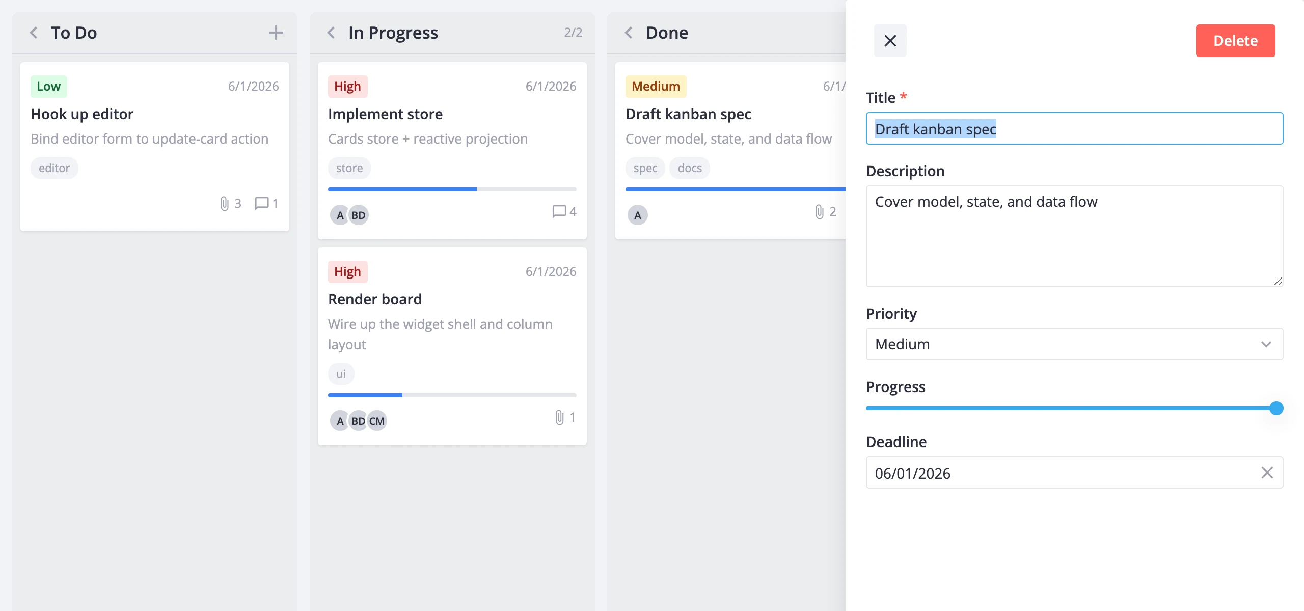
The Editor is a standalone component - it doesn't live inside <Kanban>. You mount it wherever you want (sidebar, modal, or inline) and connect it to the same kanban instance via the api prop. Clicking a card dispatches select-card, which populates the store's editorData with a working copy of that card. The editor renders from that copy. When the user changes a field, the editor dispatches update-card back to the store.
Three things to keep in mind:
- The editor works on a clone of the card, not the original. Changes only reach the board when
update-cardfires (immediately withautoSave, or on explicit save). - The editor mounts and unmounts based on
editorData. Dispatchingselect-card({ id: null })clears it and the editor disappears. <Kanban>doesn't render the editor for you. If no<Editor>is mounted, clicking a card still dispatchesselect-card, but nothing visible happens.
Mounting the editor
Get a reference to the kanban API with ref, then pass it to <Editor>:
<script setup>
  import { ref } from "vue";
  import { Kanban, Editor } from "@svar-ui/vue-kanban";

  const columns = [
    { id: "backlog", label: "Backlog" },
    { id: "doing", label: "In Progress" },
    { id: "done", label: "Done" },
  ];

  const cards = [
    { id: 1, label: "Task A", column: "backlog" },
    { id: 2, label: "Task B", column: "doing" },
  ];

  const api = ref();
</script>

<template>
  <Kanban ref="api" :cards="cards" :columns="columns" />
  <Editor v-if="api" :api="api" />
</template>
The v-if="api" guard ensures the editor doesn't try to subscribe before the kanban instance is ready.
Default editor items
Without an explicit items prop, the editor renders the default field set from getEditorItems():
| Field | Component | Notes |
|---|---|---|
label | text | Always present, marked required |
description | textarea | Shown when description is truthy in the shape |
priority | richselect | Options from priority.data or getPriorityOptions() |
progress | slider | Range 0 to 1, step 0.1 |
deadline | datepicker | Clearable |
tags | multicombo | Only when tags.data is provided |
users | multicombo | Only when users.data is provided |
To keep the editor in sync with what's shown on the cards, pass the same shape you use on <Kanban>:
<script setup>
  import { ref } from "vue";
  import { Kanban, Editor, getEditorItems, getCardShape } from "@svar-ui/vue-kanban";

  const card = {
    ...getCardShape(),
    users: { data: [{ id: 1, label: "Alice" }, { id: 2, label: "Bob" }] },
    menu: true,
  };

  const items = getEditorItems(card);

  const api = ref();
</script>

<template>
  <Kanban ref="api" :cards="cards" :columns="columns" :card="card" />
  <Editor v-if="api" :api="api" :items="items" />
</template>
tags and users fields only appear in the editor when their data array is provided in the shape. Without it, they collapse out of the form even if the boolean flag is true.
Custom items
Build your own items array for full control over field order, labels, required flags, and column placement. You can mix default items (extracted via getEditorItems().find(...)) with hand-built entries:
<script setup>
  import { ref } from "vue";
  import { Kanban, Editor, getEditorItems } from "@svar-ui/vue-kanban";

  function getDefaultItem(key) {
    const item = getEditorItems().find(it => it.key === key);
    if (!item) throw new Error(`Editor item not found: ${key}`);
    return item;
  }

  const items = [
    { comp: "text", key: "label", label: "Title", column: "left", required: true },
    { comp: "textarea", key: "description", label: "Description", column: "left" },
    { ...getDefaultItem("priority"), column: "right", required: true },
    { ...getDefaultItem("progress"), column: "right" },
  ];

  const api = ref();
</script>

<template>
  <Kanban ref="api" :cards="cards" :columns="columns" />
  <Editor v-if="api" :api="api" :items="items" placement="modal" layout="columns" />
</template>
The column property ("left" or "right") only takes effect when layout="columns" is set.
Layout, placement, and action bars
The editor supports three placement modes and two layout modes:
placement="sidebar"(default) - a slide-in panel, 450px wide.placement="modal"- a centered dialog.placement="inline"- renders in the normal document flow for embedding in your own container.
Set layout="columns" to split items across a two-column form. Items with column: "left" go to the left pane; everything else goes to the right.
The default top bar shows a close icon and a Delete button. You can replace it, hide it, or add a bottom bar:
<template>
  <Editor
    :api="api"
    :items="items"
    :topBar="false"
    :bottomBar="{
      items: [
        { comp: 'button', id: 'delete', text: 'Delete', type: 'danger' },
        { comp: 'spacer' },
        { comp: 'button', id: 'close', text: 'Cancel', type: 'default' },
        { comp: 'button', id: 'save', text: 'Done', type: 'primary' },
      ],
    }"
    :autoSave="false"
    placement="modal"
    layout="columns"
    :onaction="handleAction"
  />
</template>
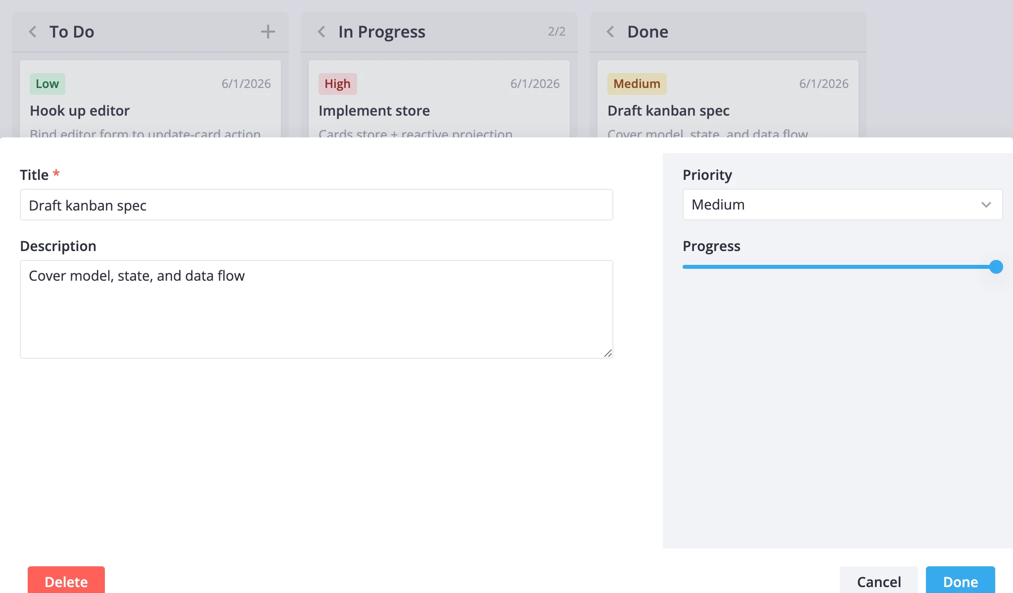
Button clicks route through onaction. The built-in "close" id closes the editor; "save" triggers validation and save. Handle custom ids (like "delete") in your onaction callback.
Comments and checklists
Register custom field components with registerEditorItem, then reference them by name in the items array:
<script setup>
  import { ref } from "vue";
  import { Editor, registerEditorItem, getEditorItems } from "@svar-ui/vue-kanban";
  import { Comments } from "@svar-ui/vue-comments";
  import { Tasklist } from "@svar-ui/vue-tasklist";

  registerEditorItem("comments", Comments);
  registerEditorItem("tasks", Tasklist);

  const users = [
    { id: 1, name: "Alice" },
    { id: 2, name: "Bob" },
  ];

  const items = [
    { comp: "text", key: "label", label: "Title", column: "left", required: true },
    { comp: "textarea", key: "description", label: "Description", column: "left" },
    { key: "comments", comp: "comments", label: "Comments", users, activeUser: 1, column: "left" },
    { key: "tasks", comp: "tasks", label: "Checklist", column: "right" },
  ];

  const api = ref();
</script>

<template>
  <Kanban ref="api" :cards="cards" :columns="columns" />
  <Editor v-if="api" :api="api" :items="items" placement="modal" layout="columns" :autoSave="false" />
</template>
Call registerEditorItem once at module scope, before any <Editor> renders. The kanban editor pre-registers richselect, multicombo, datepicker, and slider - you only need to register components beyond that set.
Auto-save vs explicit save
By default, autoSave is true. Every field change immediately dispatches update-card and the board updates in real time.
Set :autoSave="false" to batch changes. The editor holds a working copy until the user clicks a Save button (a toolbar item with id: "save"). Validation runs on save - fields marked required: true or with a validation function are checked before the update goes through.
<template>
  <Editor
    :api="api"
    :items="items"
    :autoSave="false"
    :onaction="({ item, changes }) => {
      // Close on save when there are no pending changes
      if (item.id === 'save' && changes.length === 0) {
        api.exec('select-card', { id: null });
      }
    }"
    :onsave="({ values }) => {
      console.log('Saved:', values);
    }"
  />
</template>
The onsave callback fires after a successful save. The onaction callback fires on any toolbar button click, including save, cancel, and custom actions.
Programmatic open and close
Open the editor on a specific card:
api.exec("select-card", { id: cardId });
Close it:
api.exec("select-card", { id: null });
These calls work regardless of readonly mode. The readonly prop only prevents the board's click handler from dispatching select-card - programmatic calls always go through.
Enabling readonly
Set readonly on the <Editor> to render all fields in read-only mode:
<template>
  <Editor :api="api" readonly />
</template>
This is independent of <Kanban readonly>. The kanban readonly prop prevents the board UI from opening the editor. The editor's own readonly prop controls whether fields are editable once the editor is open. You might combine them for a view-only dashboard, or use just the editor readonly to let users inspect cards without editing.