Agenda View
The agenda view shows a flat, chronological list of events for a single calendar month. This guide covers when to reach for it, how its month-scoped range works, and how to customize the way each row looks.
The functionality is available in PRO Edition only
The Mental Model
The agenda view is one of the seven built-in views, alongside day, week, month, year, resources, and timeline. It's the only built-in that uses the list section mode - instead of plotting events on a time grid, it groups them by start day and renders them as rows.
A few rules shape what you see:
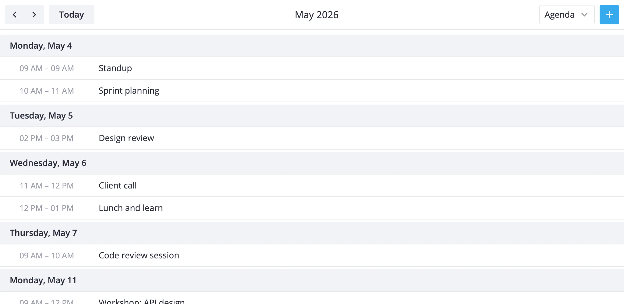
- The range is one calendar month. Navigation steps by one month at a time. The toolbar's "Today" jumps to the month that contains today.
- Events are filtered by
startonly. An event that starts before the month - even if it ends inside it - won't show up. An event that starts on the last day at 23:59 will. The time-based views split events across boundaries; agenda doesn't. - Sorting is start-time first, then end-time. Two events at the same start time render shorter-first.
- Grouping happens at the renderer. Each day with at least one event gets a date header. Days with no events don't appear. When the whole month is empty, you get a localized "No events this month" message.
- The view is read-only by design. All event coordinates are zeroed, so drag, resize, and drag-to-create don't apply. Click still selects an event and opens the editor when one is mounted.
Because of the month-scoped range, the agenda view pairs naturally with day or week for detail and month for overview.
Adding the Agenda View
The default views prop is ["day", "week", "month"]. Agenda is built in but not listed by default - add it explicitly:
<script setup>
  import { Calendar } from "@svar-ui/vue-calendar";
  const events = [/* ... */];
</script>

<template>
  <Calendar :events="events" view="agenda" :views="['agenda', 'day', 'week', 'month']" />
</template>
The view="agenda" prop opens the calendar on the agenda; the views array decides what shows up in the mode switcher.
Month-scoped List
The agenda always operates on a full calendar month around the current date:
<template>
  <Calendar
    :events="events"
    view="agenda"
    :date="new Date(2025, 9, 15)"
    :views="['agenda', 'month']" />
</template>
With date set to October 15, 2025, the visible range is Oct 1 - Oct 31. The toolbar's prev/next arrows step to September and November.
To react when the user navigates - say, to fetch events for that range - listen for onnavigateto and onnavigatetime:
<template>
  <Calendar
    :events="events"
    view="agenda"
    :views="['agenda']"
    :onnavigateto="({ date, view }) => console.log('jumped to', date, view)"
    :onnavigatetime="({ direction }) => console.log('stepped', direction)" />
</template>
For a programmatic jump, use the instance API via api.exec and the navigate-time action:
<script setup>
  import { ref } from "vue";
  const api = ref();
</script>

<template>
  <Calendar ref="api" :events="events" view="agenda" :views="['agenda', 'month']" />

  <button @click="api.exec('navigate-time', { direction: 'now' })">
    Today
  </button>
</template>
Customizing Row Content
Each row in the agenda is a single event. By default, the renderer shows a time range on the left ("09:00 - 10:00") and the event title on the right. For all-day events or events that span multiple days, the time range collapses to the localized "Full day" label.
To replace the row content, pass a Vue component to eventContent. The component receives { event, mode }, and for the agenda view mode is "list":
<script setup>
  import { Calendar } from "@svar-ui/vue-calendar";
  import AgendaRow from "./AgendaRow.vue";
</script>

<template>
  <Calendar :events="events" view="agenda" :views="['agenda']" :eventContent="AgendaRow" />
</template>
<!-- AgendaRow.vue -->
<script setup>
  const props = defineProps({ event: {}, mode: {} });
</script>

<template>
  <div class="row">
    <strong>{{ event.text }}</strong>
    <span v-if="event.location" class="loc">{{ event.location }}</span>
    <em>{{ event.start.toLocaleTimeString() }}</em>
  </div>
</template>
The same eventContent component is used in other views too (grid, bars, boxes, year-tooltip). Branch on mode if you want different markup per view:
<script setup>
  const props = defineProps({ event: {}, mode: {} });
</script>

<template>
  <template v-if="mode === 'list'">
    <strong>{{ event.text }}</strong> - {{ event.location ?? "no location" }}
  </template>
  <span v-else>{{ event.text }}</span>
</template>
To restyle rows without replacing their markup, use eventCss instead. It returns CSS class names per event:
<template>
  <Calendar
    :events="events"
    view="agenda"
    :views="['agenda']"
    :eventCss="({ event }) =>
      event.priority === 'high' ? 'row-priority-high' : ''" />
</template>
For tooltips and click-popups, the standard tooltip and eventPopup props apply to the agenda the same way they do to other views.
What's Not Available
The agenda view bypasses the scale/layout pipeline, so a few props don't apply:
cellCssdoes nothing here. There are no grid cells to style.- No drag interactions. The view ignores
ui.drag,ui.dragCreate, and any move/resize affordances. views[].sectionsoverrides have no visible effect on the agenda section - the renderer doesn't read scale configs. Use a customViewModelsubclass if you need different range semantics.
Where to Go Next
- For the full prop list, see the Calendar API reference.
- For other built-in views and their section overrides, see the Views guide.
- For writing your own view from scratch, see the Custom Views guide.
- For subclassing this view's logic, see
AgendaViewModel.