Tooltip
This guide covers how to attach a custom hover preview to events. The calendar takes the component, decides when to mount it, and feeds it the right payload depending on the view.
How tooltips work
The tooltip prop takes a Vue component, not a DOM string. The calendar render layer owns its lifecycle:
- It listens for hover only when a
tooltipcomponent is configured. - It resolves the event under the cursor and instantiates the component with the right props.
- It dismisses the tooltip on mouse leave or when an event card opens.
Two render paths exist:
| Surface | Trigger | Position | Props |
|---|---|---|---|
boxes, bars, grid, list | Hover an event element | Floats with the cursor | { event } |
year | Hover a marked day cell | Anchored to the cell | { events: CalendarEvent[] } |
Year view passes a list because a single day can hold multiple events. Every other view passes one event at a time. A tooltip designed for both should accept both shapes.
The widget never injects a close callback. Tooltips are display-only, with pointer-events: none in the regular overlay path. If you need clicks or buttons inside the popup, use eventPopup instead.
Passing a component
Import a component and hand it to the tooltip prop:
<script setup lang="ts">
  import { Calendar } from "@svar-ui/vue-calendar";
  import EventTooltip from "./EventTooltip.vue";
</script>

<template>
  <Calendar :events="data" view="month" :date="date" :tooltip="EventTooltip" />
</template>
Inside the tooltip component, declare both possible payloads so the same file works in every view:
<script setup lang="ts">
  const props = defineProps<{
    event?: any;
    events?: any[];
  }>();
</script>

<template>
  <div v-if="event">
    <div class="title">{{ event.text }}</div>
    <div class="time">
      {{ event.start.toLocaleTimeString() }} - {{ event.end.toLocaleTimeString() }}
    </div>
  </div>
  <div v-else-if="events">
    <div>{{ events.length }} events</div>
    <div v-for="ev in events" :key="ev.id">{{ ev.text }}</div>
  </div>
</template>
If you only use month/week/day, the event branch is enough. Add the events branch when you also want year view to use the same component.
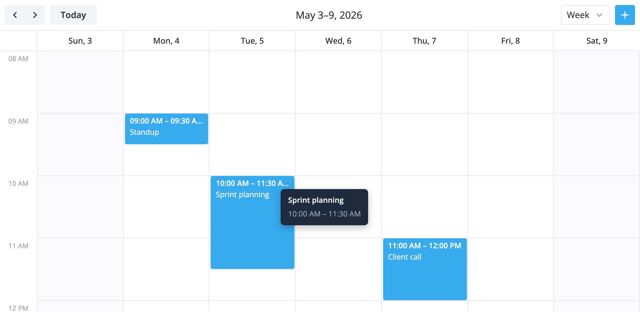
Positioning and styling
The render layer handles positioning - your component only needs to render the inner content.
- In
boxes,bars,grid, andlistsections, the tooltip is wrapped in a fixed-position layer that follows the pointer. - In
yearsections, it mounts inside aPopupanchored to the day cell.
Style the inside of the component - width, padding, background, typography - and let the calendar place it. The wrapping element sets pointer-events: none, so hover styles inside the tooltip will not trigger.
<style scoped>
  .event-tooltip {
    background: #1e293b;
    color: #f1f5f9;
    border-radius: 6px;
    padding: 8px 12px;
    font-size: 12px;
    box-shadow: 0 4px 12px rgba(0, 0, 0, 0.25);
    min-width: 140px;
    max-width: 260px;
  }
</style>
When no custom tooltip is provided, year view falls back to a built-in list of events for that day. Setting a custom component replaces the built-in entirely - there is no partial override.