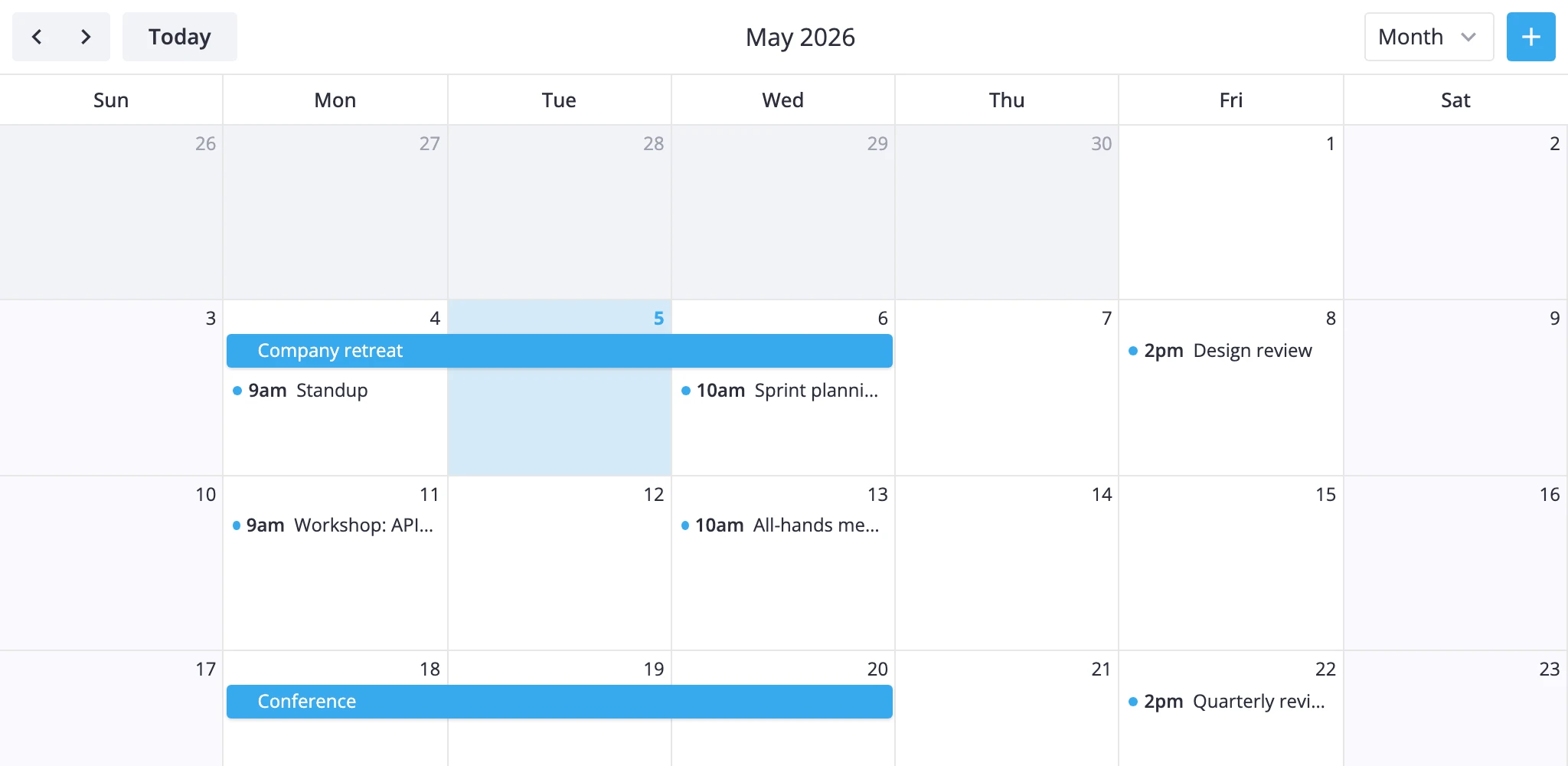
Month View
The month view gives you a high-level picture of an entire month at once, so users can spot busy stretches and free days without scrolling through hours. This guide covers how the grid is built, how to surface week numbers, how to paint cells, and how to control which day starts the week.
How the Month View Thinks
The month view renders one section in grid mode: 7 columns for days of the week and 4-6 rows for weeks. Every event becomes a horizontal bar inside its week row; events that cross a week boundary are split into chunks, one per row.
A few rules shape the layout:
- The grid always starts on the configured first weekday of the week containing the 1st of the month. That means the first row often pulls a few padding days from the previous month, and the last row often pulls a few from the next.
- The number of week rows is computed per month - usually 5, sometimes 4 (a 28-day February that starts on the first weekday) or 6 (months that begin near the weekend and run 30-31 days).
- Single-day events snap to the full day cell, regardless of their start/end times. A 10:00-11:00 meeting on Wednesday fills the whole Wednesday slot in the bar lane it's assigned to.
- Multi-day events keep their natural span and sort ahead of single-day events at the same x-position, so they land on the top lane of the row.
- Padding days (the ones outside the displayed month) are real cells: they receive events and accept clicks. The render layer just dims their day numbers.
To tweak this view you have two levers: the views prop with sections overrides for layout/scale changes, and <Locale> for the first day of the week. For visual styling, use the cellCss prop on Calendar.
Grid Layout
The default month view needs no configuration - list "month" (or include it in the views array) and pass events:
<script setup>
  import { Calendar } from "@svar-ui/vue-calendar";
  const events = [/* ... */];
  const date = new Date();
</script>

<template>
  <Calendar :events="events" :date="date" view="month" :views="['day', 'week', 'month']" />
</template>
The single section is named month. Its xScale runs across 7 days; its yScale runs across the dynamic week count. Both scales are discrete, so positions snap to whole cells.
If you want to override scale options, target the month section by name. The override merges into the defaults - only the keys you set are replaced:
<template>
  <Calendar
    :events="events"
    :date="date"
    view="month"
    :views="[
      {
        id: 'month',
        sections: {
          month: {
            ui: { clipDrag: true }
          }
        }
      }
    ]"
  />
</template>
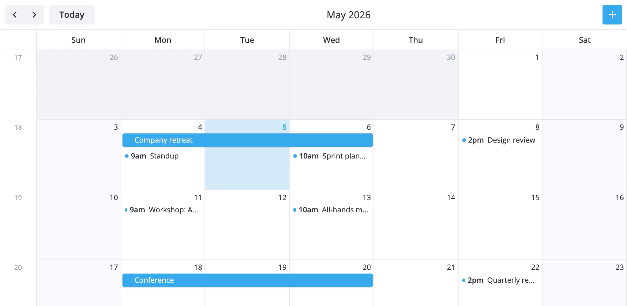
Week Numbers
The y-axis is hidden by default. Flip its visible flag on and point format at the locale's weekNumberFormat to add a week-number column on the left:
<script setup>
  import { Calendar } from "@svar-ui/vue-calendar";
  const views = [
    {
      id: "month",
      sections: {
        month: {
          yScale: {
            visible: true,
            format: "weekNumberFormat"
          }
        }
      }
    }
  ];
</script>

<template>
  <Calendar :events="events" :date="date" view="month" :views="views" />
</template>
The same y-scale also supplies row positions for drag operations, so toggling visible doesn't change drag behavior - it only controls whether the column renders.
Styling Cells
Pass a cellCss callback on <Calendar> to apply CSS classes per cell. The callback receives a CellContext with the cell's date, the active view, the section name, and the section mode. Return a class name (or empty string).
<script setup lang="ts">
  import { Calendar } from "@svar-ui/vue-calendar";
  import type { CellContext } from "@svar-ui/vue-calendar";

  function cellCss(ctx: CellContext): string {
    const { date } = ctx;
    if (!date) return "";
    const day = date.getDay();
    if (day === 0 || day === 6) return "weekend";
    if (day === 5) return "holiday";
    return "";
  }
</script>

<template>
  <Calendar :events="events" :date="date" view="month" :cellCss="cellCss" />
</template>

<style scoped>
  :global(.weekend) {
    background-color: #f5f0ff !important;
  }
  :global(.holiday) {
    background-color: #fde8e8 !important;
  }
</style>
To branch by view or section, check ctx.view ("month") or ctx.section ("month"). The same callback runs for every grid cell, so guard for date being null and use ctx.section if you only want the rule to fire in certain views.
Weekend cells already get the wx-weekend class and the --wx-calendar-weekend-background CSS variable, so theming weekends globally can also be done in the theme layer instead of through cellCss.
First Day of Week
The first weekday is a locale concern, not a view prop. Wrap the calendar in <Locale> and set calendar.weekStart (0 for Sunday, 1 for Monday, ..., 6 for Saturday):
<script setup>
  import { Calendar } from "@svar-ui/vue-calendar";
  import { Locale } from "@svar-ui/vue-core";
  import { ref, computed } from "vue";

  const sundayStart = ref(false);
  const weekStart = computed(() => sundayStart.value ? 0 : 1);
  const words = computed(() => ({ calendar: { weekStart: weekStart.value } }));
</script>

<template>
  <Locale :words="words" :key="weekStart">
    <Calendar :events="events" :date="date" view="month" />
  </Locale>
</template>
The :key="weekStart" binding remounts the calendar when the value changes. The grid's range is computed once per range update, so without the remount an already-mounted calendar keeps its previous week alignment.
Changing weekStart shifts the column order, the first column of the grid, and the rule that decides which days are pulled in as padding from adjacent months.
What to Read Next
cellCss- full callback signature andCellContextfieldsviews- view configuration and section overridesMonthViewModel- subclassing the month view for custom layouts- Localization - full
<Locale>setup, includingweekStart