Calendar groups
This guide covers how to expose multiple calendars to your users - work, home, holidays, project boards - as a sidebar with checkbox filters and a mini date picker.
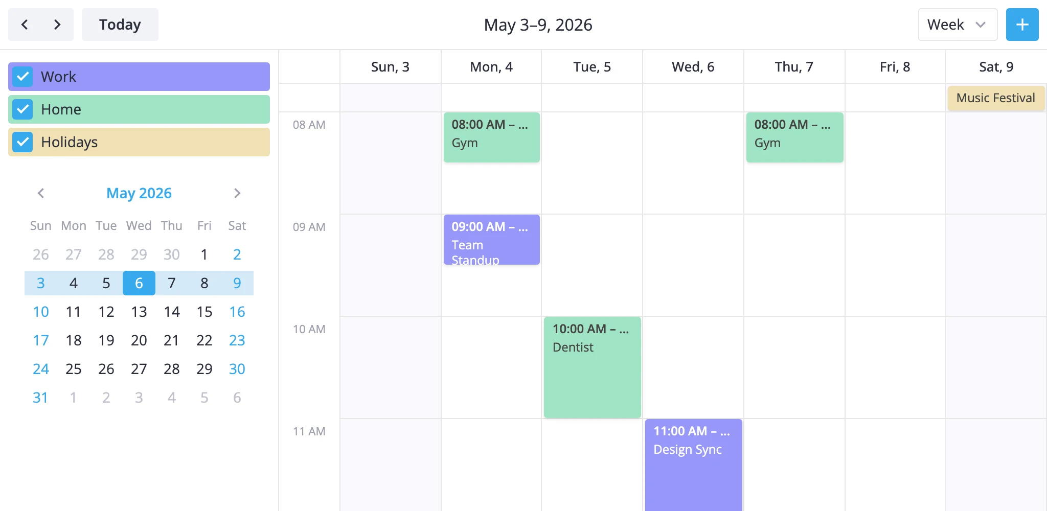
The piece doing the work is CalendarPanel. It plugs into the calendar's sidebar slot, reads the calendar API from Vue's inject context, and turns checkbox toggles into the standard filter-events action. You don't write the filter wiring yourself.
How it thinks
Each event carries a group id under a single field on the event object. By default that field is calendarId, but you choose the name through the accessor prop. The panel renders one checkbox per group entry; toggling a checkbox flips that group's bit in a local active map and dispatches a fresh predicate:
event => active[event[accessor]];
When all checkboxes are on, the panel sends filter: null to clear the filter rather than dispatching a predicate that always returns true. Both dispatches use the tag "calendar-panel", so the filter stacks correctly with other filters you might apply with a different tag.
The panel always renders the checkbox list. The open prop only toggles the mini date picker below it - collapsed mode hides the picker but keeps the filters.
Declaring calendar groups
Build a calendars array. Each entry needs id and label; the rest is optional.
const calendars = [
	{ id: "work", label: "Work", css: "cal-work" },
	{ id: "home", label: "Home", css: "cal-home" },
	{ id: "holiday", label: "Holidays", css: "cal-holiday", active: false },
];
active: false makes the group start unchecked, which means the panel applies the corresponding filter on mount - handy for optional overlays like shared calendars or vacations.
css is added to the group's row in the sidebar. Use it to color-code the group there, and to color the matching events themselves through eventCss (see "Grouping events" below).
Mounting as a side panel
Put CalendarPanel inside the default slot of <Calendar>. It reads the API from inject context, so no ref is needed:
<script setup>
  import { Calendar, CalendarPanel } from "@svar-ui/vue-calendar";

  const calendars = [
    { id: "work", label: "Work" },
    { id: "home", label: "Home" },
  ];
</script>

<template>
  <Calendar :events="data" view="week" :date="date">
    <CalendarPanel :calendars="calendars" accessor="calendarId" />
  </Calendar>
</template>
For a Gmail-style hamburger that hides the sidebar on demand, replace the toolbar with a layout that includes a menuButton and toggle the panel's open prop from onaction:
<script setup>
  import { ref } from "vue";

  const panelVisible = ref(true);

  const toolbar = { items: [
    { id: "menu", comp: "menuButton" },
    { comp: "spacer" },
    { id: "title", comp: "dateLabel" },
    { comp: "spacer" },
    { id: "nav", comp: "dateNav" },
  ]};

  function handleAction(ev) {
    if (ev.id === "menu-button") panelVisible.value = !panelVisible.value;
  }
</script>

<template>
  <Calendar :events="data" view="week" :date="date" :toolbar="toolbar" :onaction="handleAction">
    <CalendarPanel :open="panelVisible" :calendars="calendars" accessor="calendarId" />
  </Calendar>
</template>
The menu-button action id is what the built-in menuButton toolbar component dispatches when clicked.
Grouping events
Two pieces have to line up:
- Each event has a field whose value is one of the group ids.
accessoronCalendarPanelnames that field.
const data = [
  { id: 1, text: "Standup",  start: ..., end: ..., calendarId: "work" },
  { id: 3, text: "Gym",      start: ..., end: ..., calendarId: "home" },
];
If your data uses a different name - category, projectId, teamId - set accessor to that string. Events whose value isn't in the panel's groups stay visible: the predicate only filters out events that map to a group currently switched off.
To color events by group, return a per-group class from eventCss:
<script setup>
  function cssByCalendar(obj) {
    return `cal-${obj.event.calendarId}`;
  }
</script>

<template>
  <Calendar :events="data" view="week" :date="date" :eventCss="cssByCalendar">
    <CalendarPanel :calendars="calendars" accessor="calendarId" />
  </Calendar>
</template>
Pair that with global styles for .cal-work.wx-box-event, .cal-home.wx-bar-event, etc., to color time-grid boxes and multi-day bars separately. The same cal-* classes work for the sidebar rows because they receive .wx-calendar-name plus the group's css class.
Reflecting selection outside
CalendarPanel already updates the calendar through filter-events. Use onchange when something else - a URL param, an analytics event, a separate component - also needs to know which groups are active.
<script setup>
  function onchange({ value, filter }) {
    console.log("Active calendars", value);
  }
</script>

<template>
  <Calendar :events="data" :date="date">
    <CalendarPanel :calendars="calendars" :onchange="onchange" />
  </Calendar>
</template>
value is the array of currently active group ids; filter is the predicate the panel just dispatched (or null when all groups are active). Two things to remember:
onchangefires on mount when at least one group starts inactive, since the panel applies an initial filter in that case.- Numeric ids come back as strings - they're collected from object keys, which JavaScript coerces to strings.
For the prop signatures see the API reference for CalendarPanel and eventCss.