Key Features
SVAR Svelte Kanban is a Svelte 5 task board component for visualizing work-in-progress. Tasks live as cards in columns, users drag them between stages, and your Svelte code drives the behavior through props, events, and actions.
Board Layout and Drag-and-Drop
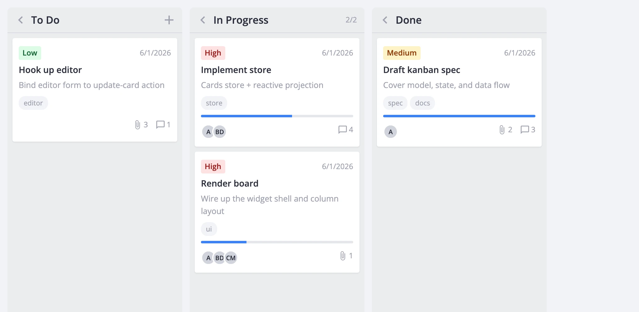
The board renders a horizontal row of columns. Each column has a header and a vertical list of cards. Users drag cards between columns or reorder them within one - every drag fires a move-card action the host can observe, validate, or cancel.
Two scroll modes control overflow. The default gives each column its own vertical scrollbar. render.columnScroll switches to a single horizontal scroll across all columns. Column width can be locked with render.fixedColumnWidth or left flexible.
Columns also support a collapsed state (shrinks to a narrow header) and an addCard flag (shows a per-column create button).
Card Customization
Cards display a configurable set of sections: cover image, priority badge, title, description snippet, progress bar, deadline, tags, user avatars, attachment and comment counts, and a menu trigger. The card prop takes a CardShape object that toggles each section and passes section-specific options - priority data, user lists, tag limits, deadline format.
When the built-in sections aren't enough, cardContent accepts a custom Svelte component that replaces the card body entirely. The wrapper, selection state, and drag behavior stay intact.
For visual styling, the cardCss callback returns CSS class names per card based on its data. You can also set a static css value directly on a card object.
Editing and History
Clicking a card fires select-card, which populates the store's editor state. The Editor component mounts as a sidebar, modal, or inline form and commits changes back through update-card. The default field set covers label, description, priority, progress, deadline, tags, and users. Custom field components - comments, checklists, file pickers - can be registered with registerEditorItem and referenced by name.
If you'd rather show a popup instead of the editor, the cardPopup prop swaps in a custom component that receives the card data and a close callback.
Right-click actions go through the ContextMenu wrapper. It resolves the clicked card and dispatches built-in actions: edit, duplicate, delete. You can extend the menu with custom entries and gate it per-card through resolver and filter callbacks.
Undo and redo are available in the Pro version. Set history to true and mutating actions start pushing state snapshots. The Toolbar component exposes undo/redo buttons that enable and disable reactively based on the history stack.
Filtering, Sorting, and Grouping
Filters are predicate functions keyed by a tag string, so multiple independent filters can stack. Pass an initial set through the filters prop; change them at runtime with filter-cards. External filter widgets from @svar-ui/svelte-filter drive the board through the same action.
Sorting accepts a comparator function, a { field, dir } descriptor, or null to clear. The Toolbar offers a built-in sort menu for label and priority in both directions.
Grouping works by swapping columnAccessor. By default it reads a column field from each card. Point it at another field - or supply a { get, set } pair - and the board regroups by that dimension (priority, assignee, status) without being recreated.
Performance
Large boards benefit from virtualization. render.virtualizeCards renders only the cards visible within each column's scroll area. render.virtualizeColumns does the same horizontally. Tuning parameters - estimatedCardHeight, cardOverscan, columnOverscan - control measurement and buffer sizes.
Dynamic column loading (Pro) defers card fetching until a column scrolls into view. The board emits request-data for each unloaded column; the host fetches and answers with provide-data. This keeps the initial payload small when you have many columns.
Integration Surface
The board exposes its API through bind:this or the init callback. You get state access (getState, getReactiveState, getCards), action dispatch (exec), and an event bus (on, intercept, detach) for reacting to or canceling any action.
For backend persistence, RestDataProvider maps five CRUD actions to REST endpoints under a configurable URL root. Attach it in init with api.setNext(provider) and call provider.getData() for the initial load.
readonly mode disables all mutating interactions - drag, create, edit, delete - and hides the matching toolbar and menu items. Good for dashboards and reports.
Export covers PDF, PNG, and XLSX through the export-data action. The ExportPopup component gives users a UI for picking format and options. ExcelImport handles inbound spreadsheet data.
Localization works by wrapping the widget in a Locale component with merged dictionaries from @svar-ui/kanban-locales and @svar-ui/core-locales. Theming is one line: drop <Willow /> or <WillowDark /> at your app root.