Week view
This guide covers how the seven-day grid is built, how to tune its hours, slot size, snap step and first day of the week, and how to style cells and events inside it.
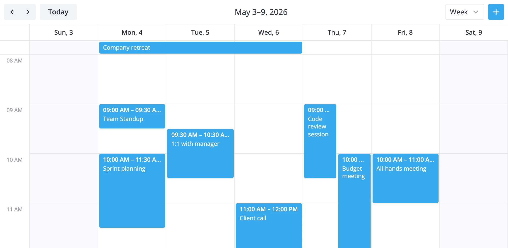
Layout
The week view stacks two sections on top of each other.
- multiday - a thin bar at the top that holds all-day and multi-day events. It spans all seven day columns.
- timeGrid - the scrollable time grid below it, also seven columns wide, with hours running down the y-axis.
Each event lands in exactly one of the two: an event with allDay: true, or one whose start and end fall on different calendar dates, goes to the multiday bar; everything else goes to the timeGrid. So a Mon 23:00 to Tue 01:00 event renders as a multiday bar, not as two grid pieces.
The grid is part of a registered WeekViewModel class. You select it by adding "week" to the views prop and setting view="week":
<Calendar events={data} view="week" views={["day", "week", "month"]} {date} />
To change anything inside the layout, pass a ViewConfig object instead of the bare string id and put your overrides under sections:
views={[
  {
    id: "week",
    sections: {
      timeGrid: {
        yScale: { startHour: 6, endHour: 22 }
      }
    }
  },
  "month"
]}
Overrides deep-merge into the defaults - only the keys you set are replaced. Arrays, functions, and primitives are replaced wholesale. Unknown section names are ignored.
First day of week
Week alignment comes from the locale, not from a prop on Calendar. The view reads weekStartDay (0 = Sunday, 1 = Monday, default 1) from the active locale's calendar.weekStart value, and rangeStart() snaps the visible range to that day.
Override it by wrapping Calendar in a Locale block:
<script>
  import { Locale } from "@svar-ui/svelte-core";
  import { Calendar } from "@svar-ui/svelte-calendar";

  let sundayStart = $state(false);
  const words = $derived({ calendar: { weekStart: sundayStart ? 0 : 1 } });
</script>

{#key sundayStart}
  <Locale {words}>
    <Calendar events={data} view="week" {date} />
  </Locale>
{/key}
The {#key} block forces a remount when the start day changes, so the running view picks up the new alignment.
Visible hours and slot size
Hours, row size, and snapping live on the timeGrid section's y-scale.
views={[
  {
    id: "week",
    sections: {
      timeGrid: {
        yScale: {
          startHour: 6,    // first visible hour
          endHour: 22,     // first hour past the end
          step: 60,        // minutes per row
          snapStep: 15,    // minutes per drag/create snap
          ui: { minUnitHeight: 100 }
        }
      }
    }
  }
]}
Defaults are startHour: 8, endHour: 18, step: 60, snapStep: 15, minUnitHeight: 100. Drop step to 30 for half-hour rows, or raise it to 120 for a coarser look. snapStep runs independently of step - keep step: 60 for hour labels but use snapStep: 5 if you want fine drag adjustments.
To show a line at the current time, flip a ui flag on the section:
views={[
  {
    id: "week",
    sections: {
      timeGrid: {
        ui: { nowLine: true }
      }
    }
  }
]}
Snap and drag
Each section accepts a ui block with three drag flags:
drag- let users move and resize events inside this sectiondragCreate- let users drag on empty space to create a new eventclipDrag- clip dragged events at the section's edges
Defaults are all on for timeGrid; the multiday section sets clipDrag: false so multi-day bars can be dragged past the visible week.
Disable creation but keep moves on the time grid:
views={[
  {
    id: "week",
    sections: {
      timeGrid: {
        ui: { dragCreate: false }
      }
    }
  }
]}
To turn off all interactions across the whole calendar, use the readonly prop instead - that also hides the add-event button and skips the editor wiring.
Work-week and custom week variants
When section overrides aren't enough - a five-day workweek, two-week range, custom labels - subclass WeekViewModel and register it under a new id with registerCalendarView.
<script>
  import {
    Calendar,
    WeekViewModel,
    registerCalendarView,
  } from "@svar-ui/svelte-calendar";

  class WorkWeekViewModel extends WeekViewModel {
    getSections() {
      const sections = super.getSections();
      return sections.map(s => ({
        ...s,
        xScale: { ...s.xScale, length: 5 },
      }));
    }

    rangeStart(date) {
      const d = new Date(date);
      d.setHours(0, 0, 0, 0);
      const diff = (((d.getDay() - 1) % 7) + 7) % 7;
      d.setDate(d.getDate() - diff);
      return d;
    }
  }

  registerCalendarView("workweek", WorkWeekViewModel);

  const views = [
    { id: "week", label: "Week" },
    { id: "workweek", label: "Work Week" },
  ];
</script>

<Calendar events={data} view="week" {views} {date} />
Override addRange() if you need a step that isn't seven days - for example, addRange(d, n) => new Date(d).setDate(d.getDate() + n * 14) for a two-week view. Override getRangeLabel() to control the toolbar title. Registration is global, so call registerCalendarView() once at module load.
Styling cells
Pass cellCss and eventCss callbacks to paint cells and events from data:
<script>
  import type { CellContext, EventContext } from "@svar-ui/svelte-calendar";

  function cellCss(ctx: CellContext): string {
    const { date, section } = ctx;
    if (!date) return "";
    const day = date.getDay();
    if (day === 0 || day === 6) return "weekend";
    if (section === "timeGrid" && date.getHours() >= 12 && date.getHours() < 13)
      return "lunch";
    return "";
  }

  function eventCss(ctx: EventContext): string {
    return `priority-${ctx.event.priority || "default"}`;
  }
</script>

<Calendar events={data} view="week" {date} {cellCss} {eventCss} />
cellCss fires for every grid cell with the active view, section ("multiday" or "timeGrid"), mode, scale units, and a resolved date when both axes are date-based. eventCss runs once per event with the event payload plus the current render mode ("bars" for the multiday bar, "boxes" for the time grid). Branch on mode to vary styling between the two sections.
The classes you return are appended to the cell or event wrapper, so define them globally (or with :global(...)) in your stylesheet.
For inner event markup - custom titles, badges, icons - use the eventContent prop with a Svelte component instead. See the API reference for cellCss, eventCss, and eventContent for the full prop signatures.