Resources View
This guide covers how to schedule events against named resources - rooms, people, equipment - in a single-day grid where each resource gets its own column.
The functionality is available in PRO Edition only
How It Works
The resources view is one of the calendar's seven built-in views. It renders a single section called timeGrid with two scales:
- x-axis -
unitscale. One column per resource, defined byxScale.items. - y-axis -
timescale. Hours run top to bottom, same as indayandweek.
Each event is matched to a column through the accessor field on the x-scale. The accessor names a property on the event - for example, "unit_id" or "roomId" - and its value must match one of the configured items[].id. Events without a matching id don't render.
The view ships with one placeholder column so the empty state still renders. You'll almost always replace it. Columns go on the views prop as a ViewConfig object that deep-merges into the section.
resources is PRO-only and isn't in the default views list - add it explicitly. It uses the scrollable renderer, so a long resource list scrolls horizontally instead of cramming columns into the viewport.
timeline is the transposed twin: time on x, resources on y. Same data model, same accessor - pick whichever orientation fits your layout.
Defining columns
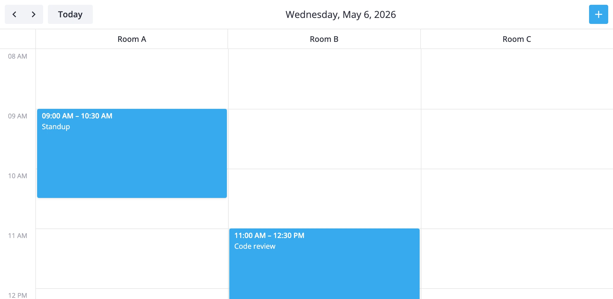
Replace the default unit list with your resources. The accessor names the field on each event that links it to a column.
<script>
  import { Calendar } from "@svar-ui/svelte-calendar";

  const rooms = [
    { id: "room-a", label: "Room A" },
    { id: "room-b", label: "Room B" },
    { id: "room-c", label: "Room C" },
  ];

  const events = [
    { id: 1, start: new Date("2026-05-05T09:00"), end: new Date("2026-05-05T10:30"), roomId: "room-a", text: "Standup" },
    { id: 2, start: new Date("2026-05-05T11:00"), end: new Date("2026-05-05T12:00"), roomId: "room-b", text: "Review" },
  ];

  const views = [
    {
      id: "resources",
      sections: {
        timeGrid: {
          xScale: { items: rooms, accessor: "roomId" },
        },
      },
    },
  ];
</script>

<Calendar {events} view="resources" {views} date={new Date("2026-05-05")} />
Each event needs the field named by accessor. An event with roomId: "room-d" won't render - there's no matching column.
Tuning the time axis
The time scale defaults to 8:00-18:00 with 60-minute slots. Override these through the same sections block. Only the keys you set are replaced; everything else keeps its default.
const views = [
	{
		id: "resources",
		sections: {
			timeGrid: {
				xScale: { items: rooms, accessor: "roomId" },
				yScale: { startHour: 7, endHour: 20, step: 30, snapStep: 15 },
			},
		},
	},
];
step is the slot height in minutes. snapStep is the drag-snap granularity.
Reactive accessor binding
The accessor can be a getter/setter pair instead of a string. Use this when a drag between columns should update a different field than the one you read from.
const xScale = {
	items: rooms,
	accessor: {
		get: event => event.assignment?.roomId,
		set: (event, id) => ({ assignment: { ...event.assignment, roomId: id } }),
	},
};
The set function is called when an event is dragged into another column; it returns the partial event update that the store applies.
Custom resource view subclass
When views[].sections overrides aren't enough - for example, you need an extra section above the grid or different navigation steps - subclass ResourcesViewModel and register it under a new id with registerCalendarView.
import {
	ResourcesViewModel,
	registerCalendarView,
} from "@svar-ui/svelte-calendar";
import type { Section } from "@svar-ui/svelte-calendar";

class WeekResourcesView extends ResourcesViewModel {
	getSections(): Section[] {
		const [timeGrid] = super.getSections();
		return [
			{
				...timeGrid,
				yScale: { ...timeGrid.yScale, startHour: 6, endHour: 22 },
			},
		];
	}

	addRange(date: Date, n: number): Date {
		const d = new Date(date);
		d.setDate(d.getDate() + n * 7);
		return d;
	}
}

registerCalendarView("week-resources", WeekResourcesView);
Then list it in views:
<Calendar view="week-resources" views={["week-resources", "week"]} {events} />
registerCalendarView is global. Calling it again with the same id replaces the previous class for any future <Calendar> instances.
Styling cells
The cellCss prop runs for every grid cell. The CellContext it receives carries the active view, section, mode, and the resolved date when both axes are date-based. For the resources view the x-axis is units, so use ctx.x?.id to branch by column and ctx.date for the row's hour.
<script lang="ts">
  import type { CellContext } from "@svar-ui/svelte-calendar";

  function cellCss(ctx: CellContext) {
    if (ctx.section !== "timeGrid") return "";
    if (ctx.x?.id === "room-a") return "premium";
    if (ctx.date && ctx.date.getHours() >= 12 && ctx.date.getHours() < 13) {
      return "lunch";
    }
    return "";
  }
</script>

<Calendar {cellCss} ... />

<style>
  :global(.premium) { background: #fff7e6; }
  :global(.lunch)   { background: #fef9e7; }
</style>
To color events by resource, use eventCss with EventContext:
import type { EventContext } from "@svar-ui/svelte-calendar";

function eventCss(ctx: EventContext) {
	return `room-${ctx.event.roomId}`;
}
Vertical time axis
In resources the time axis is vertical and the resource axis horizontal. If you want the inverse - time across the top, resources stacked as rows - use the timeline view instead. It uses the same accessor model but swaps the scales:
const views = [
	{
		id: "timeline",
		sections: {
			timeGrid: {
				yScale: { items: rooms, accessor: "roomId" },
			},
		},
	},
];
Both views share the scrollable renderer and step navigation by one day.
What to read next
- Views reference - full
ViewConfigshape and section override rules. registerCalendarView- registering a custom view class.cellCssandeventCss- per-cell and per-event styling hooks.