Tooltips
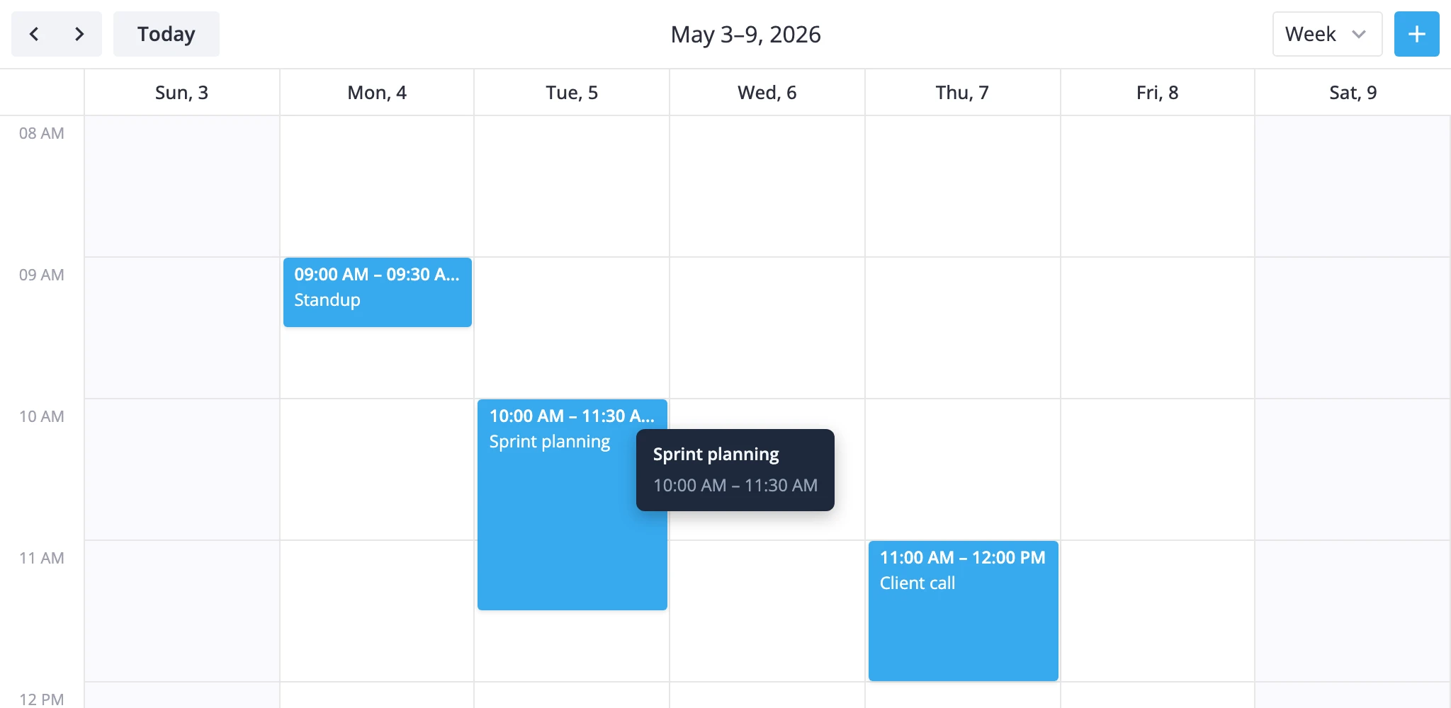
This guide covers the two ways to show event details without opening the editor: a hover tooltip through the tooltip prop, and a clickable card through eventPopup. Both take a React component, and the calendar owns when it mounts and where it goes.
How tooltips work
The tooltip prop takes a React component, not a DOM string. The calendar render layer owns its lifecycle:
- It listens for hover only when a
tooltipcomponent is configured. - It resolves the event under the cursor and instantiates the component with the right props.
- It dismisses the tooltip on mouse leave or when an event card opens.
Two render paths exist:
| Surface | Trigger | Position | Props |
|---|---|---|---|
boxes, bars, grid, list | Hover an event element | Floats with the cursor | { event } |
year | Hover a marked day cell | Anchored to the cell | { events: CalendarEvent[] } |
Year view passes a list because a single day can hold multiple events. Every other view passes one event at a time. A tooltip designed for both should accept both shapes.
The widget never injects a close callback. Tooltips are display-only, with pointer-events: none in the regular overlay path. If you need clicks or buttons inside the popup, use eventPopup instead.
Passing a component
Import a component and hand it to the tooltip prop:
// App.jsx
import { Calendar } from "@svar-ui/react-calendar";
import EventTooltip from "./EventTooltip.jsx";
import { getData } from "./data";

const { data, date } = getData();

function App() {
    return (
        <Calendar events={data} view="month" date={date} tooltip={EventTooltip} />
    );
}

export default App;
Inside the tooltip component, declare both possible payloads so the same file works in every view:
// EventTooltip.jsx
function EventTooltip({ event, events }) {
    if (event) {
        return (
            <>
                <div className="title">{event.text}</div>
                <div className="time">
                    {event.start.toLocaleTimeString()} - {event.end.toLocaleTimeString()}
                </div>
            </>
        );
    }

    if (events) {
        return (
            <div>
                <div>{events.length} events</div>
                {events.map((ev) => (
                    <div key={ev.id}>{ev.text}</div>
                ))}
            </div>
        );
    }

    return null;
}

export default EventTooltip;
If you only use month/week/day, the event branch is enough. Add the events branch when you also want year view to use the same component.
Positioning and styling
The render layer handles positioning - your component only needs to render the inner content.
- In
boxes,bars,grid, andlistsections, the tooltip is wrapped in a fixed-position layer that follows the pointer. - In
yearsections, it mounts inside aPopupanchored to the day cell.
Style the inside of the component - width, padding, background, typography - and let the calendar place it. The wrapping element sets pointer-events: none, so hover styles inside the tooltip will not trigger.
.event-tooltip {
    background: #1e293b;
    color: #f1f5f9;
    border-radius: 6px;
    padding: 8px 12px;
    font-size: 12px;
    box-shadow: 0 4px 12px rgba(0, 0, 0, 0.25);
    min-width: 140px;
    max-width: 260px;
}
When no custom tooltip is provided, year view falls back to a built-in list of events for that day. Setting a custom component replaces the built-in entirely - there is no partial override.
Clickable cards with eventPopup
A tooltip disappears on mouse leave and cannot hold buttons. When the preview needs to stay open and react to clicks, use the eventPopup prop instead: the calendar mounts your component inside an anchored Popup whenever the user clicks an event.
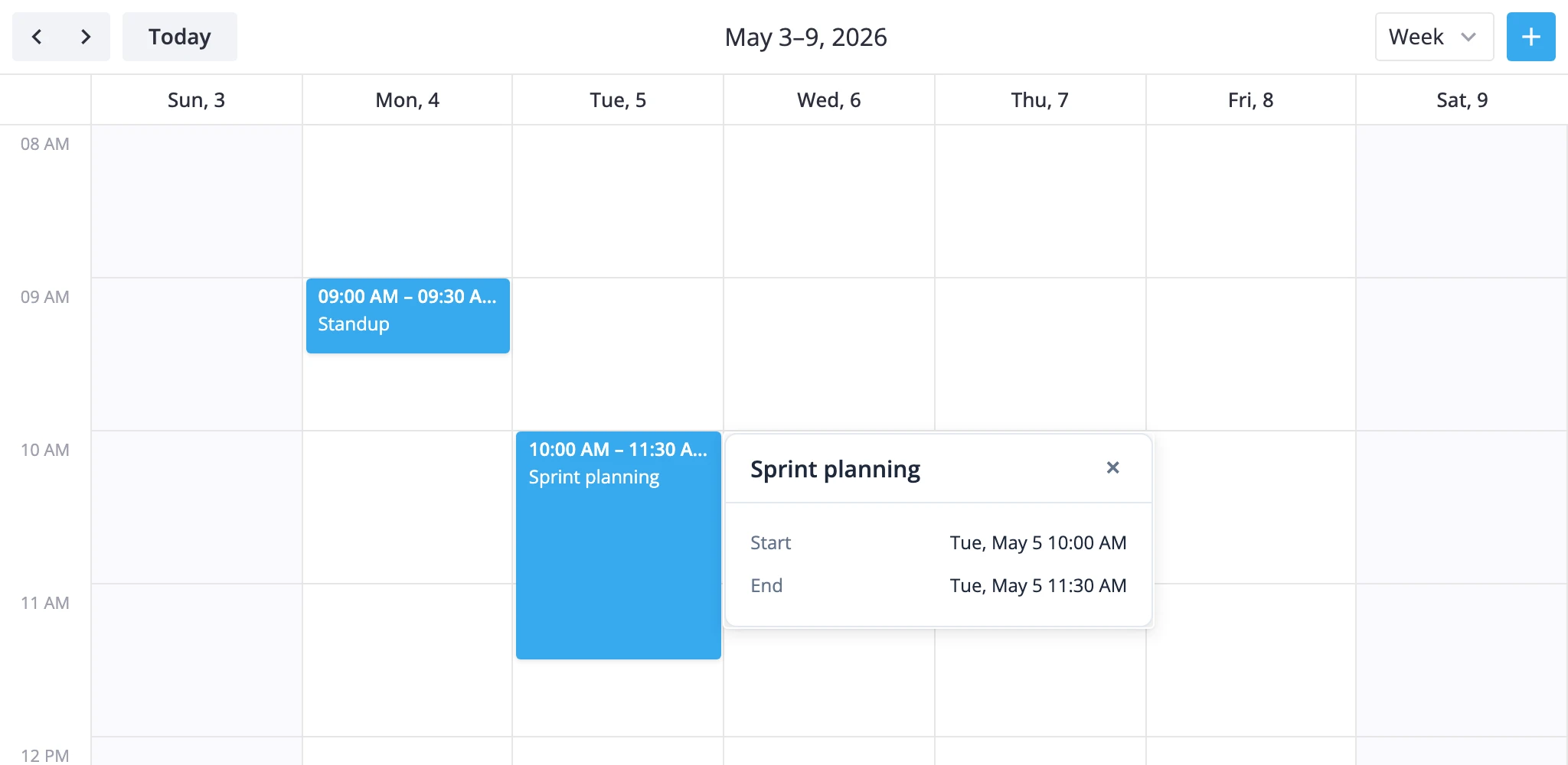
A few rules drive how it behaves:
- Click detection is movement-aware. The internal click handler listens for
mousedown/mouseupon the section container and treats the interaction as a click only when the pointer stays within a 3 px threshold. This is what separates a click from the start of a drag. - Resolution is store-based. Event elements expose a
data-id. The handler resolves it throughapi.getEvent(...)to find the stored event, then opens the popup with that event. eventPopupoverrides the default click path. WithouteventPopup, an event click dispatchesselect-event(which opens the editor when one is mounted). WitheventPopup, the click opens the card instead -select-eventis not dispatched.- Empty-space clicks dismiss. Clicking outside an event closes the current card. Clicking another event swaps the card to that event.
- The component renders inside the calendar subtree. It can read any React context exposed by the calendar's parent components - useful for passing app-level data such as resource lists.
The card receives two props: the resolved event object and a close callback. You decide what the card looks like and when it dismisses itself.
// App.jsx
import { Calendar } from "@svar-ui/react-calendar";
import EventCard from "./EventCard.jsx";
import { getData } from "./data";

const { data, date } = getData();

function App() {
    return (
        <Calendar
            events={data}
            date={date}
            view="week"
            eventPopup={EventCard}
            views={["day", "week", "month"]}
        />
    );
}

export default App;
The card component itself reads its props:
// EventCard.jsx
function EventCard({ event, close }) {
    return (
        <div className="event-card">
            <header>{event.text}</header>
            <p>{event.start.toLocaleString()} - {event.end.toLocaleString()}</p>
            <button onClick={close}>Close</button>
        </div>
    );
}

export default EventCard;
close is the supported way to dismiss the popup from inside the card - use it after the user confirms an action, navigates away, or clicks an explicit close control.
Reading app data through context
Because the card renders inside the calendar's subtree, it can read React context from any ancestor - including contexts you set in the parent that mounts <Calendar>:
// parent component
import { createContext } from "react";
import { Calendar } from "@svar-ui/react-calendar";

export const ResourcesContext = createContext(null);

const resources = [
    { id: "alice", label: "Alice" },
    { id: "bob",   label: "Bob"   },
];

function Parent() {
    return (
        <ResourcesContext.Provider value={resources}>
            <Calendar events={data} date={date} eventPopup={EventCard} />
        </ResourcesContext.Provider>
    );
}
The card pulls the same context with useContext:
import { useContext } from "react";
import { ResourcesContext } from "./Parent.jsx";

function EventCard({ event, close }) {
    const resources = useContext(ResourcesContext);
    const assignee = resources?.find(r => r.id === event.unit_id)?.label;
    // ...
}
This pattern keeps domain data out of every event and lets the card resolve it on demand.
Coexisting with the editor
The default click path opens the editor (when <Editor> is mounted) by dispatching select-event. The eventPopup prop replaces that path, so the editor will not auto-open on click while the card is active.
If you want the card and the editor side by side, route the editor explicitly from a button inside the card. Call api.exec("select-event", { id }) to open the editor for the same event the card is showing:
// EventCard.jsx
import { useContext } from "react";
import { context } from "@svar-ui/react-calendar";

function EventCard({ event, close }) {
    const api = useContext(context.api);

    const openEditor = () => {
        api.exec("select-event", { id: event.id });
        close();
    };

    return (
        <>
            <button onClick={openEditor}>Edit</button>
            <button onClick={close}>Close</button>
        </>
    );
}

export default EventCard;
context.api is the React context the calendar exposes for child components; see the API reference for the full surface (getState, getReactiveState, exec, fmt, getEvent).
If you prefer a card-only flow, leave the editor out of the tree - eventPopup does not require it.
When to use what
- Tooltip - a read-only preview that follows the pointer.
tooltipset. No clicks inside, no editor involvement. - Editor only - users edit events through the form. No
eventPopup. Click selects, editor opens. - Card only - users see a read-only or action-driven preview on click.
eventPopupset, no<Editor>. - Card plus editor - card is the entry point, editor opens from a card action.
eventPopupset,<Editor api={api} />mounted, card callsapi.exec("select-event", ...).