Configuring toolbar
Toolbar configuration
The Editor widget allows for the addition and customization of toolbars. Toolbars can be positioned at the top or bottom of the editor and can include interactive elements such as buttons, labels, and menus. These toolbars enhance user interaction and provide quick access to specific actions or information.
Adding a top toolbar to the Editor
import { Editor } from "@svar-ui/react-editor";

const topBar = {
  items: [
    { comp: "spacer" },
    { comp: "button", text: "Click me", onClick: () => alert("clicked") },
  ],
};

export default function Example() {
  return <Editor topBar={topBar} />;
}
This configuration adds a top toolbar to the editor. The toolbar includes a spacer for layout adjustment and a button labeled "Click me." When the button is clicked, it triggers an alert message. This setup is useful for placing critical actions or controls at the top of the editor for easy access.

Adding a bottom toolbar to the Editor
import { Editor } from "@svar-ui/react-editor";

const bottomBar = {
  items: [
    { comp: "spacer" },
    { comp: "button", text: "Click me", handler: () => alert("clicked") },
  ],
};

export default function Example() {
  return <Editor bottomBar={bottomBar} />;
}
This configuration creates a bottom toolbar in the editor. Similar to the top toolbar, it contains a spacer and a button labeled "Click me" that triggers an alert when clicked. This layout is commonly used for actions or settings that are less critical but still need to be readily available.
Adding a top toolbar with form values
import { Editor } from "@svar-ui/react-editor";
import { Switch } from "@svar-ui/react-core";

const topBar = {
  items: [
    { comp: "label", spacer: true, key: "label" },
    { comp: Switch, key: "state" },
  ],
};

const values = {
  label: "Product N1",
  state: false,
};

export default function Example() {
  return <Editor topBar={topBar} values={values} />;
}
This setup adds a top toolbar that dynamically uses form values to populate its elements. A label displays the value of the "label" key, and a switch toggles the "state" key's value. This configuration is ideal for displaying and adjusting settings or metadata directly within the toolbar.

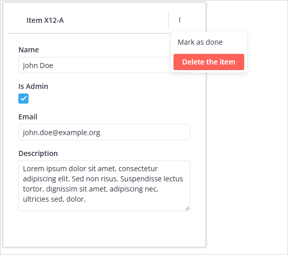
Creating an Action Menu in the toolbar
import { Editor } from "@svar-ui/react-editor";

const buttonClick = (id) => {
  alert(`Action: ${id}`);
};

const topBar = {
  items: [
    {
      comp: "label",
      spacer: true,
      text: "Item X12-A",
    },
    { comp: "separator" },
    {
      icon: "wxi-dots-v",
      collapsed: true,
      layout: "column",
      items: [
        {
          id: "done",
          comp: "item",
          text: "Mark as done",
          handler: () => buttonClick("done"),
        },
        {
          id: "delete",
          comp: "button",
          type: "danger",
          text: "Delete the item",
          handler: () => buttonClick("delete"),
        },
      ],
    },
  ],
};

export default function Example() {
  return <Editor topBar={topBar} />;
}
This configuration introduces an action menu within the top toolbar. The menu consists of a labeled item, a separator, and a dropdown menu activated by an icon. The dropdown contains options like "Mark as done" and "Delete the item," each with a specific handler function. This is particularly useful for providing contextual actions related to the editor's content or state without cluttering the toolbar.
Related sample: Toolbar values