Applying display modes
Display options
The Editor widget can be displayed in various ways to suit different interface designs and user interaction needs. It can appear as an inline form, a modal dialog, or a sidebar panel. The sidebar panel layout further supports a single-column or two-column arrangement for organizing inputs.
Displaying the Editor as an inline form
import { Editor } from "@svar-ui/react-editor";

const items = [ /* editor config */ ];

<Editor items={items} placement="inline" />
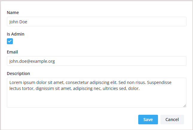
The inline form placement integrates the editor directly into the page content. This option is suitable for scenarios where the editor needs to be part of a continuous workflow without interrupting the user's navigation. It is often used in dashboard or management views where the editor is seamlessly embedded.

Displaying the Editor as a modal dialog
import { Editor } from "@svar-ui/react-editor";

const items = [ /* editor config */ ];

<Editor items={items} placement="modal" />
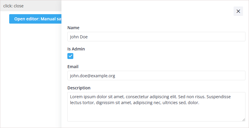
The modal dialog placement opens the editor as a centered overlay. This approach is ideal when the editing process requires the user's full attention and should not be mixed with other page elements. It is commonly used for creating or editing important records where focus and isolation are necessary.
Related sample: Modal Editor
Displaying the Editor as a sidebar panel
import { Editor } from "@svar-ui/react-editor";

const items = [ /* editor config */ ];

<Editor items={items} placement="sidebar" />
The sidebar panel placement attaches the editor to the side of the screen. This layout is effective for workflows where the editor is secondary to the main content but still needs to be accessible. It works well in applications where users perform tasks like reviewing details or making quick edits while keeping the main context visible.
Related sample: Sidebar Editor
Displaying the Editor in two columns
column?: "left" | "right"
import { Editor } from "@svar-ui/react-editor";

const items = [
  { comp: "text", key: "name", label: "Name", column: "left" },
  {
    comp: "textarea",
    key: "descr",
    label: "Description",
    column: "left", // move to left column
  },
  { comp: "checkbox", key: "admin", label: "Is Admin" }
];

<Editor items={items} values={data} layout="columns" />
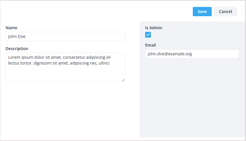
The two-column layout organizes inputs into distinct left and right sections within the sidebar. This configuration is useful when there are multiple inputs, and grouping them visually helps users understand and navigate the form more efficiently. For example, key details can be placed in the left column while supplementary options appear in the right column.
Related sample: Modal Editor with columns