Rendering input controls
Field rendering
The editor widget provides functionality for rendering various input controls. These controls include basic input types, advanced components, and specialized widgets like comments and task lists. Each control can be customized with labels, keys, and additional properties to suit specific use cases.
Rendering a color select control in the Editor
Import ColorSelect control from @svar-ui/react-core and register it as Editor item:
import { Editor, registerEditorItem } from "@svar-ui/react-editor";
import { ColorSelect } from "@svar-ui/react-core";

registerEditorItem("colorselect", ColorSelect);

const items = [
  {
    comp: "colorselect",
    key: "name",
    label: "Name"
  }
];

<Editor items={items} />
The color picker control allows users to select a color through a graphical interface. This is ideal for use cases where users need to define a color, such as customizing themes or assigning colors to categories.
Rendering a Date Picker control in the Editor
Import DatePicker control from @svar-ui/react-core and register it as Editor item:
import { Editor, registerEditorItem } from "@svar-ui/react-editor";
import { DatePicker } from "@svar-ui/react-core";

registerEditorItem("datepicker", DatePicker);

const items = [
  {
    comp: "datepicker",
    key: "name",
    label: "Name"
  }
];

<Editor items={items} />
The date picker control enables users to select a date from a calendar interface. It is useful for scenarios like scheduling, deadline setting, or any date-related input.
Rendering Radio Buttons in the Editor
Import RadioButtonGroup control from @svar-ui/react-core and register it as Editor item:
import { Editor, registerEditorItem } from "@svar-ui/react-editor";
import { RadioButtonGroup } from "@svar-ui/react-core";

registerEditorItem("radio-group", RadioButtonGroup);

const items = [
  {
    comp: "radio-group",
    key: "name",
    label: "Name",
    options: [
      {
        value: "s",
        label: "Scorpions",
      },
      {
        value: "m",
        label: "Muse",
      },
    ]
  }
];

<Editor items={items} />
Radio buttons are used to present multiple options to users where only one can be selected. This is suitable for scenarios like selecting preferences or categories.
Rendering a read-only Block in the Editor
This is a built-in control that does not require additional registering.
import { Editor } from "@svar-ui/react-editor";

const items = [
  {
    comp: "readonly",
    key: "name",
    label: "Name"
  }
];

<Editor items={items} />
The read-only block is designed for displaying static information that cannot be edited. It is useful for showing pre-defined or system-generated data.
Rendering a Rich Select control in the Editor
Import RichSelect control from @svar-ui/react-core and register it as Editor item:
import { Editor, registerEditorItem } from "@svar-ui/react-editor";
import { RichSelect } from "@svar-ui/react-core";

registerEditorItem("select", RichSelect);

const items = [
  {
    comp: "select",
    key: "name",
    label: "Name",
    options: [
      { id: 1, label: "High", color: "#DF282F" },
      { id: 2, label: "Medium", color: "#FFC975" },
      { id: 3, label: "Low", color: "#65D3B3" },
    ]
  }
];

<Editor items={items} />
The rich select control allows users to choose from a list of options, with additional properties like colors or icons for better visualization. It is ideal for priority selection or categorization.
Rendering a Slider control in the Editor
Import Slider control from @svar-ui/react-core and register it as Editor item:
import { Editor, registerEditorItem } from "@svar-ui/react-editor";
import { Slider } from "@svar-ui/react-core";

registerEditorItem("slider", Slider);

const items = [
  {
    comp: "slider",
    key: "name",
    label: "Name"
  }
];

<Editor items={items} />
The slider control is used for selecting a value within a predefined range. It is commonly used for settings like volume, brightness, or rating systems.
Rendering Editable Text control in the Editor
This is a built-in control that does not require additional registering.
import { Editor } from "@svar-ui/react-editor";

const items = [
  {
    comp: "text",
    key: "name",
    label: "Name"
  }
];

<Editor items={items} />
Editable text control is a basic input field for entering single-line text. It is suitable for simple data entry like names, titles, or short descriptions.
Rendering a Textarea control in the Editor
This is a built-in control that does not require additional registering.
import { Editor } from "@svar-ui/react-editor";

const items = [
  {
    comp: "textarea",
    key: "name",
    label: "Name"
  }
];

<Editor items={items} />
The textarea control provides a multi-line input field for entering longer text. It is ideal for comments, descriptions, or notes.
Adding Comments to the Editor
Import Comments widget from @svar-ui/react-comments and register it as Editor item:
import { Editor, registerEditorItem } from "@svar-ui/react-editor";
import { Comments } from "@svar-ui/react-comments";

registerEditorItem("comments", Comments);

const users = [
  {
    id: 1,
    name: "John Doe",
    avatar: "https://via.placeholder.com/150",
  },
];

const items = [
  {
    comp: "comments",
    key: "comments",
    label: "Comments",
    users,
    activeUser: 1,
  },
];

const data = {
  comments: [
    {
      id: 1,
      user: 1,
      content: "Greetings, fellow colleagues.",
      date: new Date(),
    },
  ],
};

<Editor items={items} values={data} />
The comments widget allows users to add, view, and manage comments within the editor. It is useful for collaborative workflows or feedback systems, with user identification and timestamps.
Related sample: Comments
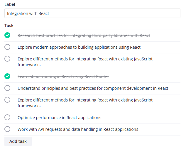
Adding a Task List to the Editor
Import TasList widget from @svar-ui/react-tasklist and register it as Editor item:
import { Editor, registerEditorItem } from "@svar-ui/react-editor";
import { TaskList } from "@svar-ui/react-tasklist";

registerEditorItem("tasks", TaskList);

const items = [
  {
    comp: "tasks",
    key: "task",
    label: "Task",
  },
];

const data = {
  task: [
    {
      id: 1,
      title: "Task 1",
      status: 1,
    },
  ],
};

<Editor items={items} values={data} />
The task list widget integrates task management functionality into the editor. It is suitable for creating and tracking tasks, with fields for task titles and status updates.
Related sample: Tasklist