Organizing form layout
Form structure
The editor widget provides multiple ways to structure and organize the form layout. It supports dividing the form into logical groups, such as batches, sections, or collapsible/accordion-like sections. This flexibility allows developers to create user-friendly interfaces where fields can be grouped and navigated efficiently. Below are the supported configurations:
Dividing form into batches with a single batch visible
The editor allows splitting form fields into separate batches, where only one batch is visible at a time. This is useful for creating step-by-step forms or simplifying complex forms.
import { Editor, registerEditorItem } from "@svar-ui/react-editor";
import { Combo } from "@svar-ui/react-core";

registerEditorItem("combo", Combo);

const items = [
  {
    comp: "text",
    key: "name",
    batch: "main",
    label: "Name",
  },
  {
    key: "theme",
    batch: "cfg",
    comp: "combo",
    label: "Theme",
    options: [
      { id: "light", label: "Light" },
      { id: "dark", label: "Dark" },
    ],
  },
];

export const Example = () => {
  return <Editor items={items} activeBatch="cfg" />;
};
In this example, the activeBatch property is set to "cfg", so only the fields assigned to the "cfg" batch will be displayed. This approach is ideal for forms with multiple logical sections that need to be displayed one at a time.

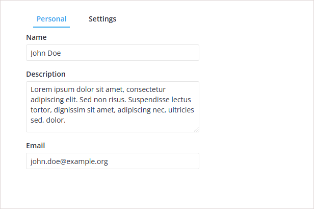
Using tab bar to switch between batches
The editor supports tab-based navigation for switching between batches. This method is suitable for forms with multiple sections where users need to navigate between tabs.
import { useState } from "react";
import { Editor, registerEditorItem } from "@svar-ui/react-editor";
import { Tabs, Combo } from "@svar-ui/react-core";

registerEditorItem("combo", Combo);

const options = [
  {
    id: "main",
    label: "Personal",
  },
  {
    id: "cfg",
    label: "Settings",
  },
];

const items = [
  {
    comp: "text",
    key: "name",
    batch: "main",
    label: "Name",
  },
  {
    key: "theme",
    batch: "cfg",
    comp: "combo",
    label: "Theme",
    options: [
      { id: "light", label: "Light" },
      { id: "dark", label: "Dark" },
    ],
  },
];

export const ExampleTabs = () => {
  const [activeBatch, setActiveBatch] = useState("cfg");

  return (
    <Editor items={items} activeBatch={activeBatch}>
      <Tabs options={options} value={activeBatch} onChange={setActiveBatch} />
    </Editor>
  );
};
Here, the Tabs component is used to allow users to select which batch to view. The activeBatch state and the value/onChange pair ensure the editor displays the appropriate fields based on the selected tab.
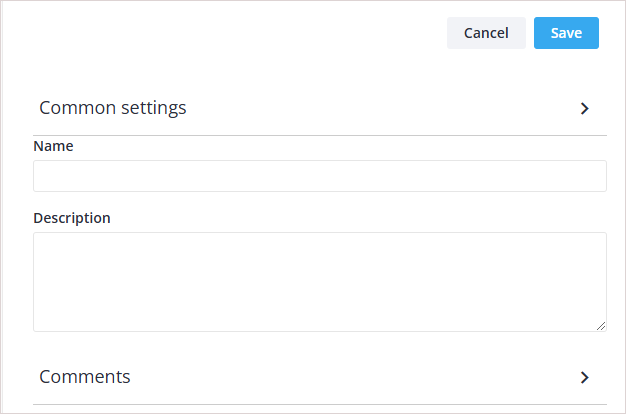
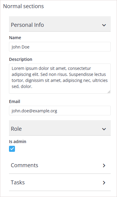
Grouping form fields into collapsible sections
The editor supports organizing fields into collapsible sections, making it easier to manage long forms. Each section can be toggled open or closed.
import { Editor, registerEditorItem } from "@svar-ui/react-editor";
import { Comments } from "@svar-ui/react-comments";

registerEditorItem("comments", Comments);

const items = [
  {
    comp: "section",
    key: "common-section",
    label: "Common settings",
  },
  {
    comp: "text",
    key: "name",
    label: "Name",
  },
  {
    comp: "textarea",
    key: "descr",
    label: "Description",
  },
  {
    comp: "section",
    key: "comments-section",
    label: "Comments",
  },
  {
    comp: "comments",
    key: "comments",
    section: "comments-section",
  },
];

export const ExampleSections = () => {
  return <Editor items={items} />;
};
All fields are rendered within collapsible sections.
Sections like "Common settings" and "Comments" can be collapsed or expanded, allowing users to focus on specific parts of the form.
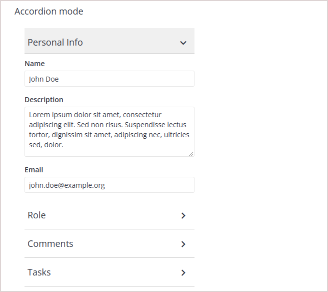
Displaying accordion-like sections
Accordion-style sections allow only one section to be open at a time. When a new section is opened, the previously opened section is automatically collapsed.
import { Editor, registerEditorItem } from "@svar-ui/react-editor";
import { Comments } from "@svar-ui/react-comments";

registerEditorItem("comments", Comments);

const items = [
  {
    comp: "section",
    key: "common-section",
    label: "Common settings",
    sectionMode: "accordion",
  },
  {
    comp: "text",
    key: "name",
    label: "Name",
  },
  {
    comp: "textarea",
    key: "descr",
    label: "Description",
  },
  {
    comp: "section",
    key: "comments-section",
    label: "Comments",
    sectionMode: "accordion",
  },
  {
    comp: "comments",
    key: "comments",
    section: "comments-section",
  },
];

export const ExampleAccordion = () => {
  return <Editor items={items} />;
};
All fields are rendered inside collapsible sections, but only one section can be open at a time.
This configuration is useful for forms where only one section's information needs to be displayed at a time.
Using modal-style sections in the Editor
Modal sections hide other fields when opened, replacing the top-level fields with the content of the selected section. This is useful for focusing on a specific set of inputs.
import { Editor, registerEditorItem } from "@svar-ui/react-editor";
import { Comments } from "@svar-ui/react-comments";

registerEditorItem("comments", Comments);

const items = [
  {
    comp: "text",
    key: "name",
    label: "Name",
  },
  {
    comp: "textarea",
    key: "descr",
    label: "Description",
  },
  {
    comp: "section",
    key: "comments-section",
    label: "Comments",
    sectionMode: "exclusive",
  },
  {
    comp: "comments",
    key: "comments",
    section: "comments-section",
  },
];

export const ExampleModalSections = () => {
  return <Editor items={items} />;
};
Fields in sections are hidden by default. Clicking on a section replaces the top-level fields with the section's content.
<Editor items={items} />
This approach is ideal for forms where sections need to take full focus, reducing distractions from other fields.
Mixing fields and sections in the Editor
The editor allows combining always-visible fields with collapsible sections. This is useful when some fields need to remain accessible at all times.
import { Editor, registerEditorItem } from "@svar-ui/react-editor";
import { Comments } from "@svar-ui/react-comments";

registerEditorItem("comments", Comments);

const items = [
  {
    comp: "text",
    key: "name",
    label: "Name",
  },
  {
    comp: "textarea",
    key: "descr",
    label: "Description",
  },
  {
    comp: "section",
    key: "comments-section",
    label: "Comments",
  },
  {
    comp: "comments",
    key: "comments",
    section: "comments-section",
  },
];

export const ExampleMixed = () => {
  return <Editor items={items} />;
};
While name and descr fields are always visible, fields below are rendered inside a collapsible section.
<Editor items={items} />
This configuration is appropriate for forms where certain critical fields must remain accessible, while others can be grouped into collapsible sections.

Related sample: Layouts