DataGrid User Interface Overview
Main UI elements
This section describes the Grid GUI.
Default view
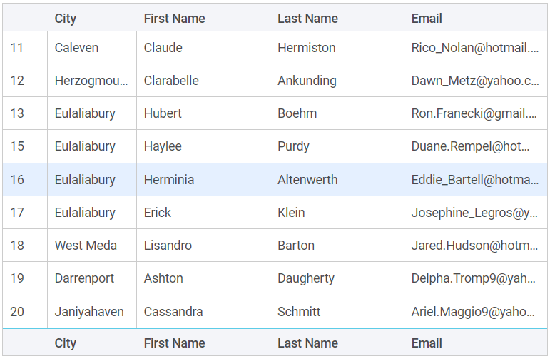
A basic table is made up of rows and columns with headers and footers. The selected row is highlighted.
Navigation keys
Down/Up Arrows- use to move to the row below/above (default)Shift + Left click- use to select the range of rows (if multiple selection is enabled via API)Ctrl/Meta + Left click- use to select multiple rows (if multiple selection is enabled via API)
Navigation to manage cells' focus:
-
Up Arrow: the cell above gets focus; if the value ofselectproperty is set to "row", then the row above is selected (if the inline editor is not open) -
Down Arrow: the cell below gets focus; if the value ofselectproperty is set to "row", then the row below is selected (if the inline editor is not open) -
Right Arrow: the cell on the right gets focus (if the inline editor is not open) -
Left Arrow: the cell on the left gets focus (if the inline editor is not open) -
Tab: if the inline editor is open for the current cell, then the next inline editor will open. If the current cell has focus, it loses it -
Shift + Tab: if the inline editor is open for the current cell, then the previous inline editor will open. if there is focus on the cell, it loses it -
Enter: for the tree table, if the treetoggle cell is in focus, the row opens or closes -
Escape: if the inline editor is open, the editor is closed and this cell gets the focus -
F2: opens the inline editor for the cell in focus -
Home: the cell of the same row of the first column gets the focus (if the inline editor is not open) -
End: the cell of the same row of the last column gets the focus (if the inline editor is not open) -
Ctrl/Meta + Home: the cell of the first row of the first column gets the focus (if the inline editor is not open) -
Ctrl/Meta + End: the cell of the last row of the last column gets the focus (if the inline editor is not open)
Columns resizing
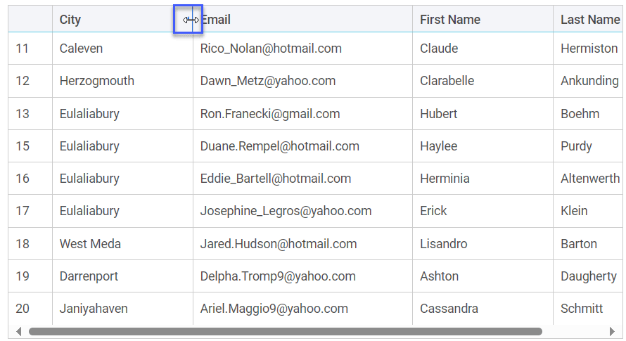
When columns resizing is enabled via the widget API, you can change the column size by dragging the border of its header cell:
Data sorting
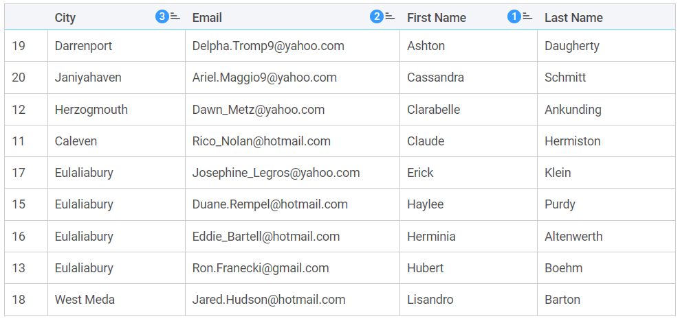
If data sorting is activated via the widget API, you can sort data by a single column clicking a column header.
For multiple sorting you should hold the Ctrl/Meta key and click column headers in the order you want to apply sorting, in this case the sort index appears in the column header.
Context menu
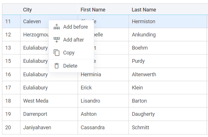
The context menu, if added via the widget API, appears with the right click. It has the following default options:
- Add before - to add a row before the selected one
- Add after - to add a row after the selected one
- Copy - to copy&paste the selected row
- Delete - to delete the selected row
Editors
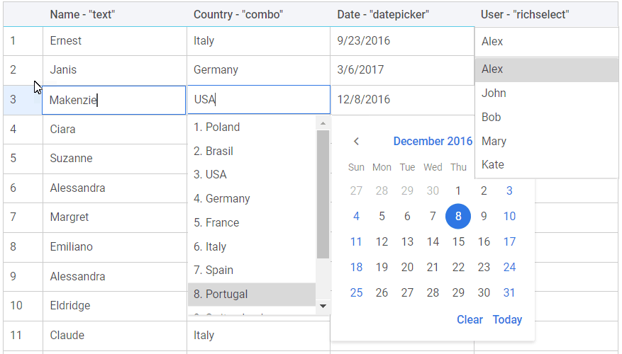
The widget provides a number of predefined editors that you can apply to a column cell: text, combo, richselect, datepicker.
Tree table
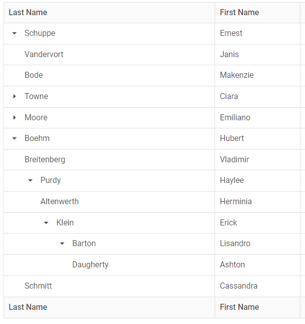
The widget allows displaying data in a hierarchical format with collapsible rows:
Example with more features
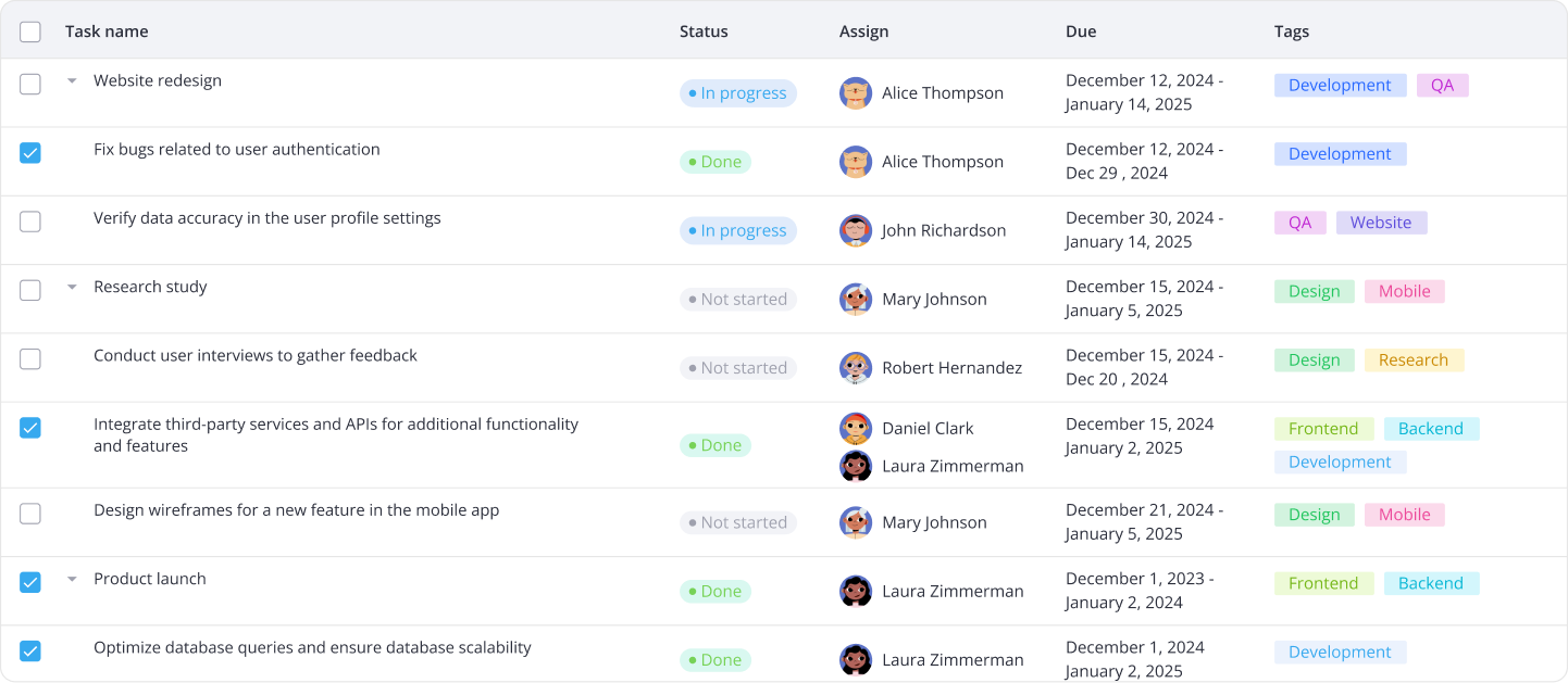
If you apply the functionality provided by the widget API you can get a good-looking table with more features as the one in the image below: