Using SVAR React Gantt in Next.js
This tutorial walks you through integrating the SVAR Gantt chart component into a Next.js application.
The complete source code is available at github.com/svar-widgets/react-gantt-nextjs, this tutorial code covers the basic branch of the repo.
Creating the project
Let's start by creating a new Next.js application:
npx create-next-app@latest my-gantt-app --typescript --tailwind --app --src-dir
cd my-gantt-app
Now we can add the SVAR Gantt package:
npm install @svar-ui/react-gantt
Adding the Gantt component
With the package installed, let's import the Gantt widget. We'll need a client component for this since Gantt requires browser APIs. Let's create src/app/components/GanttChart.tsx:
"use client";

import { Gantt } from "@svar-ui/react-gantt";

const tasks = [
  {
    id: 1,
    text: "Project Planning",
    start: new Date(2024, 0, 1),
    end: new Date(2024, 0, 10),
    progress: 100,
    type: "summary",
    open: true,
  },
  {
    id: 2,
    text: "Requirements Gathering",
    start: new Date(2024, 0, 1),
    end: new Date(2024, 0, 5),
    progress: 100,
    parent: 1,
  },
  // ... more tasks
];

const links = [
  { id: 1, source: 2, target: 3, type: "e2s" },
];

const scales = [
  { unit: "month", step: 1, format: "%M %Y" },
  { unit: "week", step: 1, format: "Week %w" },
];

export default function GanttChart() {
  return (
    <div style={{ height: "600px", width: "100%" }}>
      <Gantt tasks={tasks} links={links} scales={scales} />
    </div>
  );
}
Let's also update the page to display our component. In src/app/page.tsx:
import GanttChart from "./components/GanttChart";

export default function Home() {
  return (
    <div className="h-screen flex flex-col">
      <header className="p-6">
        <h1 className="text-3xl font-bold">My Gantt Chart</h1>
      </header>
      <main className="flex-1 min-h-0">
        <GanttChart />
      </main>
    </div>
  );
}
Run npm run dev to check the component renders. Now we need to add proper styling.
Adding styles
To add styles, import the component’s CSS into GanttChart.tsx.
"use client";

import { Gantt } from "@svar-ui/react-gantt";
import "@svar-ui/react-gantt/all.css";
Note that the Gantt package provides two CSS files: all.css and style.css.
all.cssis the safest option, as it includes all styles required for the Gantt componentstyle.cssdoesn't include styles for other SVAR widgets that are used inside of Gantt (such like a Grid, Editors, etc.), it can be used to optimize the bundle size.
Let's refresh the page. Now to add the look and feel to the application, we need to add the theme.
Adding the theme
SVAR components use a theme provider for visual styling. We need to wrap our Gantt with the Willow theme:
"use client";

import { Gantt, Willow } from "@svar-ui/react-gantt";
import "@svar-ui/react-gantt/style.css";

// ... tasks, links, scales definitions ...

export default function GanttChart() {
  return (
    <div style={{ height: "600px", width: "100%" }}>
      <Willow>
        <Gantt tasks={tasks} links={links} scales={scales} />
      </Willow>
    </div>
  );
}
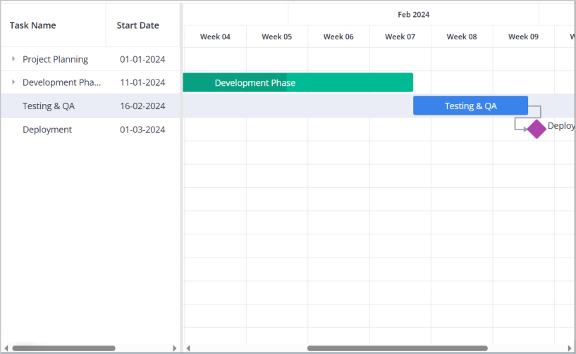
Now we have styled headers, colored task bars, proper visual feedback.
Fixing the layout
When using a flexible layout where the Gantt component is expected to fill the available space (instead of using a fixed height such as 600px), additional layout considerations are required. Let's try changing the container to use percentage height:
<div style={{ height: "100%", width: "100%" }}>
  <Willow>
    <Gantt tasks={tasks} links={links} scales={scales} />
  </Willow>
</div>
In this configuration, the Gantt component may collapse or fail to occupy the intended space. The issue here is that the theme wrapper needs explicit height. Let's add this to globals.css:
.wx-theme {
  height: 100%;
}
The .wx-theme class is used internally by SVAR's theme providers. Without explicit height, it defaults to content-based sizing, which breaks the percentage-based layout chain.
For a full-page layout, we should also ensure html and body cooperate:
html,
body {
  height: 100%;
  margin: 0;
}

.wx-theme {
  height: 100%;
}
Now the Gantt properly fills its container.
Understanding the hydration warning
With everything working nicely, you might notice a warning appearing in the browser console:
A tree hydrated but some attributes of the server rendered HTML
didn't match the client properties.
This behavior may appear concerning, but it does not indicate a defect: the Gantt component calculates its layout based on container dimensions. During server-side rendering, there's no actual DOM to measure — the server has no idea about your browser window size. So the initial render uses default values. When React hydrates on the client, it recalculates with real dimensions and gets different values.
React notices this mismatch and warns you about it. The component itself renders correctly, and the client-side calculations correctly replace the initial server-side values.
Two ways to handle the warning
Option 1: Ignore the warning
The component works fine either way. You'll see a brief style adjustment as dimensions are recalculated, but the end result is correct. If a console warning doesn't bother you, this is the simpler path.
Option 2: Client-only rendering
If you'd prefer a clean console, we can render the Gantt only after mounting:
"use client";

import { useState, useEffect } from "react";
import { Gantt, Willow } from "@svar-ui/react-gantt";
import "@svar-ui/react-gantt/style.css";

// ... tasks, links, scales definitions ...

export default function GanttChart() {
  const [mounted, setMounted] = useState(false);

  useEffect(() => {
    setMounted(true);
  }, []);

  if (!mounted) {
    return <div style={{ height: "100%", width: "100%" }} />;
  }

  return (
    <div style={{ height: "100%", width: "100%" }}>
      <Willow>
        <Gantt tasks={tasks} links={links} scales={scales} />
      </Willow>
    </div>
  );
}
This renders an empty placeholder during SSR. Once the client mounts, the actual Gantt appears. No mismatch, no warning — there's simply nothing server-rendered to compare against.
So two behaviors are possible: a brief empty state before Gantt is fully initialized, or the warning with immediate (slightly adjusting) content. Pick whichever suits your preferences.
Enabling edit operations
So far our Gantt displays tasks, but users can't edit them. Let's add an editor panel that allows modifying task properties.
The Gantt component exposes its API through an init callback. We can capture this reference and pass it to an Editor component:
"use client";

import { useState, useEffect } from "react";
import { Gantt, Willow, Editor } from "@svar-ui/react-gantt";
import "@svar-ui/react-gantt/all.css";

// ... tasks, links, scales definitions ...

export default function GanttChart() {
  const [mounted, setMounted] = useState(false);
  const [api, setApi] = useState(null);

  useEffect(() => {
    setMounted(true);
  }, []);

  if (!mounted) {
    return <div style={{ height: "100%", width: "100%" }} />;
  }

  return (
    <div style={{ height: "100%", width: "100%" }}>
      <Willow>
        <Gantt tasks={tasks} links={links} scales={scales} init={setApi} />
        {api && <Editor api={api} />}
      </Willow>
    </div>
  );
}
A few things happening here:
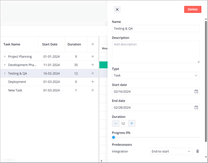
init={setApi}— When the Gantt initializes, it passes its API object to our state setter{api && <Editor ... />}— The Editor requires the API to function, so we only render it once the API is availableEditor— Renders a side panel that appears when a task is selected, allowing users to modify its properties
Now dbl-clicking on a task opens an editor panel where users can change the task name, dates, progress, and other properties.
Next steps
At this point you have a working Gantt chart with task editing. Here's where to go from here depending on what you want to build.
Working with task data — We used a simple array of tasks in this tutorial, but real applications need more. The tasks API reference covers all available task properties including custom fields, duration-based tasks, and handling different task types.
Setting up dependencies — Task links define how work flows through your project. The links API reference explains all dependency types and how to configure lag time between connected tasks.
Customizing the editor — The default editor works well, but you might want to add custom fields or change the layout. The editor guide shows how to configure fields, validation, and create custom editor layouts.
Formatting dates and scales — The %M %Y format we used is just the beginning. The localization guide has the complete list of format specifiers and explains how to set up different locales.