SVAR Svelte DataGrid Overview
SVAR Svelte DataGrid is designed to be part of your Svelte application for displaying data in a powerful table with rows and columns. Data sorting, advanced filtering and editing options, pagination and dynamic data loading are only a few of the various possibilities provided by the DataGrid API. The component also offers TypeScript support with built-in type definitions.
License: MIT
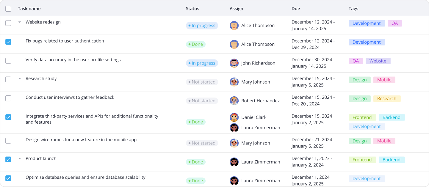
The image below shows DataGrid with custom styles applied:
Key features
SVAR Svelte DataGrid provides a set of advanced features, making it suitable for complex, data-heavy UIs.
Data operations
- In-cell editing with built-in editors
- Integration with Editor
- Filtering via filters in column headers
- Advanced filtering with Filter integration
- Single and multi-column sorting
- Single and multiple row selection
- Row reordering
- Context menu for common actions
- Undo/redo
- API to listen, intercept and execute data operations
Data presentation
- Cell templates
- Custom HTML content in cells
- Tooltips
- Tree data
- Pagination
- Overlay for empty / loaded data
Configuration & layout
- Colspans and rowspans in header and footer
- Collapsible column groups
- Pinned columns (to the left)
- Hide/show columns
- Column resizing with drag-and-drop
- Auto-sizing of columns to header or cell content
- Auto-sizing of rows to content
- Responsive mode
- Localization
- Light and dark themes
- Styling with CSS variables
Backend and export
- Export to CSV
- Print API
- RestDataProvider to integrate with backend
Performance
- Virtual scrolling for rows and columns
- Dynamic loading of data while scrolling
Accessibility
- WAI-ARIA compliance
- Keyboard navigation
Next steps
- Read getting started guide
- Browse API documentation
- Explore DataGrid demos with code examples references on GitHub