SVAR Svelte Editor Docs - Overview
SVAR Svelte Editor component allows the implementation of an editor form as a standalone widget or as part of a sidebar panel. It supports easy integration of all SVAR Svelte Core form controls, including Comments and Tasklist components. The component also offers TypeScript support with built-in type definitions.
You can integrate the Editor as an edit form for any structured data, attaching it to any UI element on a page and configuring it to your application needs. Key use cases include:
- Edit structured data with multiple field types (user profiles, info cards, product details, table rows)
- Provide inline editing without page navigation
- Create contextual edit forms that appear as sidebars or popups
- Integrate editing capabilities into existing UI workflows
License: MIT
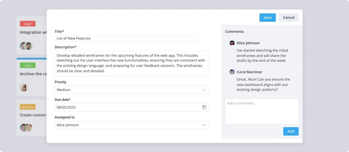
The image below demonstrates one of the possible ways you can configure the Editor component using its API:
Key features
Configuration
- Popup, sidebar, or inline display modes
- Integration with SVAR Core Controls (text input, checkboxes, date picker, etc.)
- Configurable toolbar positioning (top or bottom)
- One or two columns layout
- Splitting form fields into separate batches
- Collapsible form sections
- Accordion-style sections
- Modal-style sections
- Light and dark themes
- Localization
Form behavior
- Customizable form validation
- Required fields support
- Saving changes automatically or on user action
Next steps
- Read getting started guide
- Browse API documentation
- Explore Editor demos with code examples references on GitHub