Installation and initialization
Installation
To install the Svelte Editor library, you should run the following command:
//npm
npm install @svar-ui/svelte-editor

//yarn
yarn add @svar-ui/svelte-editor
The package migrated from wx-svelte-editor to @svar-ui/svelte-editor. We continue publishing wx-svelte-editor until the Svelte SVAR 3.0 update
Initialization
The editor widget provides flexible options for initialization, allowing developers to define input fields, prefill values, and set the widget in editable or read-only modes. It supports a wide variety of configurations to suit diverse use cases.
Initializing the Editor widget
Editor has built-in controls which are "text", "textarea, "checkbox", "section" and "readonly".
To use other controls, you need to import them from @svar-ui/svelte-core library and register them as Editor items with the corresponding registerEditorItem helper:
<script>
   import { Editor } from "@svar-ui/svelte-editor";

   const items = [
      { comp: "text", key: "name", label: "Name" },
      {
        comp: "textarea",
        key: "descr",
        label: "Description"
      },
      { comp: "checkbox", key: "admin", label: "Is Admin" }
   ];

   const values = {
      name: "John Doe",
      descr: "Lorem ipsum dolor sit amet",
      admin: true,
      role: "admin"
   };
</script>

<Editor {items} {values} />
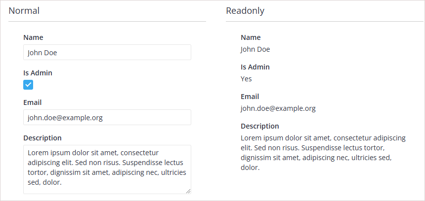
This example demonstrates how to initialize the editor widget with a list of input fields and their corresponding values. The items array defines the structure of the form, where each object specifies the input type (comp), a unique key (key), and a user-friendly label (label). The values object provides initial values for these inputs, matched by their keys. This setup is useful for creating a basic form with preloaded data, such as when editing an existing record.
Initializing the Editor widget in read-only mode
<script>
   import { Editor } from "@svar-ui/svelte-editor";

   const items = [
      { comp: "text", key: "name", label: "Name" },
      {
        comp: "textarea",
        key: "descr",
        label: "Description",
      },
      { comp: "checkbox", key: "admin", label: "Is Admin" }
   ];
   const values = {
      name: "John Doe",
      descr: "Lorem ipsum dolor sit amet",
      admin: true,
      role: "admin"
   };
</script>

<Editor {items} {values} readonly={true} />
This example illustrates how to initialize the editor widget in read-only mode. The readonly property is set to true, which prevents users from modifying the input fields. The items array and values object are defined in the same way as in the editable mode. This configuration is ideal for scenarios where the form data needs to be displayed without allowing edits, such as in a review or audit interface.
Full init code
To see the widget in action, add some items to the widget.
<script>
  import { Editor, Willow } from "@svar-ui/svelte-editor";

  const items = [
   { comp: "text", key: "name", label: "Name" },
   { comp: "text", key: "descr", label: "Description" },
   { comp: "text", key: "role", label: "Role" }
  ];

  const values = {
   name: "John Doe",
   descr: "Lorem ipsum dolor sit amet",
   role: "admin"
  };
</script>

<Willow>
  <Editor {items} {values} />
</Willow>
To ensure correct initialization, it's recommended to apply a theme at the top level of your application. If you use the Editor component standalone, do not forget to wrap it into a theme (Willow is applied in the example above).
Visual themes
The widget is provided in two visual styles - Light and Dark, controlled by the theme tag.
<script>
import { Willow, WillowDark } from "@svar-ui/svelte-core";
</script>

<!-- Light -->
<Willow>
  <Editor />
</Willow>

<!-- Dark -->
<WillowDark>
  <Editor />
</WillowDark>