DateRangePicker
The DateRangePicker control combines an input text field with a RangeCalendar which allows displaying a date range selected by a user in the input. You can align the popup with calendars relative to the input, set the width of the popup, apply the desired date format, use a placeholder in the input, display a selected date range and hide calendar buttons.
Related resources
- Get the widget by installing the
@svar-ui/svelte-corepackage. - Check DateRangePicker API Reference to see the list of configuration properties and events.
- Explore the samples to visualize the available features.
Initialization
To create a DateRangePicker instance on a page, you need to complete two steps:
- import the source file of the control on a page:
<script>
  import { DateRangePicker } from "@svar-ui/svelte-core";
</script>
- apply the
<DateRangePicker>tag to initialize a date range picker:
<DateRangePicker />
A default date range picker is initialized with no date range selected.
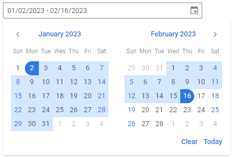
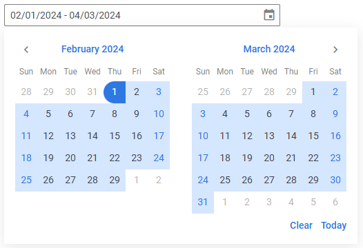
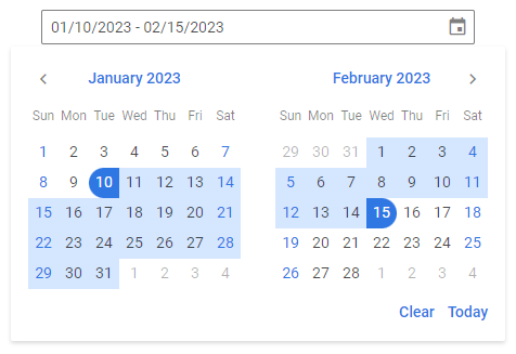
Setting the value
You can select a particular date range in calendars and show it in the input of a date range picker. Use the value property for this purpose. The value of this property is an object with the start and end dates of a range. Set each date as a Date object.
<script>
  const date = {
    start: new Date(2024, 1, 1),
    end: new Date(2024, 3, 3)
  };
</script>

<DateRangePicker value={date} />
The specified date range will appear in the date range picker input and the days of the range will be highlighted in the calendars, if visible.
Related sample: DateRangePicker
Getting the current value
You can get the current value of the DateRangePicker control. For this, you need to:
- declare a variable that will contain the control's value (it may contain the initial value):
<script>
  import { DateRangePicker } from "@svar-ui/svelte-core";

  let daterange= {
    start: new Date(2020, 1, 1),
    end: new Date(2021, 3, 3),
  };
</script>
- bind the variable to the
valueproperty of the control:
<DateRangePicker bind:value={daterange} />
If the name of the variable matches its value, you can use the shorthand while binding the property:
<script>
  import { DateRangePicker } from "@svar-ui/svelte-core";

  let value;
</script>

<DateRangePicker bind:value />
After that the value assigned to the bound variable will be updated on each change of the date range.
Catching the change of the selected date
In case you need to catch the change of the selected date range, you can do it by handling the change event. Inside the event you can get the newly selected date range in the following way:
<script>
  function handleSelect({value}) {
    console.log(value);
      // an object with the start and end dates of the selected range
  }
</script>

<DateRangePicker onchange={handleSelect} />
The handler function of the change event takes an object with the new value of the date range picker (start and end dates of the selected range).
Related sample: DateRangePicker
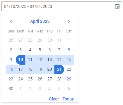
Setting the number of calendars
A default DateRangePicker has 2 calendars for selection of a date range. You can also use one month to select a date range by specifying the months property with the 1 value.
<DateRangePicker months={1} />
Related sample: DateRangePicker
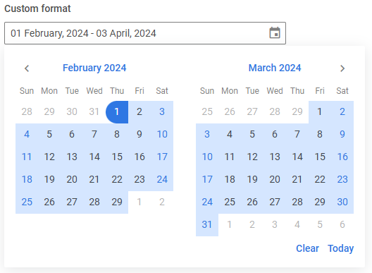
Setting the date format
The default format of displaying a date in DateRangePicker is "%m/%d/%Y". You can change it and set your own format with the help of the format property.
<DateRangePicker value={date} format="%d %F, %Y" />
SVAR DateRangePicker uses the date-fns library for handling dates. You can find format specifications in the corresponding article.
Related sample: DateRangePicker
Configuring the dropdown
You can configure the behavior and appearance of the date range picker dropdown via the dropdown property.
By default, the dropdown is attached to the document body and rendered above the other elements of the application. If you use a custom popupContainer, the dropdown will be attached to it instead. To render the dropdown inline — inside the same HTML element as the input — set the inline option to true:
<DateRangePicker dropdown={{ inline: true }} />
The popup with calendars is automatically aligned to the bottom left of the input by default. You can control its alignment with the align option:
<DateRangePicker dropdown={{ align: "center" }} />
The width of the popup adjusts to the calendars inside it by default. If needed, you can change the popup's width using the width option. It works in the same way as the width CSS property:
<DateRangePicker dropdown={{ width: "100%" }} />
When the dropdown is in the default (non-inline) mode and the date range picker is placed inside a scrollable container, you can use the trackScroll option to automatically close the dropdown when the container is scrolled. This prevents the dropdown from staying open after the input has scrolled out of view:
<Field>
  <div style="height: 150px; overflow: auto;">
    <div style="height: 700px;">
      <DateRangePicker dropdown={{ trackScroll: true }} />
    </div>
  </div>
</Field>
Related article: dropdown
Related sample: DateRangePicker
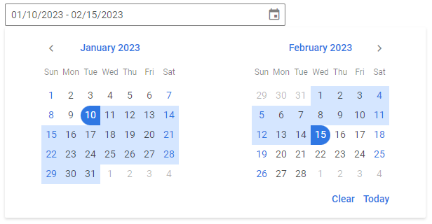
Configuring buttons
Hiding the Today and Clear buttons
The calendars of DateRangePicker have the Today and Clear buttons in the lower part. If needed, you can switch those buttons off. Set the buttons property to false to achieve this purpose:
<DateRangePicker buttons={false} />
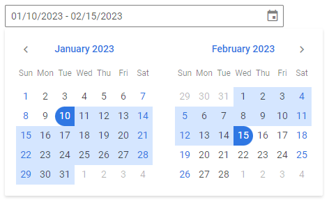
Enabling individual buttons
Instead of showing all default buttons, you can display only the specific buttons you need — "clear", "today", or "done". To do this, pass an array to the buttons property containing the names of the buttons you want to enable.
For example, to display only the Clear and Done buttons:
<DateRangePicker value={date} buttons={["clear", "done"]} />
Related sample: DateRangePicker
Setting the date format
The default format of displaying a date in the DateRangePicker input in the EN locale is "%m/%d/%Y". You can change it and set your own format with the help of the format property. Set the value of this property as a string with the format or as a function that returns a formatted string.
<DateRangePicker value={date} format="%d %F, %Y" />
Check the characters available for specifying the date format.
Related sample: DateRangePicker
You can also specify the date format from the locale.
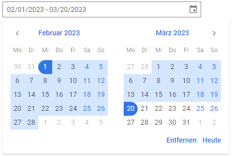
Localizing the calendars
You can translate the labels of the calendars used inside the DateRangePicker control. Read the detailed information at the Calendar page. Take the following simple steps:
- import the Locale object:
<script>
  import { DateRangePicker, Locale } from "@svar-ui/svelte-core";
</script>
- include the necessary locales package on a page:
<script>
  import { DateRangePicker, Locale } from "@svar-ui/svelte-core";
  import { de } from "@svar-ui/core-locales";
</script>
- wrap the DateRangePicker tag in the
<Locale>tags and use thewordsproperty to set the locale:
<script>
  import { DateRangePicker, Locale } from "@svar-ui/svelte-core";
  import { de } from "@svar-ui/core-locales";
</script>

<Locale words={de}>
  <DateRangePicker />
</Locale>
Setting the date format from the locale
You can localize the format of displaying dates in the input of the DateRangePicker control.
To provide the desired format, you should:
- wrap a daterangepicker instance in the
<Locale>tag and set thewordsproperty for it - specify the formats object inside the
wordsobject and define the dateFormat property with the necessary date format set as a string. Check the characters available for specifying the date format
Note that dateFormat set in the <Locale> tag will be applied for all the controls specified within this tag. Thus, this way is useful for setting the date format for the whole app or a form that contains several date range pickers. If you need to modify the date format of a separate date range picker, you can use the format property.
For example:
<script>
  import { DateRangePicker, Locale } from "@svar-ui/svelte-core";
</script>

<Locale
  words={{
    formats: { dateFormat: "%d %F, %Y" },
  }}
>
  <DateRangePicker value={date} />
</Locale>
Customizing position of the icon
The "wxi-calendar" icon is placed in the rightmost part of the date range picker input by default. You can put the icon in the leftmost part of the input (before the selected date range) with the help of the css property of the control. Specify the name of the icon as "wx-icon-left":
<DateRangePicker value={date} css="wx-icon-left" />
Related sample: DateRangePicker
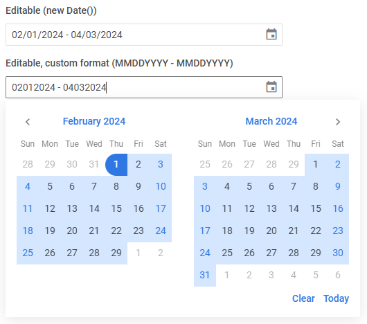
Setting the editable state
If needed, you can make DateRangePicker editable using the editable property. By default the property is disabled. You can either enable it by setting the value to true (or use the property without a value):
<DateRangePicker editable={true} />
Or specify a custom function to apply a custom editable format, for example:
<script>
  function parseDate(string) {
    const p = string.match(/(..)(..)(.+)/);
    return p ? new Date(p.slice(1, 4).join("/")) : null;
  }
</script>

<Field label="Editable custom format (MMDDYYYY)">
  <DateRangePicker editable={parseDate} format={"%m%d%Y"} />
</Field>
Related sample: DateRangePicker
Adding the Clear button
The Clear button allows clearing the selected option from the control's input.

To add the Clear button into the input, use the clear property:
<DateRangePicker clear />
Related sample: DateRangePicker
Adding a title
A title is a tooltip text that appears on hovering the mouse cursor over the input and may contain some extra information about the control. Use the title property to add a tooltip for a date range picker:
<DateRangePicker error title="Invalid date" />

Related sample: DateRangePicker
Adding a placeholder for the input
You can add a placeholder inside the date range picker's input. The placeholder can contain some prompting message to make interaction with the control simpler. All you need is to set your message as a value of the placeholder property:
<DateRangePicker placeholder="Select a date range"/>
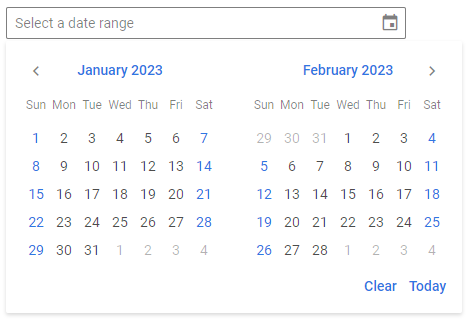
For a placeholder to be visible in the input, a date range picker should be initialized without an initial value.
Setting the disabled state
Whenever you need to render a disabled date range picker, you can do it with the help of the disabled property. You can either set the property to true or set it without any value.
<DateRangePicker disabled={true}/>

//or
<DateRangePicker disabled />

Related sample: DateRangePicker
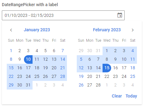
Adding a label
A default date range picker has no label. To add it, you can use the Field component and complete several steps:
- include the Field source file on a page, declare the
<Field>tag and complete it with the necessary props:- add a desired label via the label property
- set the position="left" property, if you want to place the label to the left of the date range picker
<script>
  import { DateRangePicker, Field } from "@svar-ui/svelte-core";
</script>

<Field><DateRangePicker /></Field>
After that, wrap the date range picker into the <Field> tag. The Field component automatically generates an id for the inner control, which creates label-input association.
<Field label="Select a date range">
  <DateRangePicker />
</Field>
Related sample: DateRangePicker
Styling a date range validation error
When you use a date range picker inside a form and a wrong date range value is passed to the control, you can use error styling to show that validation has failed. Once you've set the error property to true (or just specified the property without a value):
<DateRangePicker error={true}/>
the input's border, the selected date range and the calendar icon become red. To make the label red as well, wrap a date range picker into the Field control tags and use the error property of Field:
<script>
  import { DateRangePicker, Field } from "@svar-ui/svelte-core";
</script>

<Field label="Validation error style" error>
  <DateRangePicker error={true}/>
</Field>

Related sample: DateRangePicker