Integrating SVAR DataGrid with Next.js
This guide shows you how to build a Next.js app with a fully styled data grid: sortable columns, inline cell editing, and a sidebar editor for full-row editing. The full code is at github.com/svar-widgets/react-grid-demo-nextjs (the basic branch).
Setting up the project
Create a new Next.js app:
npx create-next-app@latest my-grid-app --typescript --tailwind --app --src-dir
cd my-grid-app
Then add the Grid package:
npm install @svar-ui/react-grid
Adding the Grid as a client component
Grid uses browser APIs, so it has to be a client component. Create src/app/components/DataGrid.tsx:
"use client";

import { Grid } from "@svar-ui/react-grid";

const data = [
  { id: 1, firstName: "Ernest", lastName: "Schuppe", email: "Leora13@yahoo.com", city: "Amieshire", score: 70 },
  { id: 2, firstName: "Jazmyne", lastName: "Roberts", email: "Tristian.Green@gmail.com", city: "South Vivian", score: 85 },
  // ... more rows
];

const columns = [
  { id: "id", width: 60, header: "ID" },
  { id: "firstName", header: "First Name", width: 150 },
  { id: "lastName", header: "Last Name", width: 150 },
  { id: "email", header: "Email", width: 220 },
  { id: "city", header: "City", width: 150 },
  { id: "score", header: "Score", width: 100 },
];

export default function DataGrid() {
  return <Grid data={data} columns={columns} />;
}
Then import the component in src/app/page.tsx:
import DataGrid from "./components/DataGrid";

export default function Home() {
  return (
    <div>
      <header className="p-6">
        <h1 className="text-3xl font-bold">My DataGrid</h1>
      </header>
      <main>
        <DataGrid />
      </main>
    </div>
  );
}
Run npm run dev. Data appears in the cells, but without borders, padding, or visual structure.
Adding CSS
The package ships two CSS files:
all.css— grid styles plus styles for sub-components like editors and pagersstyle.css— grid styles only, useful if you import sub-component styles separately and want a smaller bundle
To add styles, import the Grid stylesheet in DataGrid.tsx:
"use client";

import { Grid } from "@svar-ui/react-grid";
import "@svar-ui/react-grid/all.css";
Refresh the page. Grid now has borders and structure, but no colors or visual hierarchy.
Applying the theme
Wrap the Grid with Willow to add styled headers, alternating row colors, and hover effects:
"use client";

import { Grid, Willow } from "@svar-ui/react-grid";
import "@svar-ui/react-grid/all.css";

// ... data, columns definitions ...

export default function DataGrid() {
  return (
    <Willow>
      <Grid data={data} columns={columns} />
    </Willow>
  );
}

WillowDark is available for dark mode.
Handle the hydration warning
Open the browser console after the page loads and you may see:
A tree hydrated but some attributes of the server rendered HTML
didn't match the client properties.
This warning is expected. Grid calculates layout from container dimensions. During SSR, there's no DOM to measure, so the server renders with default values. The client corrects them on mount, which triggers the warning. The page renders correctly in both cases.
There are two options to handle this: ignore the warning or render the component client-only.
Ignore it
The component works as expected. A brief style adjustment on mount is the only visible effect.
Render client-only
To suppress the warning, skip SSR for the Grid entirely. The following snippet renders nothing on the server, so there's nothing to compare against on mount:
"use client";

import { useState, useEffect } from "react";
import { Grid, Willow } from "@svar-ui/react-grid";
import "@svar-ui/react-grid/all.css";

// ... data, columns definitions ...

export default function DataGrid() {
  const [mounted, setMounted] = useState(false);

  useEffect(() => {
    setMounted(true);
  }, []);

  if (!mounted) return null;

  return (
    <Willow>
      <Grid data={data} columns={columns} />
    </Willow>
  );
}
The result is a brief empty space on load instead of instant content with a console warning.
Enable column sorting
Add sort: true to any column to make it sortable. The following snippet enables sorting on most columns:
const columns = [
  { id: "id", width: 60, header: "ID", sort: true },
  { id: "firstName", header: "First Name", width: 150, sort: true },
  { id: "lastName", header: "Last Name", width: 150, sort: true },
  { id: "email", header: "Email", width: 220 },
  { id: "city", header: "City", width: 150, sort: true },
  { id: "score", header: "Score", width: 100, sort: true },
];
Click a header to sort. Use Ctrl+click (Cmd on Mac) for multi-column sorting.
Enable inline cell editing
Add an editor property to a column to make its cells editable. The available types are "text", "number", "richselect", "combo", "checkbox", and "datepicker". The example below adds text editors to the name, email, and city columns:
const columns = [
  { id: "id", width: 60, header: "ID", sort: true },
  { id: "firstName", header: "First Name", width: 150, sort: true, editor: "text" },
  { id: "lastName", header: "Last Name", width: 150, sort: true, editor: "text" },
  { id: "email", header: "Email", width: 220, editor: "text" },
  { id: "city", header: "City", width: 150, sort: true, editor: "text" },
  { id: "score", header: "Score", width: 100, sort: true },
];
Double-click a cell to edit it.
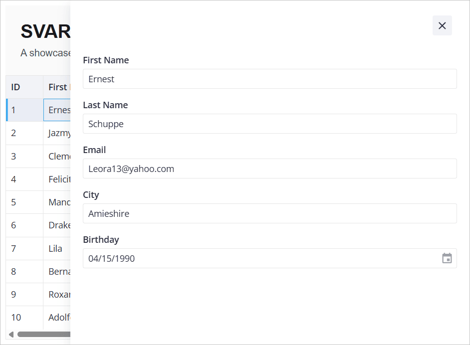
Adding a sidebar editor
For editing a complete row at once, use our Editor component. It renders a sidebar form for the selected row. First, install the extra packages:
npm install @svar-ui/react-editor @svar-ui/react-core
Then connect everything in DataGrid.tsx. The following snippet connects the Grid and Editor so that clicking a row opens it in the sidebar:
"use client";

import { useState, useEffect, useRef, useMemo } from "react";
import type { IColumnConfig, IApi, IRow } from "@svar-ui/react-grid";
import { Grid, getEditorConfig, Willow } from "@svar-ui/react-grid";
import { DatePicker } from "@svar-ui/react-core";
import { Editor, registerEditorItem } from "@svar-ui/react-editor";
import "@svar-ui/react-grid/all.css";

registerEditorItem("datepicker", DatePicker);

const data = [
  { id: 1, firstName: "Ernest", lastName: "Schuppe", email: "Leora13@yahoo.com", city: "Amieshire", score: 70, birthday: new Date(1990, 3, 15) },
  { id: 2, firstName: "Jazmyne", lastName: "Roberts", email: "Tristian.Green@gmail.com", city: "South Vivian", score: 85, birthday: new Date(1985, 7, 22) },
  // ... more rows
];

const columns: IColumnConfig[] = [
  { id: "id", width: 60, header: "ID", sort: true },
  { id: "firstName", header: "First Name", width: 150, sort: true, editor: "text" },
  { id: "lastName", header: "Last Name", width: 150, sort: true, editor: "text" },
  { id: "email", header: "Email", width: 220, editor: "text" },
  { id: "city", header: "City", width: 150, sort: true, editor: "text" },
  { id: "score", header: "Score", width: 100, sort: true },
  { id: "birthday", header: "Birthday", width: 150, editor: "datepicker" },
];

export default function DataGrid() {
  const [mounted, setMounted] = useState(false);
  const api = useRef<IApi | null>(null);
  const [dataToEdit, setDataToEdit] = useState<IRow | undefined>(undefined);
  const items = useMemo(() => getEditorConfig(columns), []);

  useEffect(() => {
    setMounted(true);
  }, []);

  if (!mounted) return null;

  return (
    <Willow>
      {dataToEdit && <Editor
        values={dataToEdit}
        items={items}
        placement="sidebar"
        autoSave={true}
        onChange={({ key, value }) => {
          api.current!.exec("update-cell", {
            id: dataToEdit!.id,
            column: key,
            value,
          });
        }}
        onAction={() => setDataToEdit(undefined)}
      />}
      <Grid
        data={data}
        columns={columns}
        select={true}
        init={v => api.current = v}
        onSelectRow={(ev) => setDataToEdit(api.current!.getRow(ev.id))}
      />
    </Willow>
  );
}
Here's what each prop does:
select={true}: makes rows clickable and highlights the selectioninit={v => api.current = v}: stores the Grid's API object on mountonSelectRow: looks up the full row viaapi.current.getRowand passes it to the EditorgetEditorConfig(columns): readseditorproperties from your column config and builds corresponding Editor fieldsregisterEditorItem("datepicker", DatePicker): registers a date picker control fordatepickerfieldsonChange: pushes each field change back to the Grid viaupdate-cellonAction: closes the sidebar by clearingdataToEdit
Click a row and a sidebar opens with all editable fields. Changes sync back to the Grid.
What's next
You now have a grid with sorting, inline editing, and a sidebar editor. Here's what to look at next:
- Columns API reference: custom cell templates, footer summaries, and resizing
- Editor docs: validation, custom fields, and layout options
- Backend integration: load data from a server and persist changes with
RestDataProviderfrom@svar-ui/grid-data-provider - Pager component and filtering guide: pagination and filtering for large datasets