Popups
In web development, the usage of various popups can significantly enhance user experience and interaction. SVAR and React, playing a duet, offer diverse options for creating interactive elements like popups. The following popup types are at your disposal: Popup, Dropdown, Portal, SideArea and Modal boxes. By leveraging these popup types in SVAR and React, developers can create dynamic and responsive user interfaces.
Dropdown
Dropdowns optimize screen space, displaying a list of options or some other content (calendars, colors) when users interact with a particular element. Thus the use of this type of popups allows enhancing navigation efficiency.
- Check Dropdown API Reference to see the list of configuration properties.
Initialization
To create a Dropdown instance on a page, you need to complete the following steps:
-
Get the widget by installing the
@svar-ui/react-corepackage -
Import the source file of the component on a page:
import { Dropdown } from "@svar-ui/react-core";
- Apply the
<Dropdown>tag to initialize a dropdown and place content inside the component:
<Dropdown>
  {/* a component to put inside a dropdown */}
</Dropdown>
Adding content
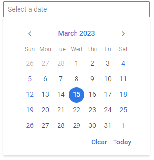
Dropdown plays a crucial role in scenarios where users need to make specific selections like dates, colors, and times. For date pickers, Dropdown might contain options like days, months, and years, allowing users to choose precise dates. Color pickers offer a palette of colors within Dropdown, enabling users to select the exact shade they desire. In time pickers, Dropdown typically includes options for hours, minutes, and sometimes seconds, making time selection accurate.
For example, to use Dropdown in a date picker, place Calendar inside. First, import the used components:
import { Dropdown, Calendar } from "@svar-ui/react-core";
Then, wrap the <Calendar /> component within <Dropdown /> and specify the necessary props, if needed:
<Dropdown align={"end"}>
  <Calendar />
</Dropdown>
To turn it all into a date picker, use React state and an onClick handler to open a dropdown on input click:
import { useState } from "react";
import { Dropdown, Calendar, Text } from "@svar-ui/react-core";

export default function DatePicker() {
  const [popup, setPopup] = useState(false);

  function onCancel() {
    setPopup(false);
  }

  return (
    <div className="datepicker" onClick={() => setPopup(true)}>
      <Text />

      {popup && (
        <Dropdown align={"end"} onCancel={onCancel}>
          <Calendar />
        </Dropdown>
      )}
    </div>
  );
}
Showing/hiding Dropdown
As a rule a dropdown opens on an input click and hides on an outside click. You can provide some state and use it to check the visibility of Dropdown.
In the example below the popup state gets the true value on a click in the input and a dropdown is shown. On an outside click a dropdown is closed. It is specified via the onCancel property of Dropdown, which is a function that defines the logic of Dropdown closing.
import { useState } from "react";
import { Dropdown, Calendar, Text } from "@svar-ui/react-core";

export default function DatePicker() {
  const [popup, setPopup] = useState(false);

  function onCancel() {
    setPopup(false);
  }

  return (
    <div className="datepicker" onClick={() => setPopup(true)}>
      <Text />

      {popup && (
        <Dropdown onCancel={onCancel}>
          <Calendar value={new Date(2023, 2, 15)} />
        </Dropdown>
      )}
    </div>
  );
}

/* CSS (separate file or styles):
.datepicker {
  position: relative;
  width: 300px;
}
*/
Setting the width of Dropdown
The width of Dropdown adjusts to the width of the content inside. By default it is "100%". If needed, you can change the width of Dropdown using the width property. It works in the same way as the width CSS property. The value should be set as a string, e.g.:
<Dropdown width="75%" />
Positioning and aligning Dropdown
Setting the position
A dropdown can appear at any of the four input's sides: at the top, bottom, right or left. By default a dropdown opens up at the bottom of the input field. Use the "top", "right" or "left" value of the position property to specify a position different from the default one.
<Dropdown position={"top"}>
  <Calendar value={new Date(2023, 2, 15)} />
</Dropdown>
Adjusting the alignment
As for the alignment of the component, there are three possible settings: "start" (default), "center" or "end" of the input. The align property is responsible for the Dropdown alignment relative to the input width.
<Dropdown onCancel={onCancel} position={"top"} align={"center"}>
  <Calendar value={new Date(2023, 2, 15)} />
</Dropdown>
The align and position properties are combined to make a style name specific for a particular position. Thus, there are "top-end" or "bottom-start" styles, for example.
Automatic positioning and alignment
The Dropdown API includes the autoFit configuration property that automatically calculates the necessary position and alignment of an inline dropdown relative to the input.
autoFit applies only when inline is set to true. For non-inline dropdowns (the default mode), automatic positioning and overflow prevention are handled internally by the positioning logic, so similar behavior is applied by default and does not depend on the autoFit property.
By default, autoFit is enabled for inline dropdowns. It adjusts the dropdown position and prevents it from overflowing the browser viewport. You can disable this behavior if needed:
<Dropdown inline autoFit={false}>
  <Calendar value={new Date(2023, 2, 15)} />
</Dropdown>
Setting the rendering mode
By default, Dropdown is attached to the document body (or to a popupContainer element if specified) and rendered above other elements of the application. You can change this behavior using the inline property. When set to true, the dropdown is rendered inside the same HTML element as the input control:
<Dropdown inline={true}>
  <Calendar value={new Date(2023, 2, 15)} />
</Dropdown>
Closing Dropdown on scroll
When Dropdown is not rendered inline, you may want it to close automatically if the page or container is scrolled - for example, to prevent the dropdown from floating detached from its input. Use the trackScroll property to enable this behavior:
<Dropdown trackScroll={true}>
  <Calendar value={new Date(2023, 2, 15)} />
</Dropdown>
trackScroll has no effect when inline is set to true.
Styling Dropdown
You can apply a custom CSS class to the Dropdown using the css property:
<Dropdown css="my-dropdown">
  <Calendar value={new Date(2023, 2, 15)} />
</Dropdown>
CSS (separate file):
.my-dropdown {
  border-radius: 8px;
  box-shadow: 0 4px 12px rgba(0, 0, 0, 0.15);
}
Modal box
Modal boxes grab user attention by overlaying the main content, ensuring focus on a specific task or message.

The Modal component allows creating two types of modal boxes: Prompt and Dialog. There are more types of modal and message boxes. You can explore all of them in the Messages guide.
- Check Modal API Reference to see the list of configuration properties.
- Explore the samples to visualize the available features.
Initialization
To create a Modal instance on a page, you need to complete the following steps:
-
get the widget by installing the
@svar-ui/react-corepackage -
import the source file of the component on a page together with the
Portalone (since a modal box should be created inside of a Portal to work correctly):
import { Modal, Portal } from "@svar-ui/react-core";
- wrap the
<Modal>tag within the<Portal>to initialize the component:
<Portal>
  <Modal>
    {/* the content */}
  </Modal>
</Portal>
- use either the
<Text />control to create a Prompt modal box or the<TextArea />control to create a custom Dialog box, correspondingly:
import { Modal, Portal, Text, TextArea } from "@svar-ui/react-core";

/* Prompt modal */
<Portal>
  <Modal>
    <Text />
  </Modal>
</Portal>

/* Dialog modal */
<Portal>
  <Modal>
    <TextArea />
  </Modal>
</Portal>
Providing the buttons' functionality
The Modal component allows using two types of buttons in modal boxes: in-built buttons used by default and custom ones.
Using default buttons
There are two built-in buttons: "ok" and "cancel". They can be controlled via the buttons configuration property. For example, you can leave just one of the buttons in a modal box, like this:
<Portal>
  <Modal buttons={["ok"]}>
    <Text select={true} focus={true} value="Some" />
  </Modal>
</Portal>
To add some actions for the buttons, you should use the onConfirm and onCancel events of the Modal box, accordingly. As values they expect functions called on click of the corresponding button. Here is an example:
import { useState } from "react";
import { Modal, Text, Portal, Button } from "@svar-ui/react-core";

export default function CustomPrompt() {
  const [visible, setVisible] = useState(true);

  function hideAll() {
    setVisible(false);
  }

  return (
    <>
      {visible && (
        <Portal>
          <Modal title="Custom Prompt" onConfirm={hideAll} onCancel={hideAll}>
            <Text select={true} focus={true} value="Some" />
          </Modal>
        </Portal>
      )}
    </>
  );
}
Related sample: Messages
Custom buttons
Besides standard buttons, you can also use custom buttons in modal boxes. The advantage of custom buttons in modal boxes is that they can be designed to match the application's theme, providing a cohesive user experience.
By default, buttons are placed in a footer snippet; this allows you to create your own buttons and use them instead of the default ones. Modal accepts a render-prop child to override or replace the footer. To add a new button into a modal box, you need to:
- import the Button control into the app:
import { Modal, Textarea, Button, Portal } from "@svar-ui/react-core";
- provide the custom footer content as a render-function child of Modal. For example:
import { Modal, Textarea, Button, Portal } from "@svar-ui/react-core";

function Footer({ onClick }) {
  return (
    <div style={{ marginTop: 20 }}>
      <Button onClick={onClick}>Yes</Button>
      <Button onClick={onClick}>No</Button>
      <Button onClick={onClick}>Maybe</Button>
    </div>
  );
}

<Portal>
  <Modal>
    <Textarea />
    {() => <Footer onClick={click} />}
  </Modal>
</Portal>

Related sample: Messages
Adding the header title
Titles in modal boxes serve as concise and informative labels, providing users with a clear understanding of the modal's content or purpose. Regardless of the modal box's type, titles help users stay oriented within the application. They enhance user experience by making the modal's content easily recognizable.
To add a title into a modal box, set the title configuration property in the <Modal> tag and provide a string with the desired text as its value.
<Portal>
  <Modal title="Custom Prompt" onConfirm={hideAll} onCancel={hideAll}>
    <Text select={true} focus={true} value="Some" />
  </Modal>
</Portal>
Related sample: Messages
Popup
A popup is a versatile tool that provides context-specific information without navigating away from the current page. You can specify the area that will define the location of a popup rendering on a page, set a function that will close a popup under provided conditions and apply top and left offsets (if the connected area isn't defined).

- Check Popup API Reference to see the list of configuration properties.
- Explore the samples to visualize the available features.
Initialization
To create a Popup instance on a page, you need to complete the following steps:
-
get the widget by installing the
@svar-ui/react-corepackage -
import the source file of the component on a page:
import { Popup } from "@svar-ui/react-core";
- apply the
<Popup>tag to initialize a popup and place content inside the component:
<Popup>
  <p>Some content</p>
</Popup>
Adding content
You can place a text or a different control inside of a popup. First, you need to import all the used controls:
import { Popup, Slider } from "@svar-ui/react-core";
Then, put the text content and necessary controls into the div with the "popup" class inside the <Popup> tag:
<Popup>
  <div className="popup">
    <p>Some text here and there</p>
    <p>Some text here and there</p>
    <Slider />
  </div>
</Popup>
Showing/hiding Popup
As a most common case, you can show a popup on a button click and hide it on a click outside the popup.
Let's declare a state variable called showPopup. By default the variable is false and a popup is hidden. On a button click, showPopup becomes true and a popup is shown.
import { useState } from "react";
import { Button, Popup } from "@svar-ui/react-core";

export default function PopupDemo() {
  const [showPopup, setShowPopup] = useState(false);

  function handleClick() {
    setShowPopup(true);
  }

  return (
    <div>
      <Button onClick={handleClick}>Show Popup</Button>

      {showPopup && (
        <Popup>
          <div className="popup">
            <p>Some text here and there</p>
          </div>
        </Popup>
      )}
    </div>
  );
}
To hide a popup, use the onCancel event of Popup. It is a function that defines the logic of Popup closing. In the example below a popup will be closed on a click outside it.
import { useState } from "react";
import { Button, Popup } from "@svar-ui/react-core";

export default function PopupDemo() {
  const [showPopup, setShowPopup] = useState(false);

  function handleShow() {
    setShowPopup(true);
  }

  function handleCancel() {
    setShowPopup(false);
  }

  return (
    <div>
      <Button onClick={handleShow}>Show Popup</Button>

      {showPopup && (
        <Popup onClick={handleShow} onCancel={handleCancel}>
          <div className="popup">
            <p>Some text here and there</p>
          </div>
        </Popup>
      )}
    </div>
  );
}
Related sample: Popup
Positioning Popup
Absolute positioning
If you want to display a popup at particular coordinates on a page, you should use the top and left properties and set their values in pixels.
<Popup top={300} left={300}>
  <div className="popup">
    <p>Some text here and there</p>
  </div>
</Popup>
The above logic defines that a popup will be shown at the specified coordinates without being bound to any node.

Relative positioning
You can specify an HTML node near which a popup will be shown. For this, use the at property of the widget. It defines the alignment or anchor point of the popup relative to its parent element. You can also provide the parent property to indicate the target node and control the show/hide logic.
For example, you can show a popup next to a button on click:
import { useRef, useState } from "react";
import { Button, Popup, Portal } from "@svar-ui/react-core";

export default function RelativePopup() {
  const buttonRef = useRef(null);
  const [showPopup, setShowPopup] = useState(false);

  function togglePopup() {
    setShowPopup((s) => !s);
  }

  return (
    <div>
      <Button ref={buttonRef} onClick={togglePopup}>
        Show Popup
      </Button>

      {showPopup && (
        <Portal>
          <Popup parent={buttonRef.current} at="bottom-right">
            <div className="popup">
              <p>Menu appears at the bottom-right corner of the button</p>
            </div>
          </Popup>
        </Portal>
      )}
    </div>
  );
}
The Portal component renders the popup under <body> so it is positioned correctly relative to the page.
Related sample: Popup
If you don't use Portal, the popup won't be aligned to the bottom left corner of the button and will appear somewhere near the button's div.
Setting the width of Popup
By default, Popup adjusts its width to the content inside. If needed, you can set a fixed width using the width property. The value should be set as a CSS string, e.g.:
<Popup top={300} left={300} width="400px">
  <div className="popup">
    <p>Some text here and there</p>
  </div>
</Popup>
Closing Popup on scroll
If you want the popup to close automatically when the page or its container is scrolled, use the trackScroll property:
<Popup top={300} left={300} trackScroll={true}>
  <div className="popup">
    <p>Some text here and there</p>
  </div>
</Popup>
Styling Popup
By default, Popup just adjusts its height to the number of elements inside it. You may also need to add some settings for the content of Popup to look neat. Use the .popup CSS class to change the appearance of the widget. For example, set the padding or add some background color:
Example JSX:
import { Popup } from "@svar-ui/react-core";

export default function StyledPopup() {
  return (
    <Popup>
      <div className="popup">
        <p>Some text here and there</p>
      </div>
    </Popup>
  );
}
CSS (separate file):
.popup {
  padding: 10px 30px;
  background: turquoise;
}
You can also attach a custom CSS class directly to the Popup using the css property for additional styling control:
<Popup top={300} left={300} css="my-popup">
  <div className="popup">
    <p>Some text here and there</p>
  </div>
</Popup>
CSS (separate file):
.my-popup {
  border-radius: 8px;
  box-shadow: 0 4px 12px rgba(0, 0, 0, 0.15);
}

Related sample: Popup
Portal
Portals are advanced popups that render content outside the DOM hierarchy. They allow seamless integration of components across different parts of the application. You need just to wrap the content you want to render somewhere else in the <Portal> tag.
- Check Portal API Reference to see the list of configuration properties.
Initialization
To create a Portal component, you need to complete the following steps:
-
get the component by installing the
@svar-ui/react-corepackage -
import the source file of the component on a page:
import { Portal } from "@svar-ui/react-core";
- apply the
<Portal>tag to initialize a portal and place content inside the component:
<Portal>
  {/* the content to be sent by the Portal */}
</Portal>
Adding content
You can transfer any content including other components to a different DOM node via the Portal component. To add a component into Portal, import it in your file:
import { Popup, Portal } from "@svar-ui/react-core";
Then, put the desired content within the <Portal> tag. The example below adds a Popup component inside a Portal:
<Portal>
  <Popup>
    <p>Some text here and there</p>
  </Popup>
</Portal>
Setting the target
You should set the target where the content should be rendered. Portal can send content both to a different part of DOM and even place it above the app structure. There's the target property intended for specifying the destination point of the transferred portal content.
In the example below a Modal component is sent through the Portal into the "box" element on a button click:
import { useRef, useState } from "react";
import { Modal, TextArea, Portal, Button } from "@svar-ui/react-core";

export default function PortalTargetDemo() {
  const [custom, setCustom] = useState(false);
  const boxRef = useRef(null);

  return (
    <>
      <div ref={boxRef} />
      <Button onClick={() => setCustom(!custom)}>Show Dialog</Button>

      {custom && (
        <Portal target={boxRef.current}>
          <Modal>
            <TextArea />
          </Modal>
        </Portal>
      )}
    </>
  );
}
Setting the theme for a moved component
Since Portal can be placed into the body of the app, the theme of the parent app/component won't apply to the component transferred through the Portal. In this case you can make use of the Portal's theme configuration property and set the necessary theme name as its value. Themes correspond to the names of the main SVAR skins available: "willow" and "willow-dark".
Check the example below to see how you can apply a theme:
import { useRef, useState } from "react";
import { Modal, TextArea, Portal, Button } from "@svar-ui/react-core";

export default function ThemedPortal() {
  const [custom, setCustom] = useState(false);
  const boxRef = useRef(null);

  function hideAll() {
    setCustom(false);
  }

  return (
    <>
      <div ref={boxRef} />
      <Button onClick={() => setCustom(!custom)}>Show Dialog</Button>

      {custom && (
        <Portal theme={"willow-dark"}>
          <Modal>
            Some text here
            <TextArea placeholder="Some text" />
            {() => (
              <div>
                <Button onClick={hideAll}>Yes</Button>
                <Button onClick={hideAll}>No</Button>
                <Button onClick={hideAll}>Maybe</Button>
              </div>
            )}
          </Modal>
        </Portal>
      )}
    </>
  );
}

SideArea
Side area popups slide in from the edge of the screen, displaying additional content or options without disrupting the user's workflow.
- Check SideArea API Reference to see the list of configuration properties.
Initialization
To create a SideArea instance on a page, you need to complete the following steps:
-
get the widget by installing the
@svar-ui/react-corepackage -
import the source file of the component on a page:
import { SideArea } from "@svar-ui/react-core";
- apply the
<SideArea>tag to initialize a sidearea and place content inside the component:
<SideArea>
  <p>Some content</p>
</SideArea>
Adding content
You can place various content into SideArea. If you want to add some controls into it, you need to import all of them in your file. e.g.:
import { SideArea, Text, Field } from "@svar-ui/react-core";
Then, put the desired content within the <SideArea> tag. The example below adds a couple of Fields with Text controls inside a SideArea. The Field component uses a render-prop child that receives an id:
import { useState } from "react";
import { SideArea, Field, Text } from "@svar-ui/react-core";

export default function SideAreaForm() {
  const [firstName, setFirstName] = useState("");
  const [lastName, setLastName] = useState("");

  return (
    <SideArea>
      <Field label="First name">
        {({ id }) => (
          <Text
            id={id}
            value={firstName}
            onChange={(v) => setFirstName(v.value)}
            placeholder="Type here"
          />
        )}
      </Field>

      <Field label="Last name">
        {({ id }) => (
          <Text
            id={id}
            value={lastName}
            onChange={(v) => setLastName(v.value)}
            placeholder="Type here"
          />
        )}
      </Field>
    </SideArea>
  );
}
Positioning SideArea
The SideArea component provides flexible positioning options, which allows creating interfaces that adjust to different user preferences and screen layouts. By default SideArea appears from the right side of the screen. Such behavior is suitable for larger screens where horizontal space is abundant and additional options are offered without cluttering the interface.
When you develop an application intended for smaller screens or decide that a left-to-right flow is more intuitive for your interface, positioning the SideArea on the left ensures easy access without compromising the user's interaction with the primary content. Use the "left" value of the position property to change the default side of SideArea showing:
<SideArea position={"left"}>
  {/*some content */}
</SideArea>
Handling SideArea closing
SideArea closes on an outside click. You can handle closing of the component by checking some parameter. In the example below, the sideAreaVisible state is false by default and SideArea is closed. There are also two functions that control the value of the state:
import { useState } from "react";
import { Button, SideArea } from "@svar-ui/react-core";

export default function SideAreaDemo() {
  const [sideAreaVisible, setSideAreaVisible] = useState(false);

  function openSideArea() {
    setSideAreaVisible(true);
  }

  function closeSideArea() {
    setSideAreaVisible(false);
  }

  return (
    <div className="demo-box">
      <Button onClick={openSideArea}>Show Side Area</Button>

      {sideAreaVisible && (
        <SideArea onCancel={closeSideArea}>
          Some content
        </SideArea>
      )}
    </div>
  );
}
On a button click, the openSideArea() function shows SideArea and the checked parameter becomes true. On an outside click, the onCancel event fires, the closeSideArea() function closes SideArea and sets the sideAreaVisible parameter to false.