Styling
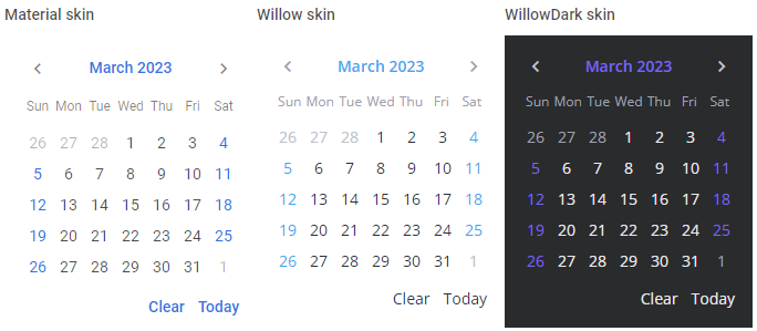
The SVAR library provides you with the next predefined skins to make your application look stylish and up-to-date: Willow and WillowDark
Related sample: Calendar Willow skin
Related sample: Calendar WillowDark skin
It is important to apply one of the skins to a control. Otherwise, it won't be rendered correctly.
Using skins
The code of each skin is provided in a separate React file. You should import the source file of the chosen skin at the top of your React file:
import { Willow } from "@svar-ui/react-core";
After you've imported the desired skin and a control in the module, you need to wrap the control in the skin component like this:
import { Calendar, Willow } from "@svar-ui/react-core";

<div style={{ width: '300px' }}>
  <Willow>
    <Calendar />
  </Willow>
</div>
Using different skins for control instances
In case you need to render several instances of a control, each of which has its own skin applied, you should wrap each of them in the corresponding skin component.
Don't forget to include all the applied skins on the app's page.
import { Calendar, Willow, WillowDark } from "@svar-ui/react-core";

<div className="demo-box" style={{ width: '350px', display: 'flex', flexDirection: 'row' }}>
  <Willow>
    <Calendar />
  </Willow>
  <WillowDark>
    <Calendar />
  </WillowDark>
</div>
Related sample: Calendar Willow skin
Related sample: Calendar WillowDark skin
Disabling fonts
Whenever you need to disable the fonts used in a skin, you can make use of the fonts property of the skin and set it to the false value:
import { Calendar, Willow } from "@svar-ui/react-core";

<div style={{ width: '300px' }}>
  <Willow fonts={false}>
    <Calendar />
  </Willow>
</div>
Please note that if you switch the default fonts off, you will have to include the fonts you need by yourself.