组织表单布局
表单结构
editor widget 提供了多种构建和组织表单布局的方式。它支持将表单划分为逻辑分组,例如批次(batch)、区块(section)或可折叠的手风琴式区块。这种灵活性使开发者能够创建用户友好的界面,让字段可以高效地分组和导航。以下是支持的配置方式:
将表单拆分为批次并每次显示单个批次
editor 允许将表单字段拆分为独立的批次,每次只显示一个批次。这适用于创建分步表单或简化复杂表单。
<script setup>
import { Editor, registerEditorItem } from "@svar-ui/vue-editor";
import { Combo } from "@svar-ui/vue-core";

registerEditorItem("combo", Combo);

const items = [
   {
     comp: "text",
     key: "name",
     batch: "main",
     label: "Name",
   },
   {
     key: "theme",
     batch: "cfg",
     comp: "combo",
     label: "Theme",
     options: [
        { id: "light", label: "Light" },
        { id: "dark", label: "Dark" },
     ],
   },
];
</script>

<template>
   <Editor :items="items" activeBatch="cfg" />
</template>
在此示例中,activeBatch 属性设置为 "cfg",因此只会显示分配到 "cfg" 批次的字段。这种方式非常适合需要逐一显示多个逻辑区块的表单。

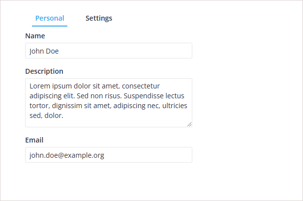
使用标签栏在批次间切换
editor 支持基于标签的导航来切换批次。此方式适用于包含多个区块、需要用户在标签间切换的表单。
<script setup>
import { ref } from "vue";
import { Editor, registerEditorItem } from "@svar-ui/vue-editor";
import { Tabs, Combo } from "@svar-ui/vue-core";

registerEditorItem("combo", Combo);

const options = [
   {
     id: "main",
     label: "Personal",
   },
   {
     id: "cfg",
     label: "Settings",
   },
];

const items = [
   {
     comp: "text",
     key: "name",
     batch: "main",
     label: "Name",
   },
   {
     key: "theme",
     batch: "cfg",
     comp: "combo",
     label: "Theme",
     options: [
        { id: "light", label: "Light" },
        { id: "dark", label: "Dark" },
     ],
   },
];

const activeBatch = ref("cfg");
</script>

<template>
   <Editor :items="items" :activeBatch="activeBatch">
      <Tabs :options="options" v-model:value="activeBatch"></Tabs>
   </Editor>
</template>
此处使用 Tabs 组件让用户选��择要查看的批次。activeBatch 绑定确保 editor 根据所选标签显示相应字段。
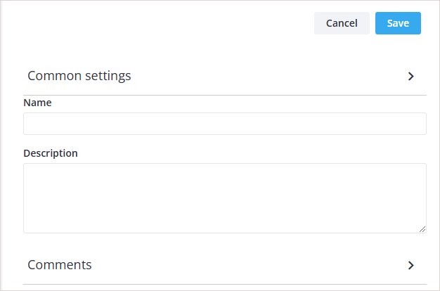
将表单字段分组为可折叠区块
editor 支持将字段组织为可折叠区块,便于管理较长的表单。每个区块可以展开或折叠。
<script setup>
import { Editor, registerEditorItem } from "@svar-ui/vue-editor";
import { Comments } from "@svar-ui/vue-comments";

registerEditorItem("comments", Comments);

const items = [
   {
     comp: "section",
     key: "common-section",
     label: "Common settings",
   },
   {
     comp: "text",
     key: "name",
     label: "Name",
   },
   {
     comp: "textarea",
     key: "descr",
     label: "Description",
   },
   {
     comp: "section",
     key: "comments-section",
     label: "Comments",
   },
   {
     comp: "comments",
     key: "comments",
     section: "comments-section",
   }
];
</script>

<template>
   <Editor :items="items" />
</template>
所有字段均在可折叠区块内渲染。
"Common settings" 和 "Comments" 等区块可以折叠或展开,让用户专注于表单的特定部分。
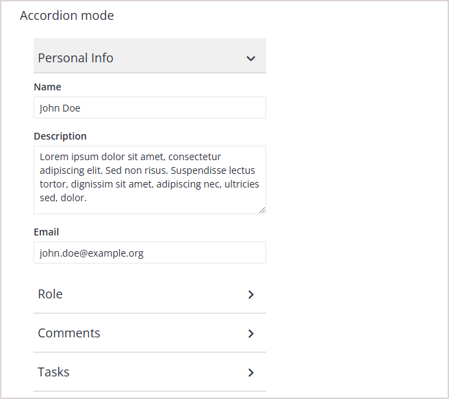
显示手风琴式区块
手风琴样式的区块每次只允许打开一个区块。当打开新区块时,之前打开的区块会自动折叠。
<script setup>
import { Editor, registerEditorItem } from "@svar-ui/vue-editor";
import { Comments } from "@svar-ui/vue-comments";

registerEditorItem("comments", Comments);

const items = [
   {
     comp: "section",
     key: "common-section",
     label: "Common settings",
     sectionMode: "accordion",
   },
   {
     comp: "text",
     key: "name",
     label: "Name",
   },
   {
     comp: "textarea",
     key: "descr",
     label: "Description",
   },
   {
     comp: "section",
     key: "comments-section",
     label: "Comments",
     sectionMode: "accordion",
   },
   {
     comp: "comments",
     key: "comments",
     section: "comments-section",
   }
];
</script>

<template>
   <Editor :items="items" />
</template>
所有字段均在可折叠区块内渲染,但每次只能打开一个区块。
此配置适用于每次只需显示一个区块内容的表单。
在 Editor 中使用模态式区块
模态区块打开时会隐藏其他字段,用所选区块的内容替换顶层字段。这适用于需要专注于特定输入集的场景。
<script setup>
import { Editor, registerEditorItem } from "@svar-ui/vue-editor";
import { Comments } from "@svar-ui/vue-comments";

registerEditorItem("comments", Comments);

const items = [
   {
     comp: "text",
     key: "name",
     label: "Name",
   },
   {
     comp: "textarea",
     key: "descr",
     label: "Description",
   },
   {
     comp: "section",
     key: "comments-section",
     label: "Comments",
     sectionMode: "exclusive",
   },
   {
     comp: "comments",
     key: "comments",
     section: "comments-section",
   }
];
</script>

<template>
   区块中的字段默认隐藏。点击区块后,顶层字段将被替换为该区块的内容。

   <Editor :items="items" />
</template>
此方式非常适合需要区块完全获得焦点、减少其他字段干扰的表单。
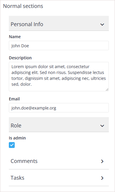
在 Editor 中混合使用字段和区块
editor 允许将始终可见的字段与可折叠区块组合使用。当某些字段需要始终可访问时,这种方式非常有用。
<script setup>
import { Editor, registerEditorItem } from "@svar-ui/vue-editor";
import { Comments } from "@svar-ui/vue-comments";

registerEditorItem("comments", Comments);

const items = [
   {
     comp: "text",
     key: "name",
     label: "Name",
   },
   {
     comp: "textarea",
     key: "descr",
     label: "Description",
   },
   {
     comp: "section",
     key: "comments-section",
     label: "Comments",
   },
   {
     comp: "comments",
     key: "comments",
     section: "comments-section",
   }
];
</script>

<template>
   `name` 和 `descr` 字段始终可见,而以下字段则在可折叠区块内渲染。

   <Editor :items="items" />
</template>
此配置适用于某些关键字段必须始终可访问、而其他字段可分组到可折叠区块的表单。

相关示例: Layouts