Filter user interface overview
FilterBuilder
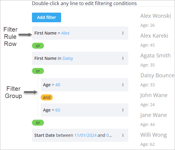
FilterBuilder is the core component that consists of the next main UI elements:
- Filter group container
- Filter rule rows
- Context menu for adding and editing groups and rules
- Filter editor is a standalone component described below
The component mode can be set to one of three available:
- simple – vertical layout with
ANDlogic only - line – horizontal layout for compact use
- list – (default) vertical layout with full rule nesting support
Filter group container
It allows visual grouping of filters using logical operators: AND, OR.
Each group can contain:
- Filter rules (single conditions)
- Nested filter groups (to allow complex logic)
Filter rule rows
Each rule allows users to:
- Select a field (e.g. name, age, status)
- Choose a condition (e.g. equals, greater than, contains)
- Input a value (or pick from dropdown if options are provided)
Context menu
Context menu allows the user to:
- Edit a rule
- Add a filter below the current rule
- Add a group (nested group)
- Delete a rule or group

FilterEditor
It's a standalone component used inside the FilterBuilder.

To add a filter, a user should:
- In the top dropdown, select a filed to filter by
- In the next dropdown, select the filtering operation ("equal", "contains", etc.)
- Input a value or select it from the provided options list
- Click Apply
FilterBar
The component provides next elements for quick filtering:
- Text input (for text, number fields)
- Dropdown (for select, or dynamic field selectors)
- Optional label shown before input
To filter data, a user should input the value into the input or/and select an option from the dropdown. After the delay, the component outputs the filtered data.

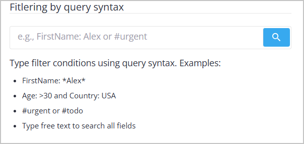
FilterQuery
The component provides the following elements for query-based filtering:
- A single-line query input
- Autocomplete suggestions for fields and values
- Syntax highlighting for fields, operators, and values
- A search button to submit the query
To filter data, the user types a query expression into the input field. As the query is written, autocomplete suggests available fields and values, and syntax highlighting shows the query structure. When the query is submitted, the component emits a parsed filter configuration that can be used to filter the dataset.
FilterQuery can also operate in Natural Language Mode, where users type filter conditions in plain text instead of query syntax. In this mode, the input text is sent to an AI/NLP endpoint that converts the description into a structured filter configuration.