ColorPicker
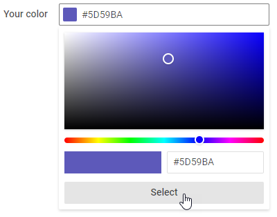
The ColorPicker control allows you to select an optional color from the сolor board and get its HEX color code value. You can specify the selected color and supply the control's input with a placeholder, a tooltip or a label.
Related resources
- Get the widget by installing the
@svar-ui/svelte-corepackage. - Check ColorPicker API Reference to see the list of configuration properties.
- Explore the samples to visualize the available features.
Initialization
To add a ColorPicker instance into your application, you need to complete two steps:
- import the source file of the control on a page:
<script>
  import { ColorPicker } from "@svar-ui/svelte-core";
</script>
- apply the
<ColorPicker>tag to initialize a color picker:
<ColorPicker />
A default color picker is initialized without any color selected.
Setting the value
The value of ColorPicker is the Hexadecimal code of a color selected in the control. It is displayed in the input of the control, when selection is done. You can specify the selected color as a string via the value property.
<ColorPicker value="#00a037" />
Related sample: ColorPicker
Getting the current value
You can get the current value of the ColorPicker control. For this, you need to:
- declare a variable that will contain the control's value (it may contain the initial value):
<script>
  import { ColorPicker } from "@svar-ui/svelte-core";

  let color;
</script>
- bind the variable to the
valueproperty of the control:
<ColorPicker bind:value={color} />
If the name of the variable matches its value, you can use the shorthand while binding the property:
<script>
  import { ColorPicker } from "@svar-ui/svelte-core";

  let value;
</script>

<ColorPicker bind:value />
After that the value assigned to the bound variable will be updated on each change of the color.
Related sample: ColorPicker
Adding the Clear button
The Clear button allows clearing the selected option from the input.

To add the Clear button into the Color Picker input, use the clear property:
<ColorPicker colors={['#65D3B3', '#FFC975', '#58C3FE']} clear />
Related sample: ColorPicker
Adding a title
A title is a tooltip text that appears on hovering the mouse cursor over the input and may contain some extra information about the control. Use the title property to add a tooltip for a colorpicker:
<ColorPicker
  bind:value={color}
  {id}
  title="Colors can be reconfigured" />

Related sample: ColorPicker
Adding a placeholder for the input
You can add a placeholder inside a color picker's input. The placeholder can contain some prompting message to make interaction with the control simpler. All you need is to set your message as a value of the placeholder property:
<ColorPicker placeholder="Select a color"/>
For a placeholder to be visible in the input, a color picker should be initialized without the initial value specified.
Related sample: ColorPicker
Setting the disabled state
Whenever you need to render a disabled color picker, you can do it with the help of the disabled property set to true.
<ColorPicker disabled={true}/>

It is also possible to set the disabled state for a color picker by declaring the property with no value:
<ColorPicker disabled />
Related sample: ColorPicker
Adding a label
A default color picker has no label. To add it, you can use the Field component and complete several steps:
- include the Field source file on a page, declare the
<Field>tag and complete it with the necessary props:- add a desired label via the label property
- optionally, set the position:"left" property, if you want to place the label to the left of the color picker
<script>
  import { ColorPicker, Field } from "@svar-ui/svelte-core";
</script>

<Field label="Select a color" position="left" />
After that, wrap the color picker into the <Field> tag. The Field component automatically generates an id for the inner control, which creates label-input association.
<Field label="Select a color" position="left">
  <ColorPicker />
</Field>
Related sample: ColorPicker
Configuring the dropdown
You can configure the behavior and appearance of the color picker dropdown via the dropdown property.
By default, the dropdown is attached to the document body and rendered above main application layer. If you use a custom popupContainer, the dropdown will be attached to it instead. To render the dropdown inline — inside the same HTML element as the input — set the inline option to true:
<ColorPicker dropdown={{ inline: true }} />
As the dropdown is detached from the input in non-inline mode, you can use the trackScroll property to automatically close it when the container is scrolled. This prevents the dropdown from staying open after the input has scrolled out of view:
<Field>
  <div style="height: 150px; overflow: auto;">
    <div style="height: 700px;">
      <ColorPicker dropdown={{ trackScroll: true }} />
    </div>
  </div>
</Field>
You can also control the position and alignment of the dropdown relative to the input, as well as its width and a custom CSS class:
<ColorPicker
  colors={['#65D3B3', '#FFC975', '#58C3FE']}
  dropdown={{
    position: "bottom",
    align: "start",
    width: "auto",
    css: "my-dropdown"
  }}
/>
Related article: dropdown
Related sample: ColorPicker
Styling a color validation error
When you use a color picker inside a form and a wrong color value is passed to the control, you can use error styling to show that validation has failed. Once you've set the error property to true (or just specified the property without a value):
<ColorPicker error={true}/>
The input's border and the color's value become red. To make the label red as well, use the error property of the Field control:
<script>
  import { ColorPicker, Field } from "@svar-ui/svelte-core";
</script>

<Field label="Value" error={"error message"}>
  <ColorPicker error={true}/>
</Field>
Related sample: ColorPicker