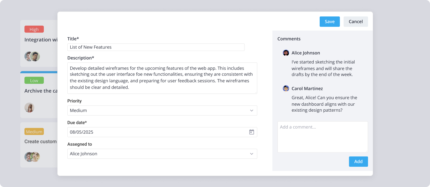
Key Features
SVAR Editor builds an edit form for any structured record - a user profile, an info card, a product, a table row - from a plain configuration array instead of hand-written markup. This overview walks through the four things that shape most of what you'll do with it: how you declare fields, how you surface and lay out the form, how edits are validated and saved, and how you extend the built-in control set.
License: MIT
The whole form comes from two props. values is the record you're editing, and items is the list of field descriptors. The editor renders those controls over a draft copy of values, so the original record stays untouched until a save succeeds. Everything below - placement, layout, validation, save timing, custom controls - layers onto that item-over-draft model through props.
Item-driven forms
Each entry in items names a control with comp and binds it to a field with key. The built-in comps - text, textarea, and checkbox - render with no setup:
import { useState } from "react";
import { Editor } from "@svar-ui/react-editor";
const items = [
{ comp: "text", key: "name", label: "Name" },
{ comp: "textarea", key: "notes", label: "Notes" },
{ comp: "checkbox", key: "active", label: "Active" },
];
function App() {
const [values, setValues] = useState({ name: "John Doe", active: true });
return <Editor items={items} values={values} />;
}

A key can be a dotted path to reach nested data, a getter/setter pair can map any custom shape, and keys lets one control edit several fields at once. See Fields for the full binding model.
Display and layout options
The same items config can be surfaced four ways through the placement prop: inline in the page flow, sidebar sliding in from the side, modal as a centered dialog, or fullscreen pinned over the viewport - whichever fits where you're placing the form.
<Editor placement="sidebar" items={items} values={values} />
Within a placement you can reshape the body. layout="columns" splits fields into a two-pane form, handy for a main/details split in a wide modal. Long forms don't have to be one scroll: group fields into collapsible sections (with accordion and exclusive modes) or into batches shown one at a time through activeBatch, which pairs naturally with a tab strip. Set readonly to render the record for viewing only. See Display Modes and Layout for details.
Save flow and validation
Edits land in the draft, run through validation, then save - and when they save is your choice. autoSave toggles between saving the instant a field changes and waiting for an explicit Save action. The top and bottom toolbars come with sensible default buttons and can be fully customized through topBar and bottomBar.
Validation is declared per item: required fails on an empty value, and a validation function adds a custom rule with a validationMessage shown under the field.
const items = [
{
comp: "text",
key: "email",
label: "Email",
required: true,
validation: value => /@/.test(value),
validationMessage: "Incorrect email",
},
];
The host app can react at every step - as the user types, when data saves, when a toolbar action fires, or when validation state changes - through the onChange, onSave, onAction, and onValidation events.
Extensibility
The built-in controls are only the starting set. registerEditorItem maps a comp string to any React component - a date picker, a rich select, or a fully custom control - so you wire it in once and reference it by name from then on:
import { Editor, registerEditorItem } from "@svar-ui/react-editor";
import PriorityCombo from "./PriorityCombo.jsx";
registerEditorItem("priority", PriorityCombo);
const items = [
{ comp: "priority", key: "priority", label: "Priority", options: priorityOptions },
];
<Editor items={items} values={values} topBar={false} />
The package also ships three ready-made rich items you register the same way: Attachments (a file list with upload and delete), CodeMirror (a code editor), and TinyMCE (a rich-text editor). These pair well with an item's fill: true flag, which stretches a single control to fill the whole editor body for a full-height code or document surface. See Input Controls for the full extension model.
The editor also ships Willow (light) and WillowDark (dark) themes, plus built-in Chinese, English, and German locales that can be extended or replaced with a custom translation object.