TextArea
The TextArea control presents a multi-line input field used for editing texts of significant size. TextArea can be provided with a placeholder, a value and a label. It is also possible to initialize a disabled area or apply error styling for it, whenever you need it.

Related resources
- Get the widget by installing the
@svar-ui/react-corepackage. - Check TextArea API Reference to see the list of configuration properties.
- Explore the samples to visualize the available features.
Initialization
To create a TextArea instance on a page, you need to complete the following steps:
- import the source file of the control on a page:
import { TextArea } from "@svar-ui/react-core";
- use the
<TextArea>component to initialize the control:
function App() {
  return <TextArea />;
}
A default area is initialized empty without a label or a placeholder.
Setting the value
On initialization an area doesn't have any value set. You can specify the text that should be rendered in an area through the value API property, for example:
<TextArea value={"Lorem ipsum dolor sit amet, consectetur adipiscing elit."} />
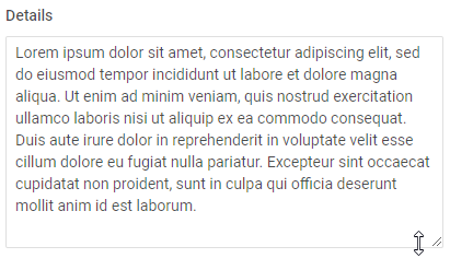
If a text is too long, a scroll appears in the area. You can also use the resizer in the bottom right corner to enlarge an area. Check the image below:
Related sample: TextArea
Getting the current value
You can get the current value of the TextArea control by making it a controlled component. For this, you need to:
- declare a state variable that will contain the input's value (it may contain the initial value):
import { useState } from "react";
import { TextArea } from "@svar-ui/react-core";

function App() {
  const [text1, setText1] = useState("Nice to meet you");

  return (
    <TextArea
      value={text1}
      onChange={(evt) => setText1(evt.value)}
    />
  );
}
If the name of the state variable is value, you can use the same identifier for the prop - the binding is still explicit in React (you must provide onChange):
import { useState } from "react";
import { TextArea } from "@svar-ui/react-core";

function App() {
  const [value, setValue] = useState("Anna");

  return (
    <TextArea
      value={value}
      onChange={(evt) => setValue(evt.value)}
    />
  );
}
After that the state assigned to the variable will be updated on each change of the value in the input.
Related sample: TextArea
Adding a placeholder for the input
You can add a placeholder inside the input of TextArea. The placeholder can contain some prompting message to make interaction with the control simpler. All you need is to set your message as a value of the placeholder property:
import { TextArea } from "@svar-ui/react-core";

function App() {
  return <TextArea placeholder="Type here" />;
}
Related sample: TextArea
Setting the disabled state
You can disable the TextArea input with the help of the disabled property.
<TextArea disabled={true} />
It is also possible to set the TextArea to the disabled state by declaring the property without an explicit value in JSX (boolean attribute shorthand):
<TextArea disabled />

Related sample: TextArea
Adding a label
A default area has no label. To provide a label for the TextArea control, you can use the Field component and complete several steps:
- include the Field source file on a page, declare the
<Field>component and fill it with the necessary props:- add a desired label via the
labelproperty - optionally, set the
position="left"property to place the label to the left of the TextArea input
- add a desired label via the
import { Field, TextArea } from "@svar-ui/react-core";
Then wrap the text area in the <Field> component. The Field component automatically generates an id for the inner control, which creates label-input association:
function App() {
  return (
    <Field label="Details" position="left">
      <TextArea placeholder="Type here" />
    </Field>
  );
}

Related sample: TextArea
Adding a title
A title is a tooltip text that appears on hovering the mouse cursor over the input and may contain some extra information about the control. Use the title property to add a tooltip for the TextArea:
import { TextArea } from "@svar-ui/react-core";

function App() {
  return <TextArea title="It can't be empty" />;
}

Related sample: TextArea
Styling a validation error
When you use the TextArea input inside a form and a wrong value is passed to the control, you can use error styling to show that validation has failed. Once you've set the error property to true (or just specified the property without a value):
<TextArea error={true} />
The input's border and the text's value become red. To make the label red as well, use the error property of the Field control.
import { Field, TextArea } from "@svar-ui/react-core";

function App() {
  return (
    <Field label="Error" error>
      <TextArea error />
    </Field>
  );
}

Catching the change of the value
In case you need to catch the change of the value in the textarea, you can do it by handling the change event via the onChange prop. Inside the event handler you receive an object that contains the current value and a flag indicating whether the change is occurring via user input:
function handleChange(ev) {
  const newValue = ev;
  console.log(newValue);
  // => { value: "some text", input: true }
}

function App() {
  return <TextArea onChange={handleChange} />;
}
The handler function receives an object that can contain:
value- the current text of the textareainput- (boolean) set to true if the value is being typed by the user (which means it may not be the final value yet)
Related sample: TextArea