RangeCalendar
The RangeCalendar control is intended for selecting a date range in a pair of calendars. You can specify the desired start and end dates of the range, switch on/off the Today, Clear and Done buttons and mark a certain date range using a custom style.
Related resources
- Get the widget by installing the
@svar-ui/react-corepackage. - Check RangeCalendar API Reference to see the list of configuration properties and events.
- Explore the samples to visualize the available features.
Initialization
To create a RangeCalendar instance on a page, you need to complete two steps:
- import the source file of the control on a page:
import { RangeCalendar } from "@svar-ui/react-core";
- use the
<RangeCalendar />component to initialize the control:
<RangeCalendar />
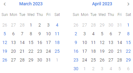
A default RangeCalendar displays the current date (the left calendar opens at the current month and year and the right one shows the following month of the same year) without any settings added.
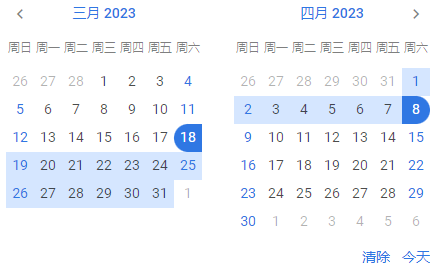
Setting the start and end dates of the range
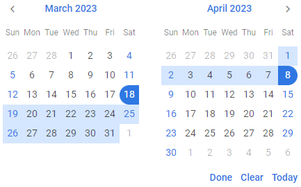
Since the calendars of RangeCalendar are intended to display a date range, you need to specify the start and end dates of the range. There are the start and end API properties, each of which is set as a Date object:
<RangeCalendar
  start={new Date(2022, 1, 18)}
  end={new Date(2022, 11, 22)}
/>
Related sample: Range Calendar
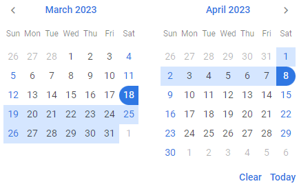
Getting the currently selected range
In React you typically use state and pass the current values to the control as props, updating the state when the control changes. For example:
import { useState } from "react";
import { RangeCalendar } from "@svar-ui/react-core";

function App() {
  const [v1, setV1] = useState(new Date(2023, 3, 18));
  const [v2, setV2] = useState(new Date(2023, 4, 22));

  const handleChange = ({ start, end }) => {
    setV1(start);
    setV2(end);
  };

  return <RangeCalendar start={v1} end={v2} onChange={handleChange} />;
}
Catching the change of the selected range
To catch changes of the selected date range, handle the onChange event. The handler will receive an object with the newly selected start and end (or null if cleared). Example:
function handleChange(newValue) {
  console.log(newValue);
  // newValue example when end is not selected:
  // { start: Tue Mar 08 2022 00:00:00 GMT+0300, end: null }
  //
  // when both start and end are selected:
  // { start: Tue Mar 08 2022 00:00:00 GMT+0300, end: Thu Apr 07 2022 00:00:00 GMT+0300 }
}

<RangeCalendar onChange={handleChange} />
Setting the number of calendars
A default RangeCalendar has two calendars for selection of a date range. You can also use the months property with the 1 value to specify that one month will be rendered in the range calendar:
<RangeCalendar months={1} />
When you select a date range in RangeCalendar with the above described setting, it will look the same as a usual calendar:
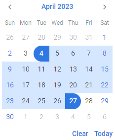
Related sample: Range Calendar
Showing the specified date
To open RangeCalendar at a certain date, make use of the current property. As a value it accepts a Date object:
<RangeCalendar current={new Date(2022, 2, 18)} />
The left calendar will show the specified date without selecting it, the right one will display the next month.
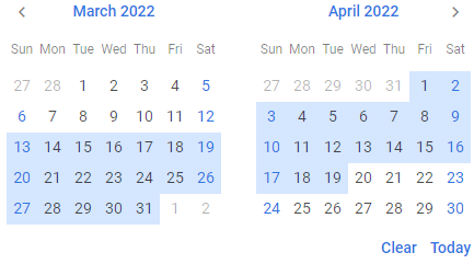
Highlighting a date range
Besides selecting a range of dates by specifying the start and end values, you can highlight an optional date range in the calendar using the markers property.
What you need to do is:
- define the logic of a date range selection in a function and pass your function to the
markersproperty:
const markLine = v =>
  v >= new Date(2022, 2, 13) && v <= new Date(2022, 2, 19) ? "inrange" : "";

<RangeCalendar markers={markLine} />
The function passed as a value of the markers property takes one parameter:
date- a date to be tested
and must return a string with the name of the CSS class or an empty string.
- make sure that calendars will open at the date where the marked range will be visible on RangeCalendar initialization by setting it through the
currentproperty:
const markLine = v =>
  v >= new Date(2022, 2, 13) && v <= new Date(2022, 3, 19) ? "inrange" : "";

<RangeCalendar current={new Date(2022, 2, 18)} markers={markLine} />
Configuring buttons
Hiding the Today and Clear buttons
By default the right calendar has two handy buttons in the lower part. A click on the Today button highlights today's date and opens it in the left calendar. The Clear button helps to discard date selection and open RangeCalendar at the current date.
If needed, you can switch those buttons off. Set the buttons property to false to achieve this purpose:
<RangeCalendar buttons={false} />
Related sample: Range Calendar
Enabling individual buttons
Instead of showing all default buttons, you can display only the specific buttons you need - "clear", "today", or "done". To do this, pass an array to the buttons property containing the names of the buttons you want to enable.
For example, to display only the Clear and Done buttons:
<RangeCalendar buttons={["clear", "done"]} />
Localizing the calendars
You can translate the labels of calendars used inside the RangeCalendar control. Read the detailed information at the Calendar page. Take the following simple steps:
- import the Locale object:
import { RangeCalendar, Locale } from "@svar-ui/react-core";
- include the necessary locales package on a page:
import { RangeCalendar, Locale } from "@svar-ui/react-core";
import { cn } from "@svar-ui/core-locales";
- wrap the RangeCalendar component in the
<Locale>component and use thewordsproperty to set the locale:
import { RangeCalendar, Locale } from "@svar-ui/react-core";
import { cn } from "@svar-ui/core-locales";

<Locale words={cn}>
  <RangeCalendar />
</Locale>