ColorBoard
ColorBoard offers a color palette that provides users with the freedom to choose their desired colors effortlessly. This intuitive tool comes with two convenient usage options: it can be used as a standalone feature, complemented by a dedicated button or in conjunction with ColorPicker for enhanced functionality. The chosen color can be easily selected through the associated configuration property.
Related resources
- Get the widget by installing the
@svar-ui/react-corepackage. - Check ColorBoard API Reference to see the list of configuration properties.
- Explore the samples to visualize the available features.
Initialization
To add a ColorBoard instance into your application, you need to complete two steps:
- import the source file of the control on a page:
import { ColorBoard } from "@svar-ui/react-core";
- apply the
<ColorBoard>tag to initialize a color board:
export default function App() {
  return <ColorBoard />;
}
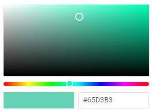
A default color board is initialized with the "#65D3B3" color selected.
Setting the value
The value of ColorBoard is the Hexadecimal code of a color selected in the control. It is displayed in the text input next to the rectangle selected color. You can specify the selected color as a string via the value property.
<ColorBoard value="#00a037" />
Related sample: ColorPicker
Getting the current value
You can get the current value of the ColorBoard control. In React you do this by storing the value in state and passing it as a controlled prop along with an onChange handler that updates the state.
- declare a state variable that will contain the control's value (it may contain the initial value):
import { useState } from "react";
import { ColorBoard } from "@svar-ui/react-core";

export default function App() {
  const [color, setColor] = useState();

  return (
    <ColorBoard
      value={color}
      onChange={({ value }) => setColor(value)}
    />
  );
}
Related sample: ColorPicker
Adding the "Select" button
To provide smooth and user-friendly experience during color selection, you can supply ColorBoard with the "Select" button. By default this button is disabled, you can turn it on with the help of the button property.
<ColorBoard value="#65D3B3" button={true} /> // or <ColorBoard value="#65D3B3" button />
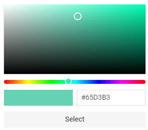
The "Select" button is useful if you need to catch the change of a color and apply the new color to some element. Read the details below.
Catching the change of the selected color
In case you need to catch the change of the selected color, you can do it by handling the
change event. In React the event prop is camelCased to onChange. The handler receives an object with the newly selected color in the value property:
import { ColorBoard } from "@svar-ui/react-core";

function handleChange({ value }) {
  console.log(value);
  // => "#75FFD6"
}

export default function App() {
  return <ColorBoard button onChange={handleChange} />;
}
The handler function of the change event receives an object containing the HEX code of the newly selected color as { value }.