Integration with Nuxt
This guide shows you how to build a Nuxt app with a fully styled data grid: sortable columns, inline cell editing, and a sidebar editor for full-row editing.
The full code is on the basic branch of vue-grid-demo-nuxt.
We'll build it up in stages. Each stage ends with something visible on screen, and we'll fix the expected errors as they come up.
Step 1. Create the project
Run the following commands to scaffold the project and install the package:
npm create nuxt@latest my-grid-app
cd my-grid-app
npm install @svar-ui/vue-grid
Step 2. Add the Grid component
The Grid uses browser APIs, so it runs on the client. Create app/components/DataGrid.vue:
<script setup>
import { Grid } from "@svar-ui/vue-grid";

const data = [
  { id: 1, firstName: "Ernest", lastName: "Schuppe", email: "Leora13@yahoo.com", city: "Amieshire", score: 70 },
  { id: 2, firstName: "Jazmyne", lastName: "Roberts", email: "Tristian.Green@gmail.com", city: "South Vivian", score: 85 },
  // ... more rows
];

const columns = [
  { id: "id", width: 60, header: "ID" },
  { id: "firstName", header: "First Name", width: 150 },
  { id: "lastName", header: "Last Name", width: 150 },
  { id: "email", header: "Email", width: 220 },
  { id: "city", header: "City", width: 150 },
  { id: "score", header: "Score", width: 100 },
];
</script>

<template>
  <Grid :data="data" :columns="columns" />
</template>
Connect it in app/pages/index.vue:
<template>
  <div>
    <header class="page-header">
      <h1>My DataGrid</h1>
    </header>
    <main>
      <DataGrid />
    </main>
  </div>
</template>
Nuxt auto-imports components from app/components/, so there's no explicit import needed.
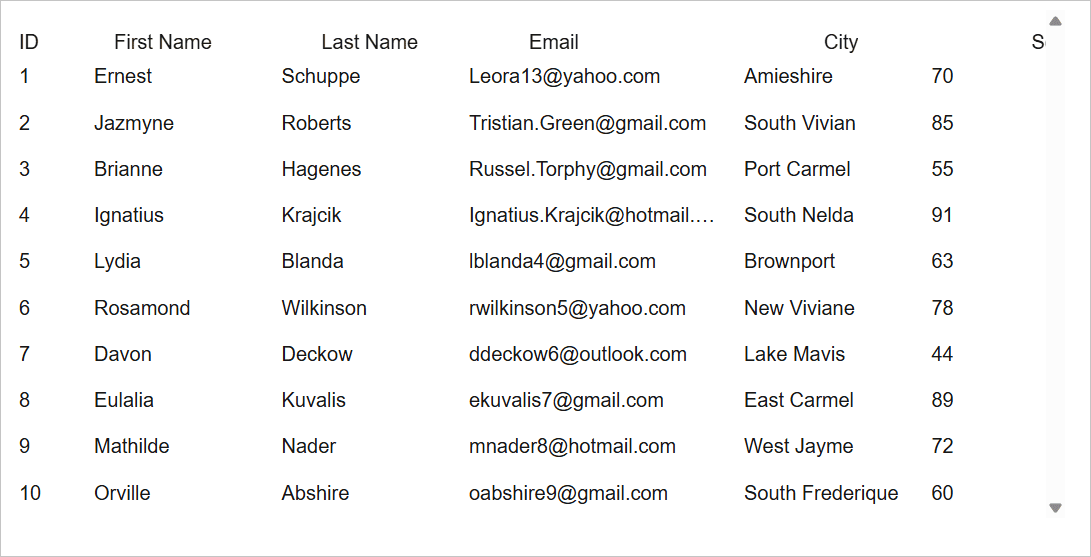
Run npm run dev. The data renders with no borders or padding. The stylesheet isn't imported yet.
Step 3. Load the stylesheet
Add the CSS import to DataGrid.vue:
<script setup>
import { Grid } from "@svar-ui/vue-grid";
import "@svar-ui/vue-grid/all.css";
The grid package ships two CSS files:
all.css: grid plus styles for sub-components like menus and toolbars.style.css: grid only. Use this when you import sub-component styles separately to keep the bundle small.
After you refresh the page, it looks like a grid now. But there are no colors or hover states. That's because you haven't wrapped a theme provider around it yet.
Step 4. Apply a theme
SVAR uses a theme provider for visual styling. Wrap the grid in Willow:
<script setup>
import { Grid, Willow } from "@svar-ui/vue-grid";
import "@svar-ui/vue-grid/all.css";

// ... data, columns definitions ...
</script>

<template>
  <Willow>
    <Grid :data="data" :columns="columns" />
  </Willow>
</template>
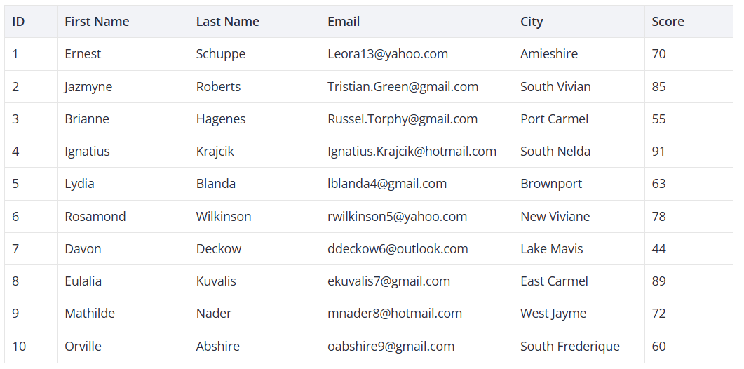
Refresh the page. You now have styled headers, alternating row colors, and hover effects.
For dark mode, replace Willow with WillowDark.
Step 5. Fix the hydration warning
Open the browser console. It likely shows:
Hydration completed but contains mismatches.
This warning is expected. The Grid calculates layout from container dimensions. During SSR there's no DOM to measure, so the server renders with defaults. The client hydrates with real dimensions, Vue sees the mismatch, and logs a warning.
You have two options.
Option A - ignore it. The component works correctly. A brief style adjustment appears on load.
Option B - render client-only. Wrap the component in <ClientOnly> in your page:
<template>
  <div>
    <header class="page-header">
      <h1>My DataGrid</h1>
    </header>
    <main>
      <ClientOnly>
        <DataGrid />
      </ClientOnly>
    </main>
  </div>
</template>
<ClientOnly> is built into Nuxt. It skips SSR for its children, so there's nothing to mismatch. The grid appears after mount.
Step 6. Fix build errors
If the build fails on the SVAR packages, edit nuxt.config.ts so that Nuxt can transpile them:
export default defineNuxtConfig({
  build: {
    transpile: [
      '@svar-ui/vue-grid',
    ],
  },
})
This tells Vite/Webpack to process these ESM packages during the build.
Step 7. Enable column sorting
Add sort: true to the columns you want sortable:
const columns = [
  { id: "id", width: 60, header: "ID", sort: true },
  { id: "firstName", header: "First Name", width: 150, sort: true },
  { id: "lastName", header: "Last Name", width: 150, sort: true },
  { id: "email", header: "Email", width: 220 },
  { id: "city", header: "City", width: 150, sort: true },
  { id: "score", header: "Score", width: 100, sort: true },
];
Users can click a header to sort. Ctrl+click (Cmd on Mac) enables multi-column sorting. For custom column templates and footer summaries, see the Columns API reference.
Step 8. Enable inline editing
Add an editor property to each column you want editable:
const columns = [
  { id: "id", width: 60, header: "ID", sort: true },
  { id: "firstName", header: "First Name", width: 150, sort: true, editor: "text" },
  { id: "lastName", header: "Last Name", width: 150, sort: true, editor: "text" },
  { id: "email", header: "Email", width: 220, editor: "text" },
  { id: "city", header: "City", width: 150, sort: true, editor: "text" },
  { id: "score", header: "Score", width: 100, sort: true },
];
Users double-click a cell to edit it. Besides "text", you can use "number", "richselect", "combo", "checkbox", and "datepicker". For large datasets, see the Pager component and the filtering guide.
Step 9. Add a sidebar editor
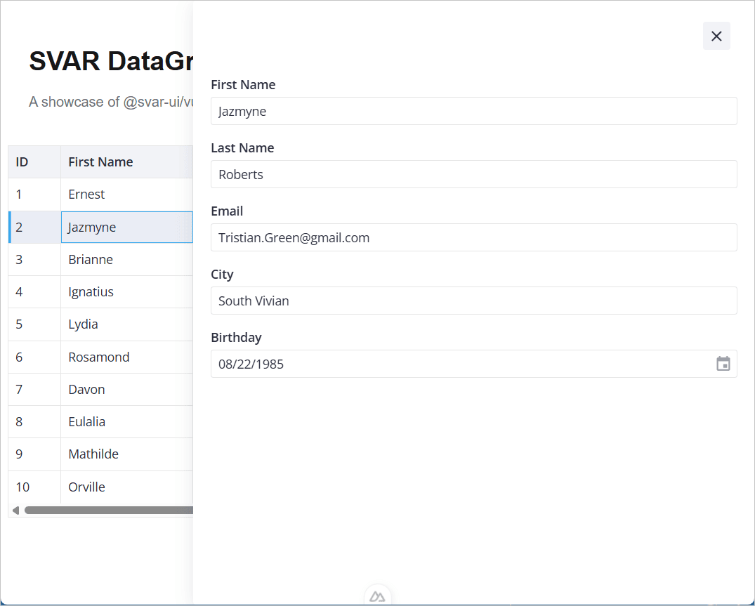
Inline editing works for quick changes. For full-row edits, our Editor component renders as a sidebar form.
Install the extra packages:
npm install @svar-ui/vue-editor @svar-ui/vue-core
Add them to the transpile list in nuxt.config.ts:
export default defineNuxtConfig({
  build: {
    transpile: [
      '@svar-ui/vue-grid',
      '@svar-ui/vue-editor',
      '@svar-ui/vue-core',
    ],
  },
})
Then update DataGrid.vue with the full sidebar setup:
<script setup lang="ts">
import { ref, computed } from "vue";
import type { IColumnConfig, IApi, IRow } from "@svar-ui/vue-grid";
import { Grid, getEditorConfig, Willow } from "@svar-ui/vue-grid";
import { DatePicker } from "@svar-ui/vue-core";
import { Editor, registerEditorItem } from "@svar-ui/vue-editor";
import "@svar-ui/vue-grid/all.css";
import "@svar-ui/vue-editor/style.css";

registerEditorItem("datepicker", DatePicker);

const data = [
  { id: 1, firstName: "Ernest", lastName: "Schuppe", email: "Leora13@yahoo.com", city: "Amieshire", score: 70, birthday: new Date(1990, 3, 15) },
  { id: 2, firstName: "Jazmyne", lastName: "Roberts", email: "Tristian.Green@gmail.com", city: "South Vivian", score: 85, birthday: new Date(1985, 7, 22) },
  // ... more rows
];

const columns: IColumnConfig[] = [
  { id: "id", width: 60, header: "ID", sort: true },
  { id: "firstName", header: "First Name", width: 150, sort: true, editor: "text" },
  { id: "lastName", header: "Last Name", width: 150, sort: true, editor: "text" },
  { id: "email", header: "Email", width: 220, editor: "text" },
  { id: "city", header: "City", width: 150, sort: true, editor: "text" },
  { id: "score", header: "Score", width: 100, sort: true },
  { id: "birthday", header: "Birthday", width: 150, editor: "datepicker" },
];

const api = ref<IApi | null>(null);
const dataToEdit = ref<IRow | undefined>(undefined);
const items = computed(() => getEditorConfig(columns));

function handleInit(v: IApi) {
  api.value = v;
}

function handleSelectRow(ev: { id: number }) {
  dataToEdit.value = api.value!.getRow(ev.id);
}

function handleChange({ key, value }: { key: string; value: any }) {
  api.value!.exec("update-cell", {
    id: dataToEdit.value!.id,
    column: key,
    value,
  });
}

function handleAction() {
  dataToEdit.value = undefined;
}
</script>

<template>
  <div>
    <Willow>
      <Editor
        v-if="dataToEdit"
        :values="dataToEdit"
        :items="items"
        placement="sidebar"
        :autoSave="true"
        :onchange="handleChange"
        :onaction="handleAction"
      />
      <Grid
        :data="data"
        :columns="columns"
        :select="true"
        :init="handleInit"
        :onSelectRow="handleSelectRow"
      />
    </Willow>
  </div>
</template>
Here's what each piece does:
:select="true": makes rows clickable and highlights the selection:init="handleInit": receives the Grid's API object on mount:onSelectRow="handleSelectRow": looks up the full row viaapi.value.getRowand passes it to the EditorgetEditorConfig(columns): readseditorproperties from your column config and builds the corresponding editor fieldsregisterEditorItem("datepicker", DatePicker): tells the Editor how to render date fields:onchange="handleChange": sends field changes back to the Grid viaupdate-cell:onaction="handleAction": handles the close button by clearingdataToEdit
On a row click, a sidebar opens with all editable fields. Changes sync back to the grid.
Wrap the component in <ClientOnly> on your page, same as before:
<template>
  <div>
    <header class="page-header">
      <h1>SVAR DataGrid in Nuxt</h1>
      <p>A showcase of @svar-ui/vue-grid component integration with Nuxt</p>
    </header>
    <main>
      <ClientOnly>
        <DataGrid />
      </ClientOnly>
    </main>
  </div>
</template>
For validation, custom fields, and layout options, see the Editor docs.
At this point you have a working grid with sorting, inline editing, and a sidebar editor. To connect it to a real database, continue with Adding a Backend.