TimePicker
The TimePicker control provides the ability to select time in the specified format. You can add a label for a time picker, disable the control, if needed, and specify the time value that should be displayed in the time picker.

Related resources
- Get the widget by installing the
@svar-ui/svelte-corepackage. - Check TimePicker API Reference to see the list of configuration properties.
- Explore the samples to visualize the available features.
Initialization
To create a TimePicker instance on a page, you need to complete the following steps:
- import the source file of the control on a page:
<script>
  import { TimePicker } from "@svar-ui/svelte-core";
</script>
- use the
<TimePicker>tag to initialize the control:
<TimePicker />
A default time picker is initialized with the midnight time (00:00) displayed.
Setting the value
To show a certain time in a time picker, use the value property, it accepts Date object.
Note that if you provide a date with no time specified, e.g. new Date(2023, 3, 16), the midnight time will be shown.
The examples below sum up the variants TimePicker provides for setting the value:
<!-- shows the current time -->
<TimePicker value={new Date()} />

<!-- shows the specified hour and minutes -->
<TimePicker value={new Date(2023, 3, 16, 12, 12)} />

<!-- shows the midnight time of the specified date -->
<TimePicker value={new Date(2023, 3, 16)} />
Related sample: TimePicker
Getting the current value
You can get the current value of the TimePicker control. For this, you need to:
- declare a variable that will contain the control's value (it may contain the initial value):
<script>
  import { TimePicker } from "@svar-ui/svelte-core";

  let time;
</script>
- bind the variable to the
valueproperty of the control:
<TimePicker bind:value={time} />
If the name of the variable matches its value, you can use the shorthand while binding the property:
<script>
  import { TimePicker } from "@svar-ui/svelte-core";

  let value;
</script>

<TimePicker bind:value />
After that the value assigned to the bound variable will be updated on each change of the time.
Related sample: TimePicker
Setting the time format
It is possible to specify the time format of the TimePicker input via the format property. The value of this property should be set either as a string with the format or as a function that returns a formatted string.
<TimePicker {value} format="%g:%i %a" />
The default value is "%H:%i". Check the characters available for specifying the time format.
Related sample: TimePicker
The format property specifies the time format for the input of the TimePicker control. To set the 12-hour/24-hour time format for the TimePicker dropdown, you should also use the clockFormat property of the calendar object in the applied locale.
Localizing TimePicker
You can apply localization settings to the interface of TimePicker. To change the default English locale, you need to import the Locale object and the desired locale into the page of your application:
<script>
  import { TimePicker, Locale } from "@svar-ui/svelte-core";
  // importing the Chinese locale
  import { cn } from "@svar-ui/core-locales";
</script>
To apply the chosen locale, you need to:
- wrap a time picker instance in the
<Locale>tag - use the words property and set the name of the locale as its value
<!-- setting the Chinese locale -->
<Locale words={cn}>
  <TimePicker {value} />
</Locale>
The result of applying the Chinese locale is given below:

Related sample: TimePicker
Setting the time format from the locale
TimePicker displays time both in the 12-hour and 24-hour (default) clock format. You can adjust the displaying of time in the TimePicker dropdown and apply the necessary format to the time rendered in the TimePicker input from the applied locale.
To provide the desired format for TimePicker you should:
- wrap a time picker instance in the
<Locale>tag and set thewordsproperty for it - specify the calendar object inside the
wordsobject and define the clockFormat property with the necessary value: 12 or 24
The clockFormat property sets the 12-hour/24-hour clock format for the time displayed in the TimePicker dropdown.
- specify the formats object inside the
wordsobject and define the timeFormat property with the necessary time format set as a string. Check the characters available for specifying the time format
Note that timeFormat set in the <Locale> tag will be applied for all the controls specified within this tag. Thus, this way is useful for setting the time format for the whole app or a form that contains several time pickers. If you need to modify the time format of a separate time picker, you can use the format property.
For example:
<script>
  import { TimePicker, Locale } from "@svar-ui/svelte-core";
</script>

<Locale
  words={{
    formats: { timeFormat: "%g:%i %a" },
    calendar: { clockFormat: 12 },
  }}
>
  <TimePicker {value} />
</Locale>
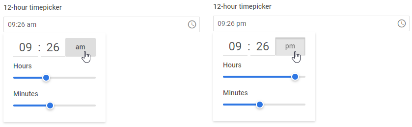
When the 12-hour format is enabled:
- the input gets the "am/pm" label next to it
- the popup with time settings gets a two-state button which changes its states from "am" to "pm" on click
Check the images below for visualization:
Related sample: TimePicker
Customizing the position of the icon
The "wxi-clock" icon is placed in the rightmost part of the time picker input by default. You can put the icon in the leftmost part of the input (before the displayed time) with the help of the css property of the control. Specify the name of the icon as "wx-icon-left":
<TimePicker css="wx-icon-left" />
Adding a title
A title is a tooltip text that appears on hovering the mouse cursor over the input and may contain some extra information about the control. Use the title property to add a tooltip for a time picker:
<TimePicker error title="Invalid option" />

Related sample: TimePicker
Setting the disabled state
Whenever you need to render a disabled time picker, you can do it with the help of the disabled property. You can either set the property to true or set it without any value.
<TimePicker disabled={true}/>

Related sample: TimePicker
Catching the change of the selected value
In case you need to catch the change of the selected value, you can do it by handling the
change event. Inside the event you can get the newly selected date in the following way:
<script>
  function handleSelect({value}){
    console.log(value);
  }
</script>

<TimePicker onchange={handleSelect} />
The handler function of the change event takes a date object with the new value of the time picker.
Adding a label
A default time picker has no label. To add it, you can use the Field component and complete several steps:
- include the Field source file on a page, declare the
<Field>tag and complete it with the necessary props:- add a desired label via the label property
- optionally, set the position="left" property to place the label to the left of the time picker
<script>
  import { TimePicker, Field } from "@svar-ui/svelte-core";
</script>

<Field label="Select time" position="left" />
After that, wrap the time picker into the <Field> tag. The Field component automatically generates an id for the inner control, which creates label-input association.
<Field label="Select time" position="left">
   <TimePicker />
</Field>

Related sample: TimePicker
Configuring the dropdown
You can control the position, alignment, width, and rendering mode of the time picker dropdown using the dropdown property.
By default, the dropdown is attached to the document body and rendered above other elements. Setting inline to true renders it inside the same HTML element as the input instead. You can also control where the dropdown appears relative to the input with position and align, set a fixed width, and attach a custom CSS class via css.
To prevent the dropdown from staying open when its container is scrolled, enable trackscroll. This applies only when inline is false (the default):
<TimePicker
    dropdown={{
        position: "bottom",
        align: "start",
        trackScroll: true
    }}
/>
Related sample: TimePicker
Styling a time validation error
When you use a time picker inside a form and a wrong time value is passed to the control, you can use error styling to show that validation has failed. Once you've set the error property to true (or just specified the property without a value):
<TimePicker error={true}/>
the input's border, the selected time and the clock icon become red. To make the label red as well, use the error property of the Field control.
<script>
  import { TimePicker, Field } from "@svar-ui/svelte-core";
</script>

<Field label="Error" error>
  <TimePicker error />
</Field>
Related sample: TimePicker