Text
The Text control is an editable input field for entering data of various types. It is mainly used in web forms to get data from a user. The control can be supplied with a label and a placeholder. You can choose a suitable input type, set a displayed text and select it, apply a specific style to the input or provide error styling, disable the control, make it read-only or set focus in the input.

Related resources
- Get the widget by installing the
@svar-ui/svelte-corepackage. - Check the API Reference to see the list of configuration properties and events.
- Explore the samples to visualize the available features.
Initialization
To create a Text instance on a page, you need to complete the following steps:
- import the source file of the control on a page:
<script>
  import { Text } from "@svar-ui/svelte-core";
</script>
- use the
<Text>tag to initialize the control:
<Text/>
A default text input is initialized empty with no label.
Setting the value
A text input doesn't have a specified value on initialization. You can set a string value that will be rendered in a text input via the value API property.
<Text value={"Anna"} />
Related sample: Text Inputs
Getting the current value
You can get the current value of the Text control. For this, you need to:
- declare a variable that will contain the input's value (it may contain the initial value):
<script>
  import { Text } from "@svar-ui/svelte-core";

  let text1 = "Anna";
</script>
- bind the variable to the
valueproperty of the control:
<Text bind:value={text1} />
If the name of the variable matches its value, you can use the shorthand while binding the property:
<script>
  import { Text } from "@svar-ui/svelte-core";

  let value = "Anna";
</script>

<Text bind:value />
After that the value assigned to the bound variable will be updated on each change of the value in the input.
Related sample: Text Inputs
Catching the change of the value
In case you need to catch the change of the value in the input, you can do it by handling the change event. Inside the event you can get the text being typed in the input in the following way:
<script>
  function handleChange({ value, input }){
    console.log(value);
    // "the typed text"
  }
</script>

<Text placeholder="Type here" onchange={handleChange}/>
The handler function of the change event receives an object with the text typed in the input. The received object may also contain input:true, if a text is being typed in the input.
Setting the type of the input
The following types of inputs are available:
- "text" - accepts values of any type (since it is the default type, the
type="text"property can be omitted) - "number" - for numbers only, non-numerical values are not allowed
- "password" - manages passwords by hiding characters behind dot symbols

To specify an input's type, set one of the above enumerated options as a value of the type property:
<!-- type="text" is omitted as a default one -->
<Text value={"Michael"} />

<Text type="password" value={"mypassword321"} />

<Text type="number" value={3235559} />
Related sample: Text Inputs
Setting focus in the input
In case you need your text input to be rendered on a page with a focus set inside it, use the focus property. You can either set it to the true value or just specify the property without a value:
<Text focus={true}/>

Setting the read-only mode
When you want a text input to be active but inaccessible for editing, make use of the readonly property. The config has the boolean value, false by default. You can either set it to the true value or just specify the property without a value:
<Text readonly={true}/>
Selecting the input content
You can select the text of an input field via the API config. For this purpose, use the select property with the true value (or without a value):
<Text value="A text to select" select={true}/>

Styling the input
You can apply custom styles to the Text control by providing a CSS class name via the css property and defining the desired styles in a <style> block:
<div class="demo-box">
  <Text placeholder="Type here" css="my-input" />
</div>

<style>
  .demo-box :global(.my-input input) {
    background-color: yellow;
    width: 300px;
    text-align: right;
  }
</style>
Svelte styles apply only to the current component's elements.
Use :global() to target elements inside SVAR controls. To make the selector more specific, include the HTML tag name before the class.
Adding an icon into the input
You can add an icon into the Text control. The name of a default icon starts with the wxi- prefix. You can check the full list of default icons to select the necessary icon. To add an icon into the input, use the icon property:
<Text icon="wxi-calendar" />
The example demonstrates the usage of the "wxi-calendar" icon in the input intended for entering dates.

Related sample: Text Inputs
Customizing the position of the icon
By default, an icon is placed to the rightmost part of the Text input. To place an icon to the leftmost part of the input, use the "wx-icon-left" value of the css property, like this:
<Text icon="wxi-calendar" css="wx-icon-left" />

Related sample: Text Inputs
Adding the Clear button
The Clear button allows clearing the selected option from the control's input.
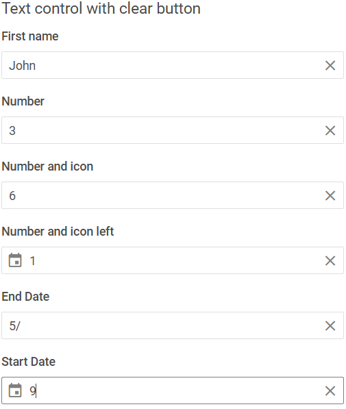
To add the Clear button into the input, use the clear property:
<Text clear />
Related sample: Text Inputs
Adding a title
A title is a tooltip text that appears on hovering the mouse cursor over the input and may contain some extra information about the control. Use the title property to add a tooltip for an input:
<Field label="Last name" error>
    <Text error title="Invalid value" />
</Field>
This is how a title for the Text control looks:

Related sample: Text Inputs
Adding a placeholder for the input
You can add a placeholder in the Text control's input. The placeholder can contain some prompting message to make interaction with the control simpler. All you need is to set your message as a value of the placeholder property:
<Text placeholder="Type here"/>

For a placeholder to be visible in the input, the Text control should be initialized without an initial value.
Related sample: Text Inputs
Setting the disabled state
Whenever you need to render a disabled input, you can do it with the help of the disabled property set to true:
<Text disabled={true}/>
It is also possible to set a text input to the disabled state by declaring the property with no value:
<Text disabled />

Related sample: Text Inputs
Adding a label
A default text input has no label. To provide a label for a text control, you can use the Field component and complete several steps:
- include the Field source file on a page, declare the
<Field>tag and fill it with the necessary props:- add a desired label via the label property
- set the position="left" property to place the label to the left of the input field
<script>
  import { Text, Field } from "@svar-ui/svelte-core";
</script>

<Field label="First name" position="left" />
After that, wrap the text into the <Field> tag. The Field component automatically generates an id for the inner control, which creates label-input association.
<Field label="First name" position="left">
    <Text />
</Field>
Related sample: Text Inputs
Styling a validation error
When you use a text input inside a form and a wrong value is passed to the control, you can use error styling to show that validation has failed. Once you've set the error property to true (or just specified the property without a value):
<Text error={true}/>
the input's border and the text's value become red. To make the label red as well, use the error property of the Field control.
<script>
  import { Text, Field } from "@svar-ui/svelte-core";
</script>

<Field label="Error" error>
  <Text error />
</Field>

Related sample: Text Inputs