Tabs
The Tabs control is useful when you create a single-page application. It allows navigating between several views each of which is linked to a tab. A tab can contain a text, or an icon, or both. The panel with tabs can be placed either at the top or at the bottom of a view with content. You can adjust the look and feel of each of the tabs and specify the active tab.

Related resources
- Get the widget by installing the
@svar-ui/svelte-corepackage. - Check the API Reference to see the list of configuration properties and events.
- Explore the samples to visualize the available features.
Initialization
To create a Tabs instance on a page, you need to complete the following steps:
- import the source file of the control on a page:
<script>
  import { Tabs } from "@svar-ui/svelte-core";
</script>
- use the
<Tabs>tag to initialize the control:
<script>
  import { Tabs } from "@svar-ui/svelte-core";
</script>

<Tabs/>
- specify an options' set to provide content for the tabs:
<script>
  import { Tabs } from "@svar-ui/svelte-core";

  const tabs = [
    { id: 0, label: "First tab"},
    { id: 1, label: "Second tab" }
  ];
</script>

<Tabs options={tabs}/>
Creating tabs
A tab of the Tabs control may include a text, an icon, or a combination of a text and an icon. The content of tabs is set through the options property. Each option in the tabs array has an object with properties presented as key:value pairs. An object of the options array may have the following properties:
- id - the id of a tab
- label - the text of a tab
- icon - the name of the icon to be used in a tab
<script>
  const tabs = [
    { id: 0, label: "Info", icon: "wxi-alert" },
    { id: 1, label: "About" },
    { id: 2, label: "Contact" },
    { id: 3, label: "", icon: "wxi-check" }
  ];
</script>

<Tabs options={tabs} />
Adding content into tabs
In order to display some content for a tab, it's necessary to create a view to put the content in and connect the tab and the view. Then, you need to add some logic that allows switching between the tabs. Take the following steps:
- add an array of tabs and initialize the Tabs control
- specify views with content for tabs in separate divs with the "body" class
- place the Tabs control together with the views containing content into a common div, let it be "tabbar"
- provide the logic that will check the currently active tab to display its content in the body
Here is an example of creating the Tabs control with content for tabs:
<script>
let active = 2;
const tabs = [
{ id: 0, label: "Info", icon: "wxi-alert" },
{ id: 1, label: "About" },
{ id: 2, label: "Contact" },
{ id: 3, label: "", icon: "wxi-check" },
];
</script>
<div class="tabbar">
<Tabs options={tabs} bind:value={active} />
{#if active === 0}
<div class="body">This page contains main information and is being constantly updated.</div>
{:else if active === 1}
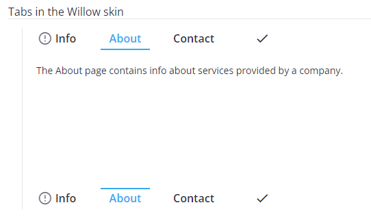
<div class="body">The About page contains info about services provided by a company.</div>
{:else if active === 2}
<div class="body">The Contact Us page is one of the most-visited pages.</div>
{:else}
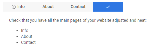
<div class="body">Check that you have all the main pages of your website adjusted and neat:
<ul>
<li>Info</li>
<li>About</li>
<li>Contact</li>
</ul>
</div>
{/if}
</div>
Setting the value
You can specify what tab should be selected at the moment. Use the value property for this purpose. Set the id of the corresponding option as a value of this property:
<script>
  const tabs = [
    { id: 0, label: "Info", icon: "wxi-alert" },
    { id: 1, label: "About" },
    { id: 2, label: "Contact" },
    { id: 3, label: "", icon: "wxi-check" },
  ];
</script>

<Tabs options={tabs} value={2} />
In the above example, the "Contact" tab is selected, as its id is set in the value property.
Getting the current value
You can get the id of the currently selected tab. For this, you need to:
- specify a variable that will contain the id of the tab (it may contain the initial value):
<script>
  import { Tabs } from "@svar-ui/svelte-core";

  const tabs = [
    { id: 0, label: "First tab"},
    { id: 1, label: "Second tab" }
  ];

  let active = 2;
</script>
- bind the variable to the
valueproperty of the control:
<Tabs options={tabs} bind:value={active} />
If the name of the variable matches its value, you can use the shorthand while binding the property:
<script>
  import { Tabs } from "@svar-ui/svelte-core";

  const tabs = [
    { id: 0, label: "First tab"},
    { id: 1, label: "Second tab" }
  ];

  let value = 2;
</script>

<Tabs options={tabs} bind:value/>
After that the value assigned to the bound variable will be updated on each change of the selected tab.
Catching the change of the selected tab
In case you need to catch the change of the selected tab, you can do it by handling the
change event. Inside the event you can get the value of the newly selected tab in the following way:
<script>
  function handleChange(ev) {
    active = ev.value;
    console.log(active);
    //=>2
  }
</script>

<Tabs options={tabs} value={0} onchange={handleChange} />
The change event receives an object that contains the id of the newly selected tab.
Setting the position of tabs
The default panel with tabs is set at the top of the views with content. You can also place the Tabs control under the divs with the tabs' content. To ensure the correct styling of the bottom Tabs panel, use the type property with the corresponding value:
<div class="tabbar">
  {#if active === 0}
    <div class="body">Info</div>
  {:else if active === 1}
    <div class="body">About</div>
  {:else if active === 2}
    <div class="body">Contact</div>
  {:else}
    <div class="body">Check</div>
  {/if}
  <Tabs options={tabs} bind:value={active} type={'bottom'} />
</div>

Note that the type property should be set, since the styling may differ depending on the used skin. For example:
Besides, it is important if you want to apply a custom skin as well.
Using icons in tabs
The default icons' set is based on the Material Design icons' collection. The list of predefined icons is presented in the snippet. This list is being constantly replenished with new icons.
To use the default icons' pack on a page, you need:
- include the pack on the page as in:
<link rel="stylesheet" href="https://cdn.svar.dev/fonts/wxi/wx-icons.css" />
- use the name of the chosen icon as the value of the icon tab's property. The name of a default icon starts with the wxi- prefix.
<script>
  const tabs = [
    { id: 0, label: "Info", icon: "wxi-alert" },
    { id: 1, label: "About", icon:"wxi-cat" },
    { id: 2, label: "Contact",icon:"wxi-edit" },
    { id: 3, label: "", icon: "wxi-check" },
  ];
</script>

<Tabs options={tabs}/>
The Tabs control from the above-mentioned example will look like this:
Get more information on the usage of icons in SVAR controls.